


.svg)
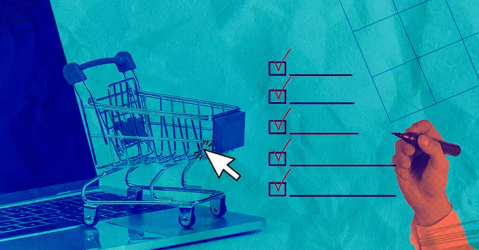
A few simple changes on your website can go a long way in boosting your conversion rate.
In this article, we will take you through a bunch of onsite optimizations to turn your visitors into customers:
1. Double check everything on your navigation bar
2. Make “searching” a cakewalk
3. Inspire confidence through the first fold
4. Use powerful nudges across featured products
5. Pepper your entire homepage with trust symbols
6. Let’s curb choice paralysis
7. Prioritize search within categories
8. Make your product the king (great images - gold)
9. Experiment with GIFs & videos
10. Make your product descriptions distinct
11. SEO optimize your product pages
14. Create urgency by adding prompts
15. Recommend products on high-intent pages
16. Place social proof strategically
17. Implement breadcrumbs on your website
18. Show attractive cart deals
20. Boost the perceived value of discounts
21. Provide guest checkout option
22. Simplify the checkout form
23. Install a checkout progress bar
24. Provide multiple payment options
25. Make sure to add trust signals during checkout
Changes To Optimize Your Site For More Conversions
Let’s take up the prominent pages appearing in your customers’ journey, one at a time.
>> ONSITE OPTIMIZATION IDEAS FOR YOUR HOMEPAGE
1. Double-check everything on your navigation bar
To make your audiences go deeper into your site through your navigation, ask:
✅ Is your nav bar organized neatly into categories and sub-categories?
✅ Are the main categories prominent?
✅ Have you featured categories that can help your shoppers save? (make “sale” and “bundles” prominent would be a way)
✅ Is your navigation bar sticky-especially on mobile?
If any of the answers is ‘No’, then you might want to make the above-mentioned changes to enhance your navigation bar.
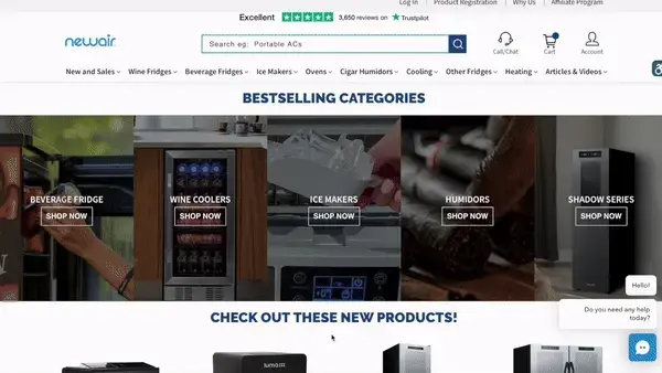
2. Make “searching” a cakewalk
To nudge users to make good use of your search bar, make it super prominent, and nudge them a little - "search for ...."
To further enhance your search, you can add hint text- examples from different categories, just like Newair does.
Here are a few other search functionalities that can drive conversions for you:
✅ Have an autocorrect feature in place
✅ Add a ‘Did you mean….?’ and show related products
✅ Show a list of “trending searches” as a dropdown when typing starts (especially beneficial for newer audiences)
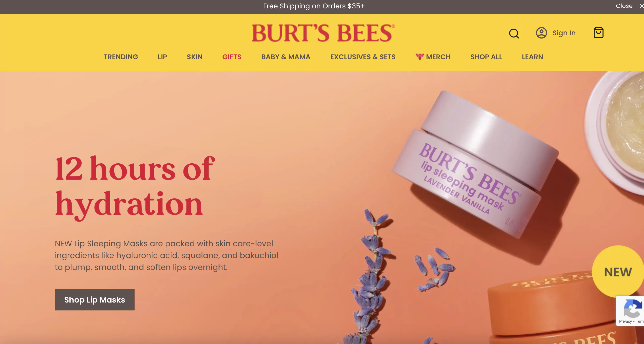
3. Inspire confidence through the first fold
In a jiffy, your first fold will crack it if it can:
✅ Talk about your UVP in the headline
✅ Stick to a single, powerful image & make sure it’s BOLD
✅ Talk about how trusted your brand is (get that “1000+ reviews” info snapshot here)
✅ Make an offer or hint at savings
✅ Feature “What’s new”
✅ Use a CTA that’ll actually draw attention & drive action
A great example that comes to our mind is Burt’s Bees.
They have clearly highlighted their unique value proposition, displayed their product, and added a CTA that has clear instructions.
4. Use powerful nudges across featured products
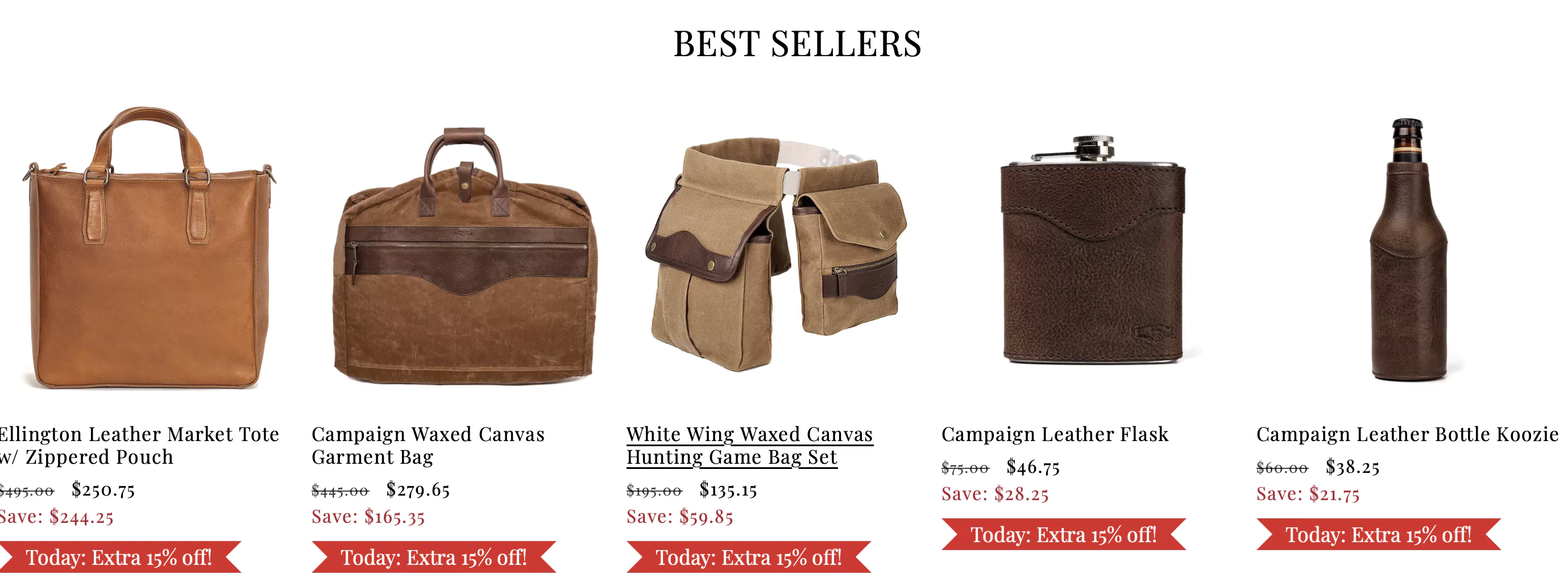
Shoppers need a good reason to stay back and check what you’ve got to offer—and that can’t happen only if you say “BEST SELLERS” on the homepage.
Here are a few ways to drive conversions through what’s featured:
✅ Limited time offers—just like Mission Mercantile uses:
✅ Highlight featured categories by displaying associated UGC alongside it
✅ Bring in a larger theme to the featured products (something like “Found the perfect gift yet?” can work wonders for seasonal shopping)
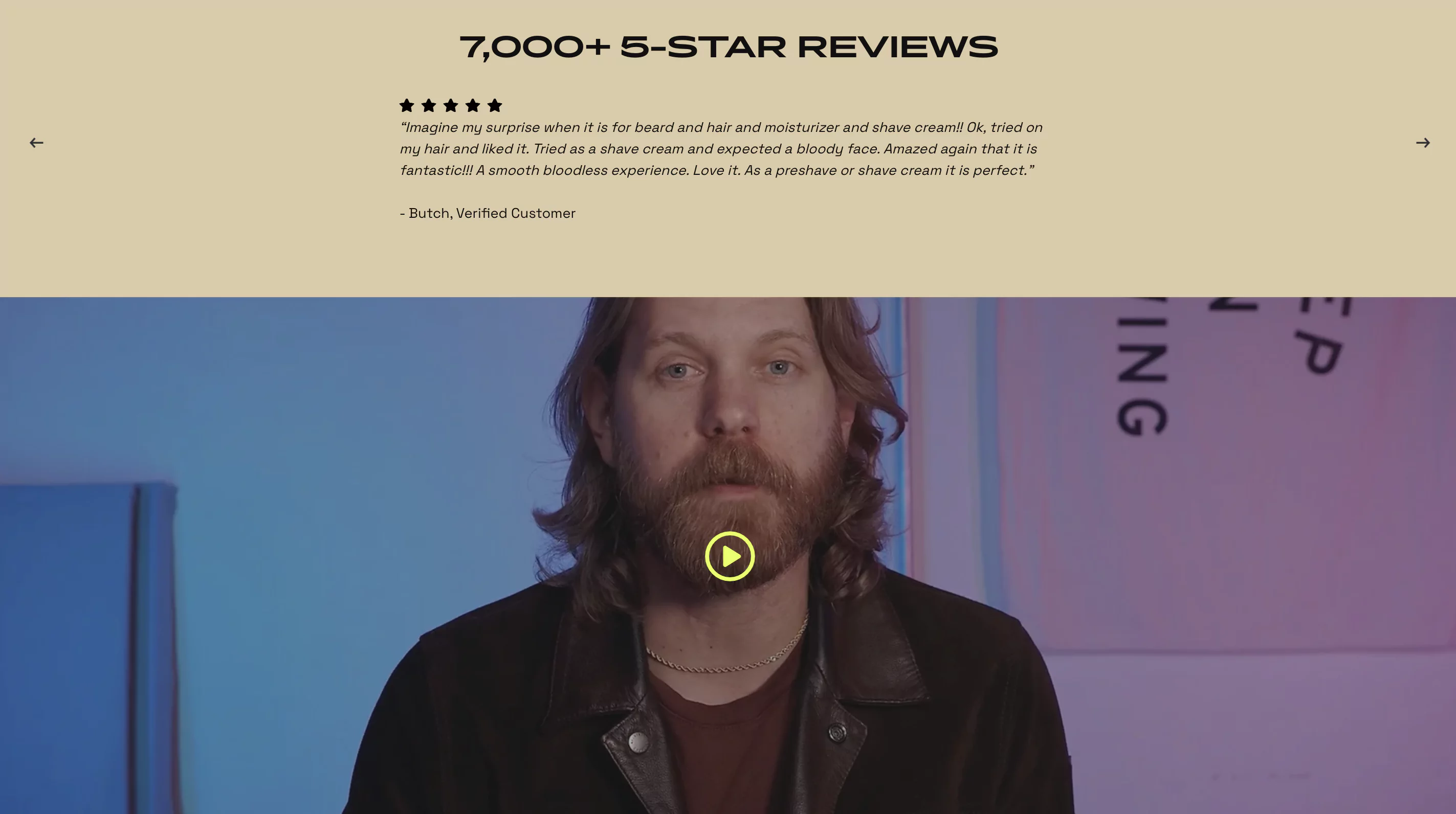
5. Pepper your entire homepage with trust symbols
Shoppers don’t trust the website, they trust the people behind it.
A few ways to garner that trust are:
✅ Utilize social proof by either adding something as simple as a Facebook fans counter or something more nuanced like a video review of a customer.
✅ Add partner logos or any organization that you are associated with.
✅ Display your real address
Beardbrand garners trust by not only added ratings and testimonials but also video reviews of their customers on their homepage.
You may also like: 23 Ways to Boost eCommerce Homepage Conversions (2024 edition)
>> ONSITE OPTIMIZATION IDEAS FOR YOUR CATEGORY & PRODUCT PAGES
6. Let’s curb choice paralysis
Giving too many product options to shoppers leads to exhaustion due to fear of missing out on the best product and the anxiety of not being able to make the right decision.
And the visitor drops off.
This is called choice paralysis.
Best solution?
💡Quizzes.
Ask your website visitors a couple of questions to understand what they are looking for and suggest a few products according to their requirements.
This is how Repairs Universe does it:
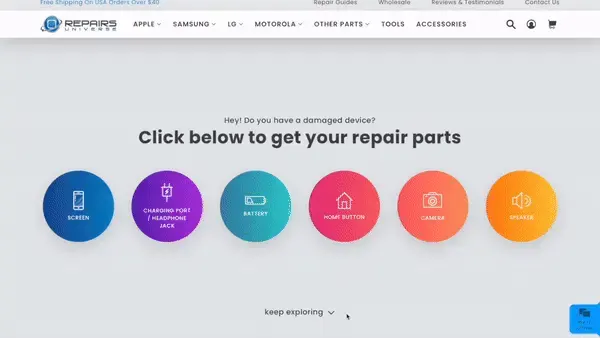
The idea is to create subcategories within categories and take your visitors to very relevant products to ease the decision-making process for them.
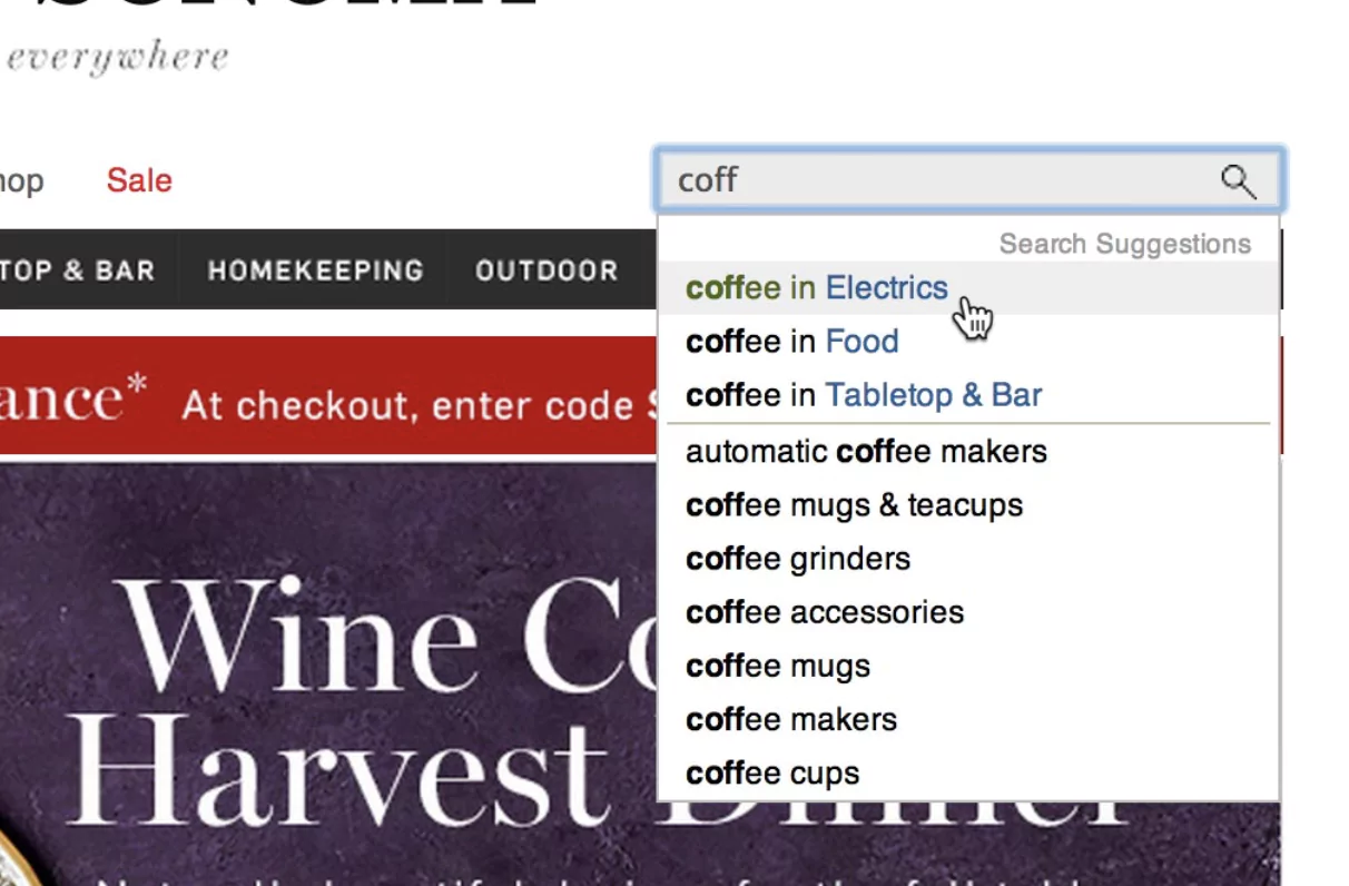
7. Prioritize search within categories
Feature a category selector as part of your search function—this way shoppers can manually pick the category they're interested in.
You should trim the search results by not showing products that you know for a fact your shoppers don’t want - which are all the products outside the category that they are browsing in.
Optimize for this by enabling a ‘search within categories’ option.
You can provide the ‘Search Within’ option in one of the 3 ways:
✅ Autocomplete scope suggestion: Where the categories are suggested along with the search query; something like this:
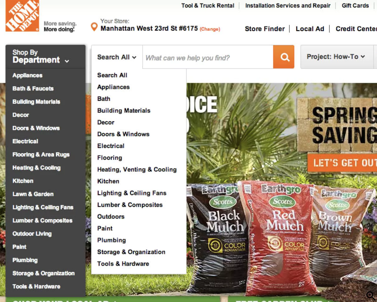
✅ Manual scope selectors: Where shoppers can select their category manually and search for the desired product.
The Home Depot lets the shoppers choose a category from the drop-down menu and then search for the product within the category.
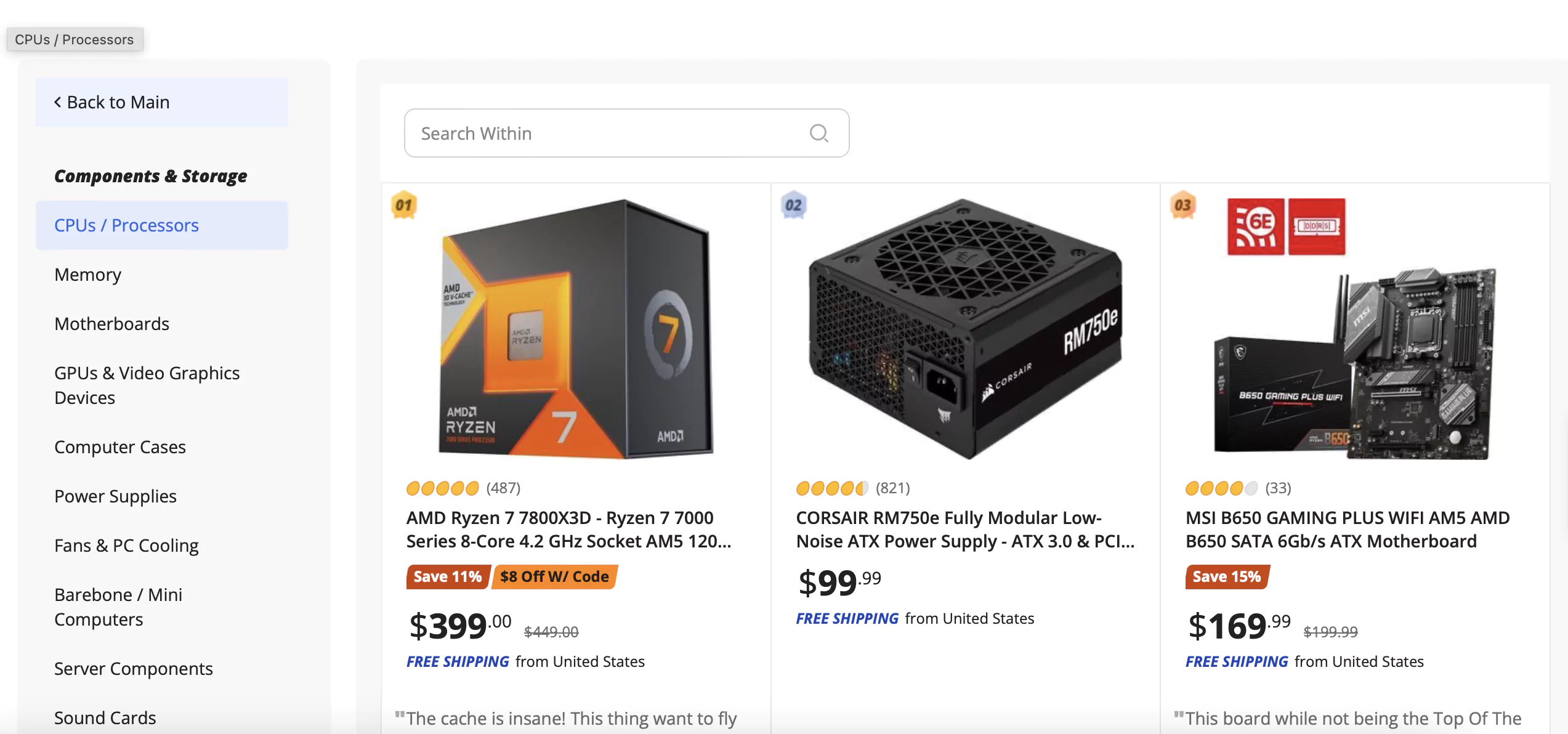
✅ ‘Search within’ field: Where the ‘search within’ bar is present on the category page. This is what Newegg has implemented on their website.
8. Make your product the king (great images - gold)
We all know about the traditional white background pictures shot from three different angles—which most eCommerce websites are doing today.
Then, how do you make your products stand out?
Here are a few ideas to set your brand and business apart:
✅ Don’t just sell the product, sell a lifestyle.
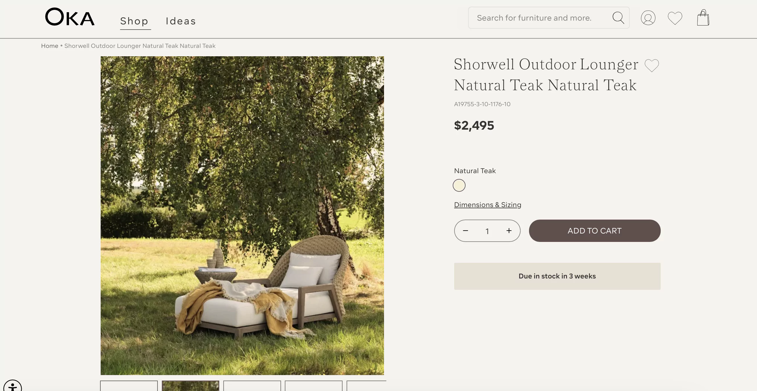
OKA presents its furniture in the context of comfort and luxury, making the purchase decision less about technical specs and more about lifestyle.
✅ Textural images (extreme close-ups) are also great when it comes to giving a true sense of the product, as the shoppers can't physically see and hold the product.
✅ Size and proportion images should be used when the shopper needs to judge the actual size of the product.
A very common way to communicate size (and portability) is by having a hand hold the product.
The thinking goes: if the product fits in the palm of your hand, then it’s portable.
✅ You can use animate images (images with other humans or animals) as they evoke more emotions and grab attention faster as compared to only inanimate products.
9. Experiment with GIFs & videos
Product images do give a good idea about the product, but you can take your online store experience a notch higher by adding video demos.
You can add:
✅ How-to videos
✅ Product features highlighted
How to get the product video strategy right:
✅ They should be placed at the top of the product page, mixed with or next to the product image gallery.
✅ For videos to stand out, mix videos into the normal image gallery thumbnails and overlay them with a “play” icon.
✅ Feel free to repeat the videos in other content sections elsewhere on the product page
Allbirds is a perfect example. They clearly demonstrate the features of their products through very simple videos.
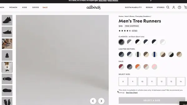
10. Make your product descriptions distinct
Long paragraphs and dense text are an instant turn-off.
The key is to make sure that features and characteristics are differentiated.
Steps to follow:
✅ Highlight the product’s key features under the main headline
✅ Create an additional features section for the less important ones
Stick to 2-6 features each
Must haves in your product description are:
✅ Materials or ingredients of your product
✅ Product dimensions
✅ Compatibility information (if applicable)
Ensure each element is visually distinct - like icons, bullets or different formatting options.
You can create icons for:
✅ Zero shipping charges
✅ Money back guarantee
✅ Features like ‘Waterproof’ or ‘Pure cotton’; and
✅ Certifications and awards
You may want to read: 23 Key Elements Every Product Description Page Must Have (eCommerce)
11. SEO optimize your product pages
SEO and CRO are two tools that help businesses succeed. SEO brings in free traffic and CRO converts them.
Hence all the SEO efforts should be done keeping CRO in mind.
To optimize for SEO:
✅ Keep the page titles around 60 characters and make sure to add your target keyword to them.
✅ Add your keyword to the product descriptions. However, keep in mind that your ultimate consumers are humans, therefore write content for humans and plug keywords organically into it.
✅ Your website should have unique meta descriptions, titles, and URLs for each page.
12. Make your CTAs unmissable
Coming to where the action happens - The CTA button.
Let’s look at some ways you can get those clicks on your CTAs:
✅ Make the CTA button stand out by using a contrasting color that draws attention.
✅ Place the CTA such that it's clearly visible above the fold.
✅ Keep the hit area of 7mm by 7mm thus reducing the number of tap issues and making it easier for users to navigate.
✅ Surround the CTA button with whitespace to prevent clutter and improve visual focus.
✅ Primary CTA should be more prominent than the secondary CTA
Lamps Plus creates bold, red CTAs to draw immediate attention.
13. Offer wishlisting
A joyful wishlisting feature is the one which:
✅ Helps shoppers wishlist products as guest users
✅ Has an unobtrusive yet descriptive design (A heart icon, Save or Add to wishlist button)
✅ Is easy to locate on desktop as well as on mobile devices (Ideally the button next to the cart button)
✅ Offers sorting, filters and removal of items with ease
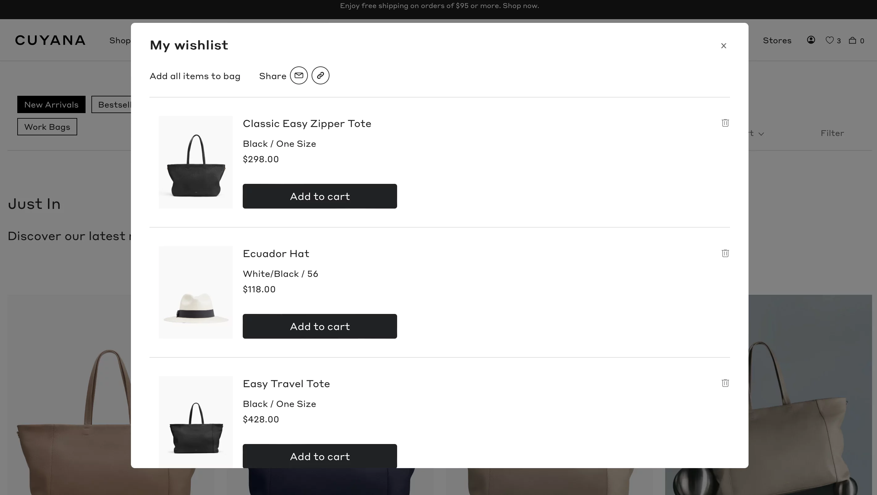
Cuyana shows a small heart icon for shoppers to add items to their wishlist.
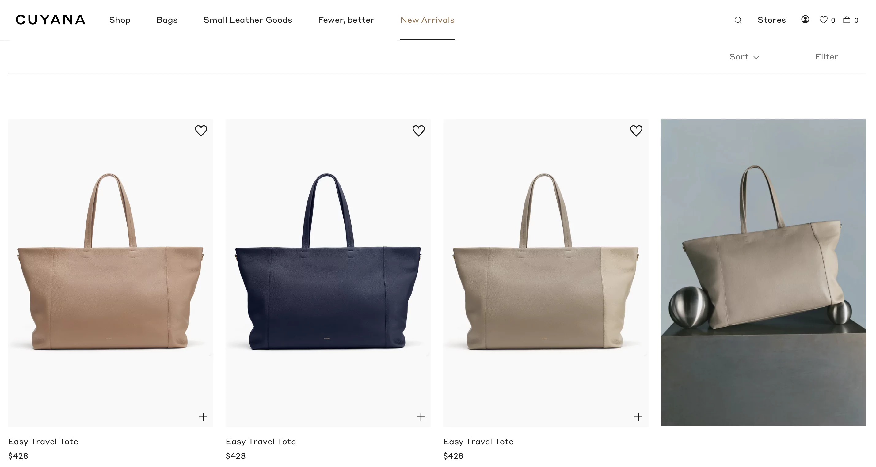
The top right corner has the wishlist icon showing the number of items in it.

Clicking on it, the shoppers get redirected to their wishlist which has prominent ‘Add to cart’ CTAs.
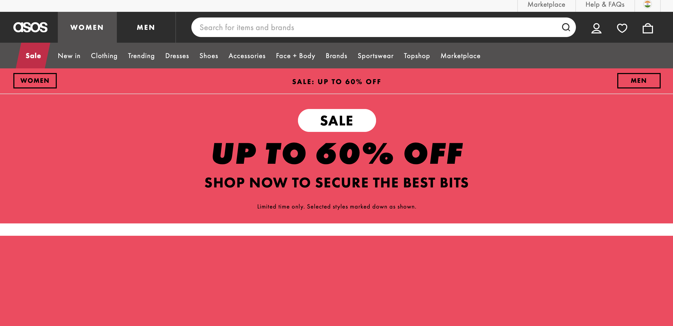
14. Create urgency by adding prompts
A few simple techniques to create that FOMO to drive your visitors to checkout are:
✅ Alert users when a product is low in stock or nearing sold-out status. Display messages such as "Only X left in stock".
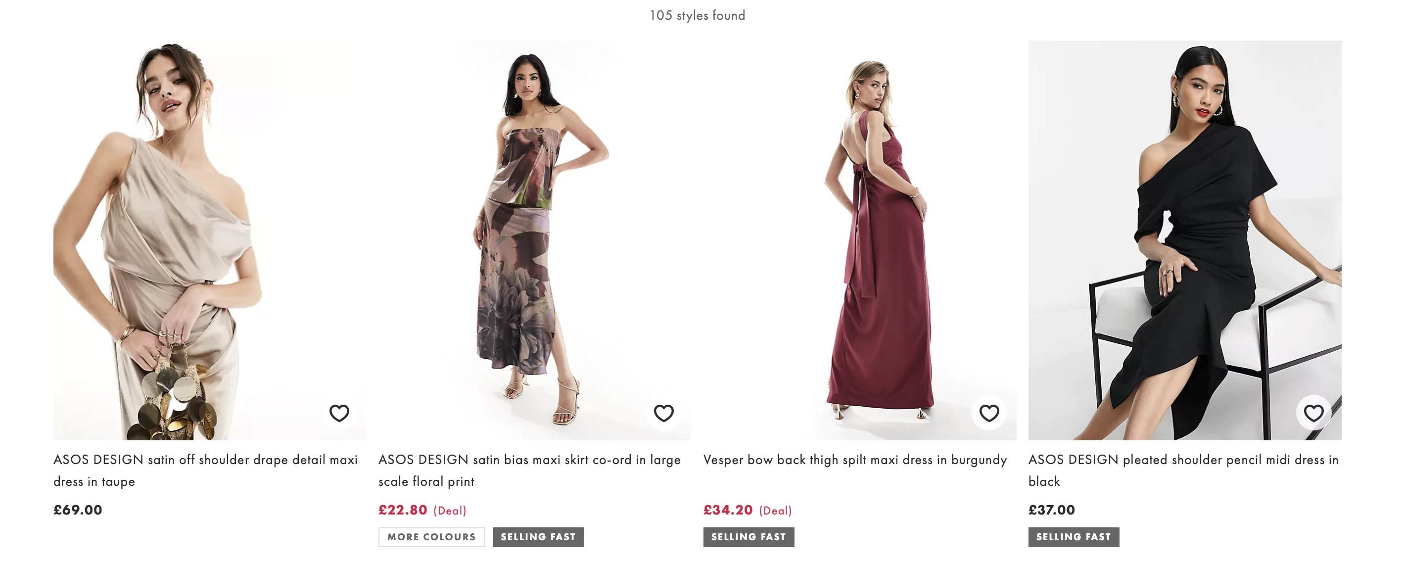
ASOS tags a few of their products as ‘Selling Fast’ to drive urgency and thus action to buy.
✅ Messages like "Bestseller" or "Customer Favorite" create a sense of urgency by signaling high demand and encouraging users to make a purchase before the product sells out.
✅ Offer free shipping thresholds. Display messages like "Free Shipping on Orders Over $X" or "Spend $X More for Free Shipping" to encourage users to add additional items to their cart to qualify for free shipping.
15. Recommend products on high-intent pages
As they say, the devil is in the details, even a seemingly insignificant change in recommendations, if appears to be personalized, can go a long way in improving your conversion rate.
The pages where you can include recommendations are:
✅ Homepage: As ‘Popular Products’
✅ Category pages: As ‘Most Commonly Bought’ items
✅ Product pages: As ‘You may also like’ or ‘Frequently bought together’
✅ Cart page: Items for upsell, other offers or discounted products
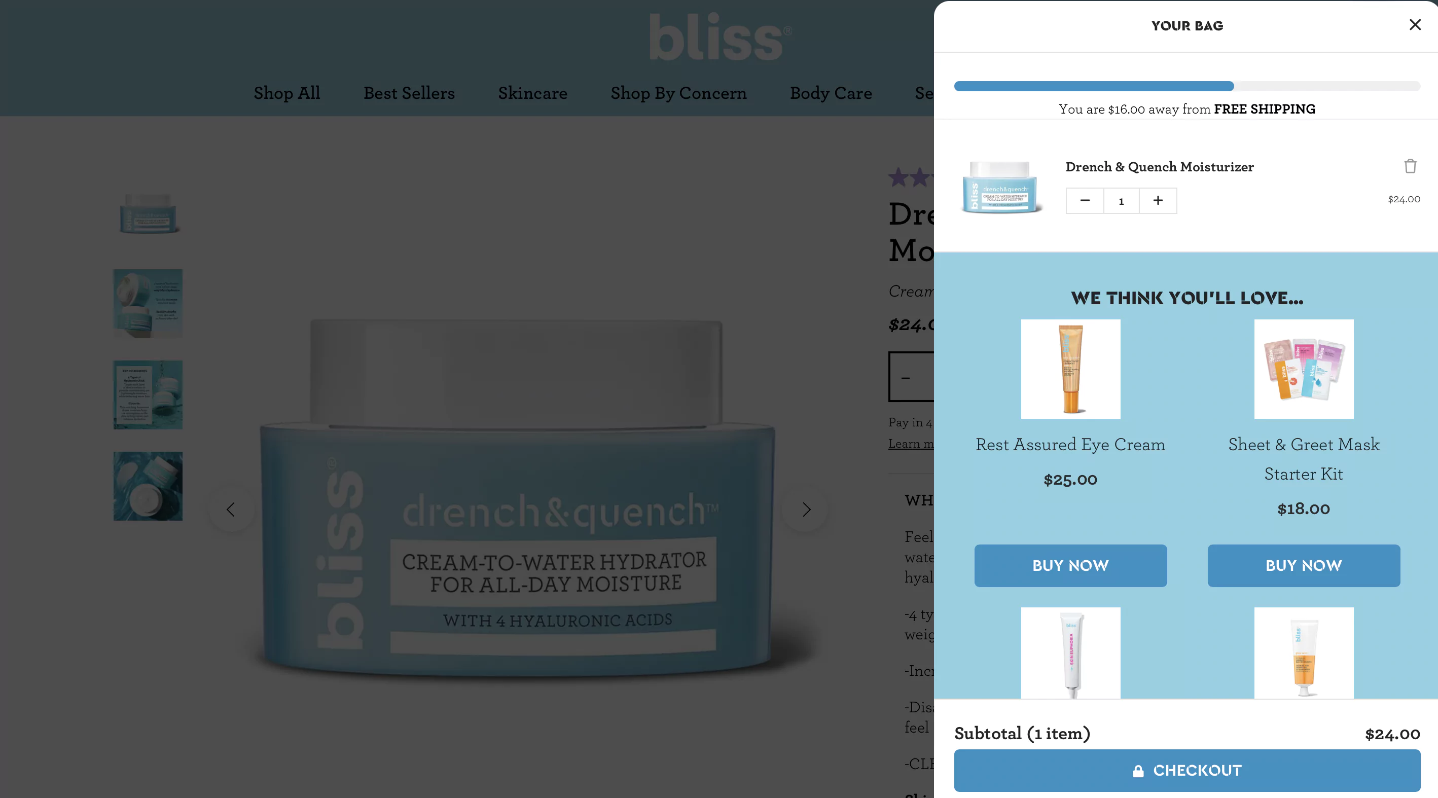
Bliss is a great inspiration here.
When shopping on Bliss’ site, every time the user adds a product to the bag, they show a few personalized recommendations that you can immediately add to your cart.
These recommendations are coupled with a progress bar on the top. It shows how far you are from that cart value that unlocks free shipping.
16. Place social proof strategically
Did you know that reviews have just the impact that personal recommendations do? And they help with SEO.
Let’s look at some ways to truly ace those reviews.
✅ Display star ratings
✅ Mention the number of reviews next to the stars
✅ Make the ratings clickable and hyperlinked to written reviews
✅ Highlight 1-2 compelling testimonials which talk about the benefits in detail
✅ Respond to reviews
✅ Use visuals such as customers’ pictures
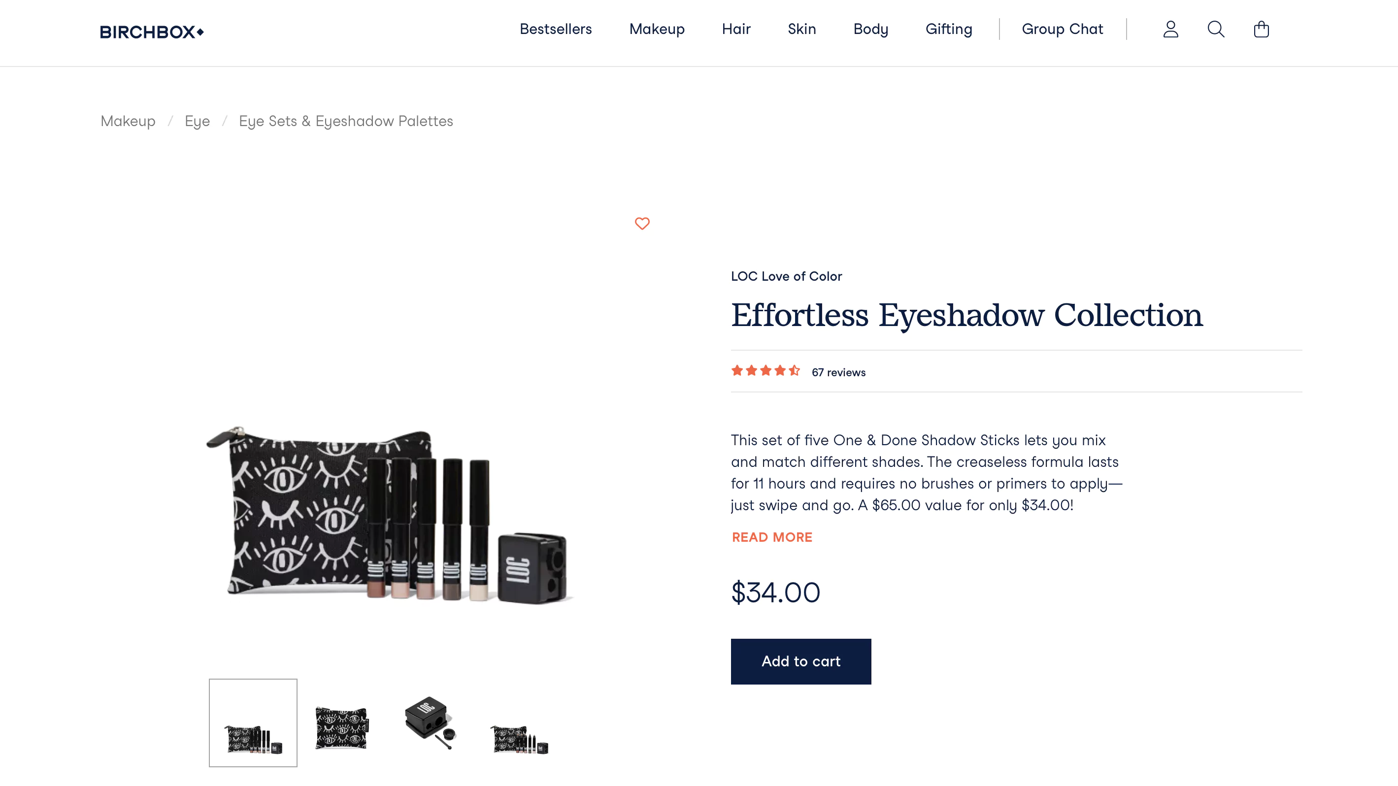
Take a look at how Birchbox has displayed star ratings and the number of reviews right under the title:
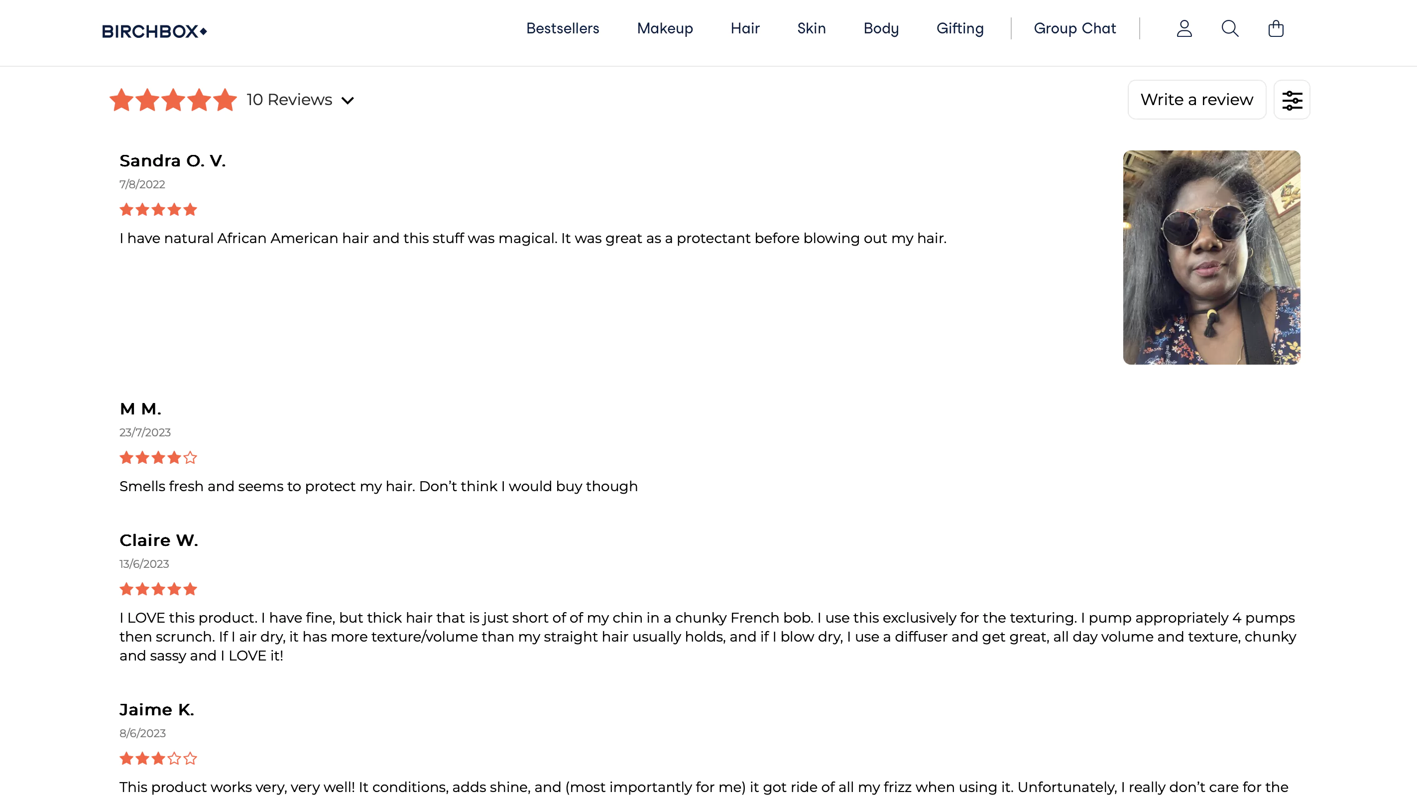
Upon scrolling down, the shoppers come across reviews that are rich with customers pictures too:
17. Implement breadcrumbs on your website
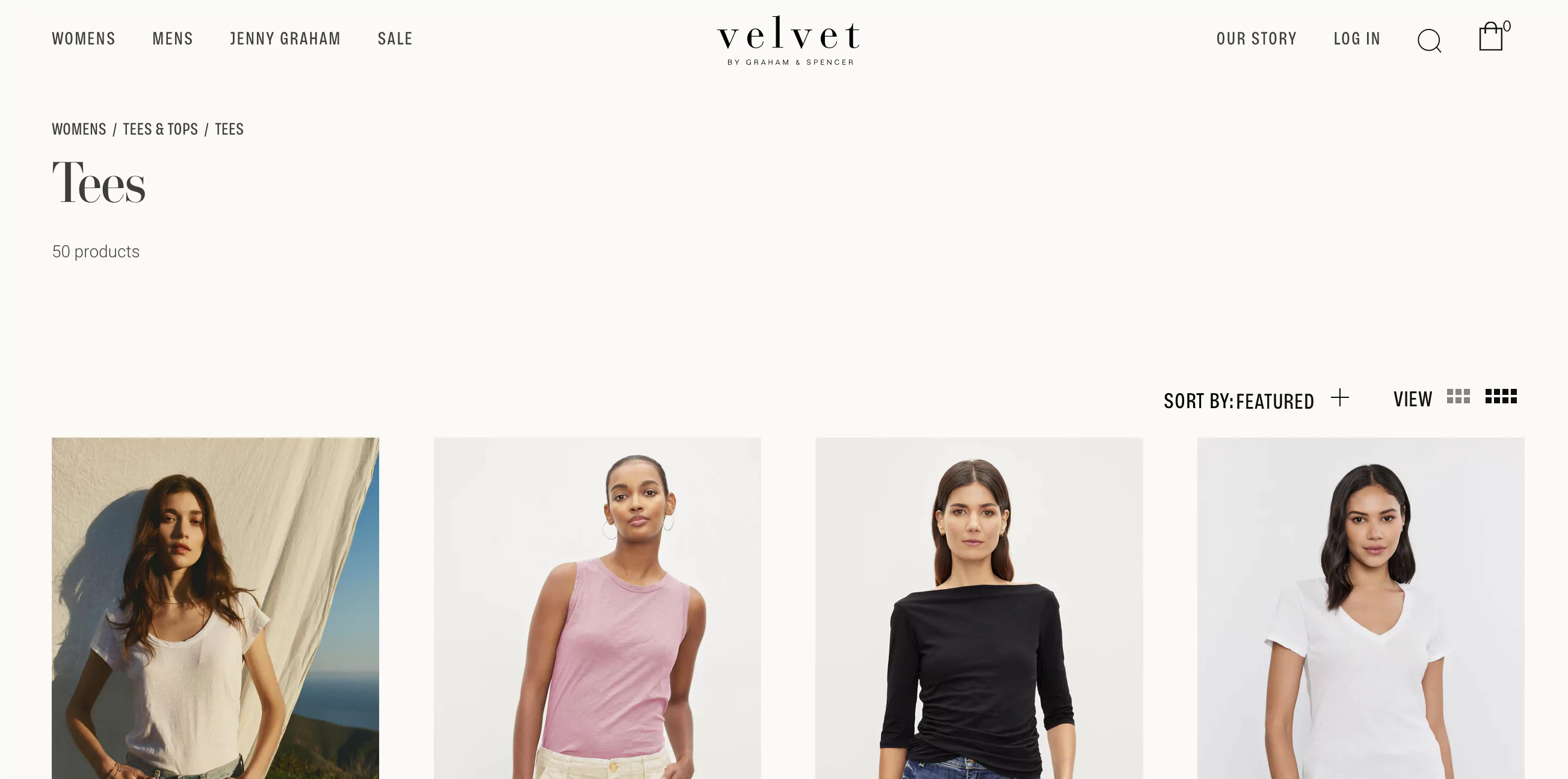
A small change that you can introduce to your website is adding breadcrumbs on your category pages for seamless navigation like Velvet Tees has done.
The users can easily go back to either ‘Tees & Tops’ or all the apparel in the ‘Womens’ section as per their will without getting lost in the navigation paths.
You may also like: Product Page Statistics Every eCommerce Pro Should Know (2024 Update)
>> ONSITE OPTIMIZATION IDEAS FOR YOUR CART & CHECKOUT
18. Show attractive cart deals
The opportunity to save a couple of dollars only pushes people down the sales conversion funnel.
Some of the cart deals that you can introduce are:
✅ Zero gift wrapping (may or may not be over a threshold)
✅ Last-minute quantity discounts
✅ Membership points
✅ Free samples
✅ Free shipping
✅ Exclusive coupons
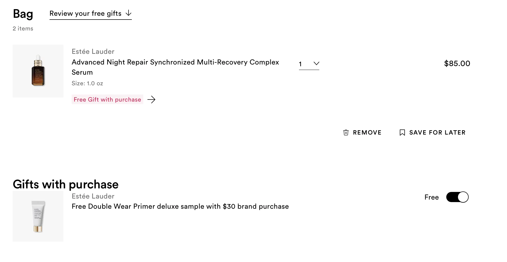
Ulta Beauty offers free gifts with selected products to shoppers making the cart look delightful.
19. Auto-apply discounts
Store owners employ coupons and rewards to attract customers. You can use the same technique for reducing cart abandonment too.
Some points to take care of:
✅ Available discounts are highly visible and users don’t have to search for it
✅ Avoid using the ‘Apply’ button. Shoppers either miss it or mistake it for primary CTA.
✅ The cart clearly shows the actual price and discounted price
You may want to read: eCommerce Tiered Discount: 10 Awesome Examples You'd Want To Copy
20. Boost the perceived value of discounts
There are two ways of showing discounts: percentage value and absolute value. They can be used in different scenarios to present a higher perceived value.
Case 1: If your product costs $250 and you are offering a $50 discount.
Instead of showing $50 off, a 20% discount portrays a higher value.
Case 2: If your product costs $1000 and you are offering a $100 discount.
Instead of calling it a 10% discount, it is preferable to highlight the absolute value - $100.
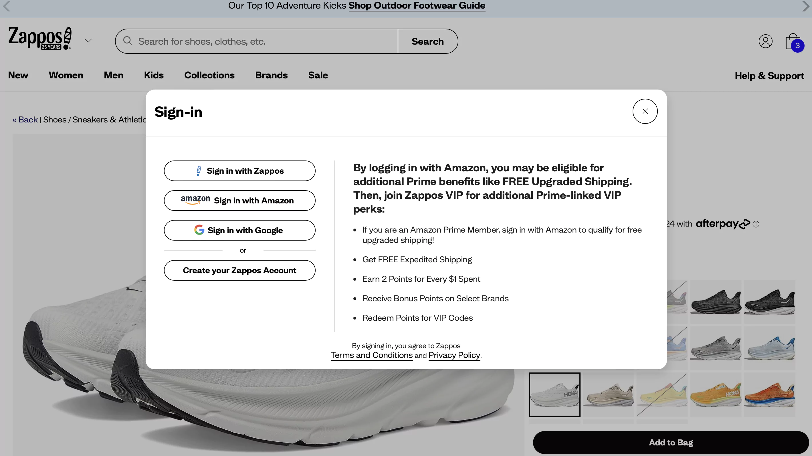
21. Provide guest checkout option
Baymnard’s research shows that ‘the site wanted me to create an account’ was the second-biggest reason for cart abandonment.
Bypassing this process via a guest checkout functionality is especially important for first-time visitors, who are less likely to tolerate interruptions to the checkout flow.
If you want more customers to sign up for an official account, consider offering some kind of incentive, like a discount or free shipping.
Zappos provides several benefits to urge users to create an account.
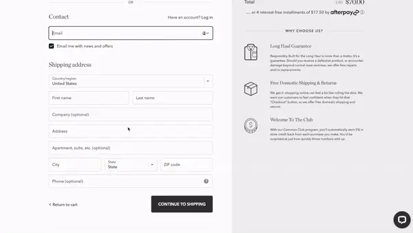
22. Simplify the checkout form
The easier the checkout form, the more the conversions.
To simplify it, you can:
✅ Have an autofill feature in the checkout form fields
✅ Mark the mandatory and non-mandatory fields
✅ Add not more than 6-8 form fields
23. Use a checkout progress bar
Determine the steps involved in your checkout process and create a bar to indicate the number of steps left.
Common steps include:
✅ Cart review
✅ Shipping information
✅ Payment method
Taylor Stitch has added a 3-step progress bar on the top, additionally, they have also added items to upsell along with an express checkout option.
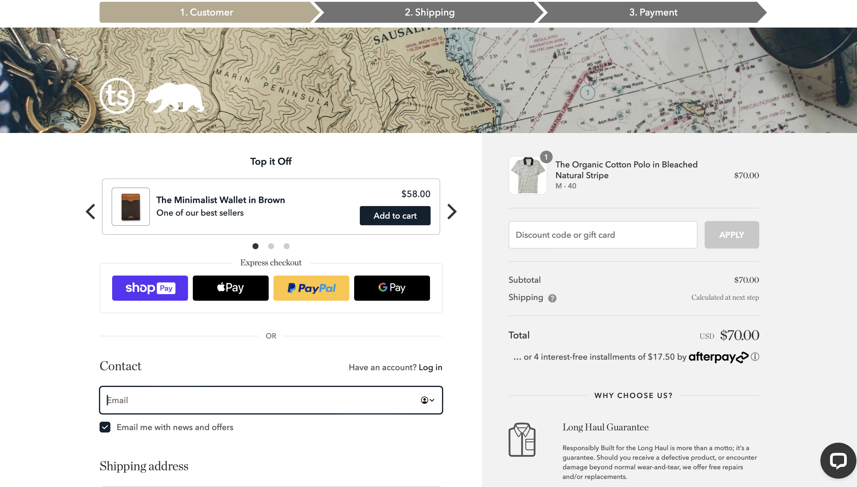
24. Provide multiple payment options
Another key area to think about is the payment options you’re providing to customers.
Lots of the larger retailers are now offering options like:
✅ Pay after delivery
✅ Credit
✅ Split payments (BNPL)
Customers have varying affinities and loyalties to different providers, so the more payment options, the better.
Coming to Taylor Stitch once again, along with the express checkout options, they also provide multiple other payment methods:
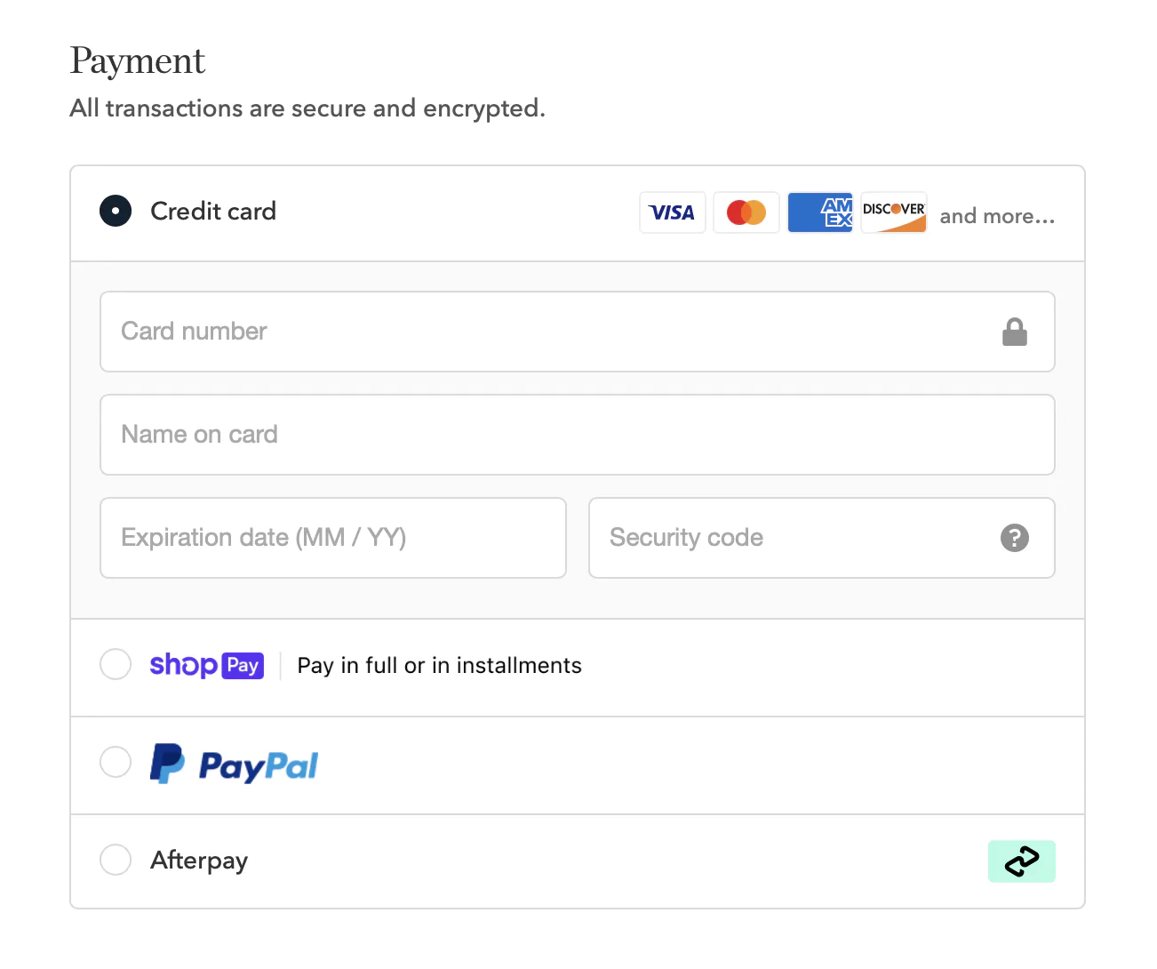
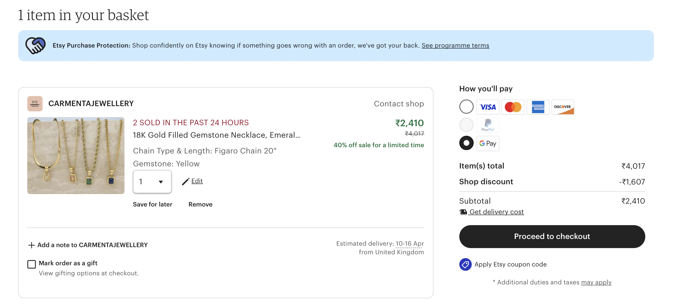
25. Make sure to add trust signals during checkout
Users really start to think about security when they reach the final payment stage on a webpage.
Showing trust signals throughout the buyer journey is something that comes across as very obvious, but isn’t always implemented on websites.
We recommend displaying the following:
✅ Merchant reviews/rating (e.g. rated 4.9 / 5 based on 100,000 orders)
✅ SSL certificate and mention of secure shopping experience. You could also potentially look at third-party security validation, such as Norton, McAfee, GeoTrust, etc.
✅ Very clear customer service/help, returns and T&Cs links.
✅ Logos of available payment options (and ideally payment certification – e.g. verified by Visa)
Etsy has planted multiple trust signals for shoppers to feel safe while making payments.
26. Limit distractions
What we would also recommend is to do away with everything that might shift the focus from the checkout to anything else.
✅ Lose all the external links if they are present on your checkout page.
✅ Ideally, replace the header and the footer as well; if something has to be added, it can be the delivery information, trust signals, etc.
Recommended reading:
15 *Underrated* Conversion Rate Optimization Ideas for eCommerce
Boost eCommerce landing page conversions: 12 scientific strategies
Final word
98% of visitors who visit an eCommerce site—drop off without buying anything.
Reason: User experience issues that cause friction for visitors.
And Convertcart solves for exactly that.
We help eCommerce brands optimize their websites to boost their conversions.
We've helped 500+ eCommerce stores (in the US) improve user experience—and 2X their conversion rate.
How do we do this?
Our conversion experts can audit your site—identify UX issues, and suggest changes to turn more of your visitors into customers.
Subscribe for more articles like this!
500+ brands across 35 countries, including Everlast, USA Hockey, American Heart Association use ConvertCart to boost traffic-to-sales conversion rate—without having to break the bank.
.webp)
.png)


.svg)

.svg)

.svg)
.svg)
