


.svg)
.jpg)
While the whole of eCommerce speaks of conversions, so much of that success lies in the powers of A/B testing.
According to a Speero report, 40% of CRO testers make archives out of their past tests, so that they can learn from them in the future.
Exactly why we thought, why not create a comprehensive list of variants we've tested, learnt from and helped clients with to earn more conversions.
With this one, you have your entire funnel covered PLUS a section on emails—here's a quick shortcut to the main sections:
Let's go!
eCommerce A/B Testing Elements To Boost Conversions
Ideas for Stage One: Homepage
1. (A) Mega menu / (B) Horizontal menu
In our experience of using AB testing ideas, we’ve noticed mega menus work with businesses that have countless categories and product offerings.
Horizontal menus work better for businesses with limited products and those that prioritize the mobile experience.
2. (A) Sticky navigation menu / (B) Non-sticky menu
At the top of the funnel, when a shopper is trying to get to know your brand in more detail, a sticky menu might just work better—it offers more navigational control across the homepage and beyond.
3. (A) Labels for primary categories / ( B) Labels for sub-categories
Anchor & Crew highlights labels for their main categories—though the more usual practice for brands is to label their dropdown subcategories.

4. (A) Rotating carousel / (B) Single hero image
Two bits from A/B testing eCommerce experience: even if you’re using a rotating carousel, make sure you offer manual control through visible previous-next buttons—if you choose to keep it on auto-rotate, let it be slow enough for shoppers to register what’s on each slide.
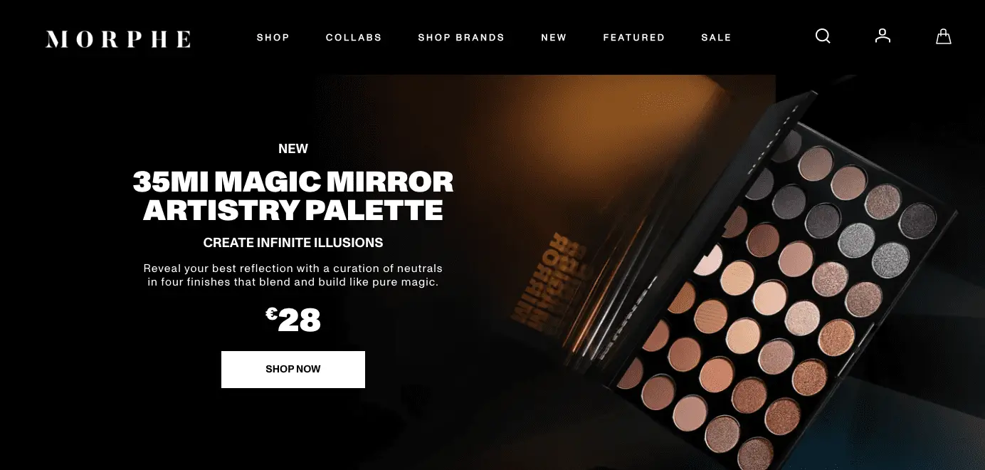
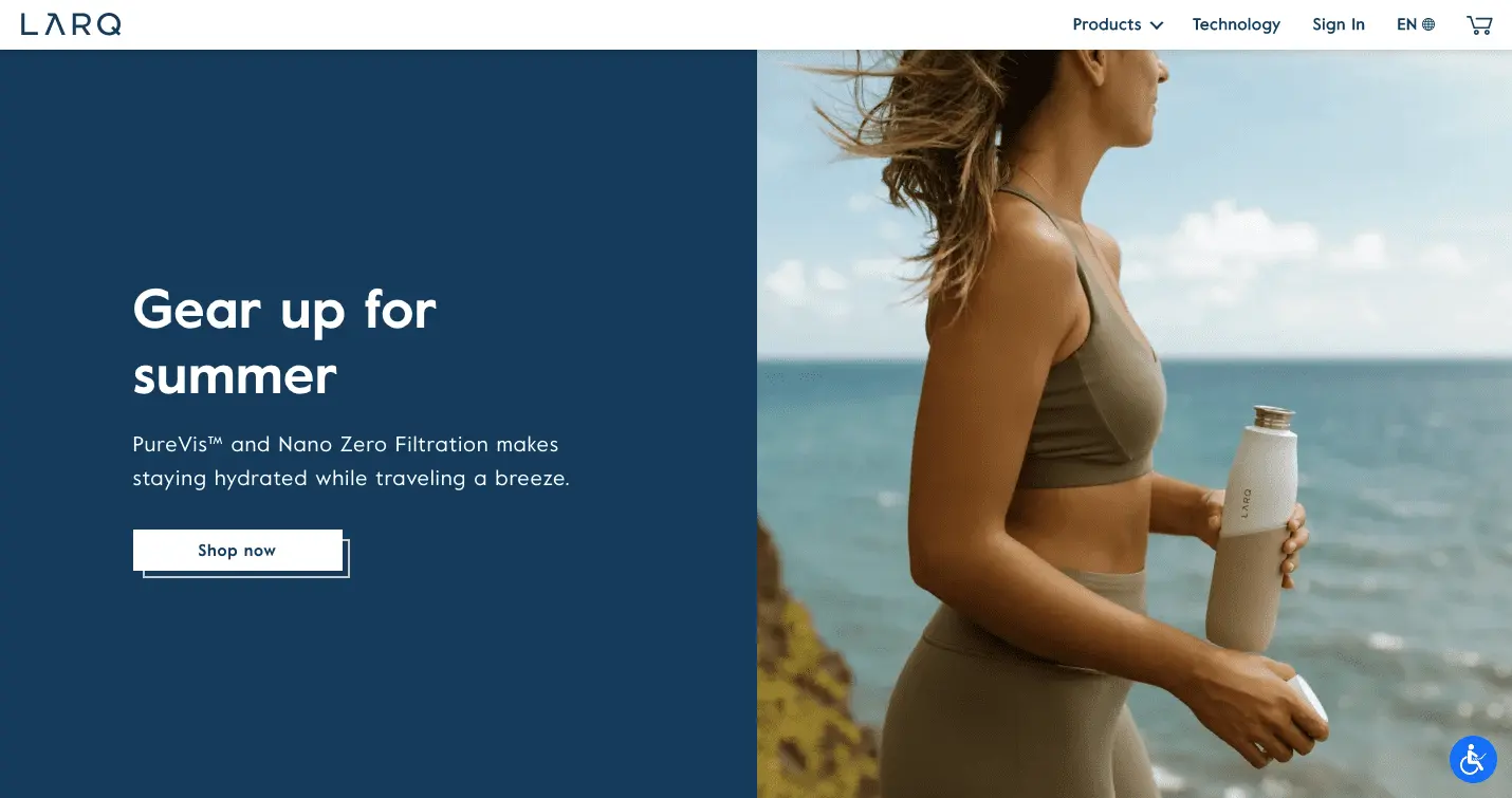
5. (A) Copy against the image / (B) Copy & image in separate sections
eCommerce brand Morphe Cosmetics places their copy (unobtrusively) against the hero image.
Larq, on the other hand, splits the hero banner between plain background for copy and then image for their eCommerce A/B testing.
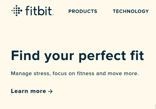
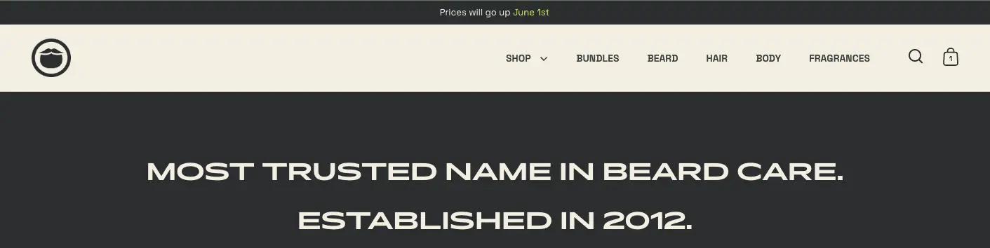
6. (A) Short headline / (B) Longer headline
Fitbit, for example, keeps it super short as part of their eCommerce testing strategy.
Beardbrand, on the other hand, keeps it simple yet longer in this eCommerce A/B testing idea.
7. (A) Headline as description / (B) Headline as question
While a description typically sets more context for the shopper, a question pushes them to think about the problem at hand that has brought them to the homepage.
8. (A) Brand-specific headline / (B) Product-specific headline
To enhance your eCommerce AB testing strategy, you could use the latter during peak season sales.
9. (A) Hero banner copy a mix of features & benefits / (B) Benefits-based hero banner copy
10. (A) The benefits come in bullets / (B) The benefits come in a paragraph
11. (A) Hero headline with microcopy / (B) Hero headline without microcopy
When experimenting with eCommerce A/B testing ideas, remember: microcopy takes an argument (made in the headline, let’s say) further—it can talk about value-add, a benefit, a limited time offer etc.
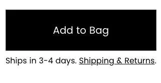
12. Test the above-the-fold CTA button (for different shapes, color, texts, positions etc.)
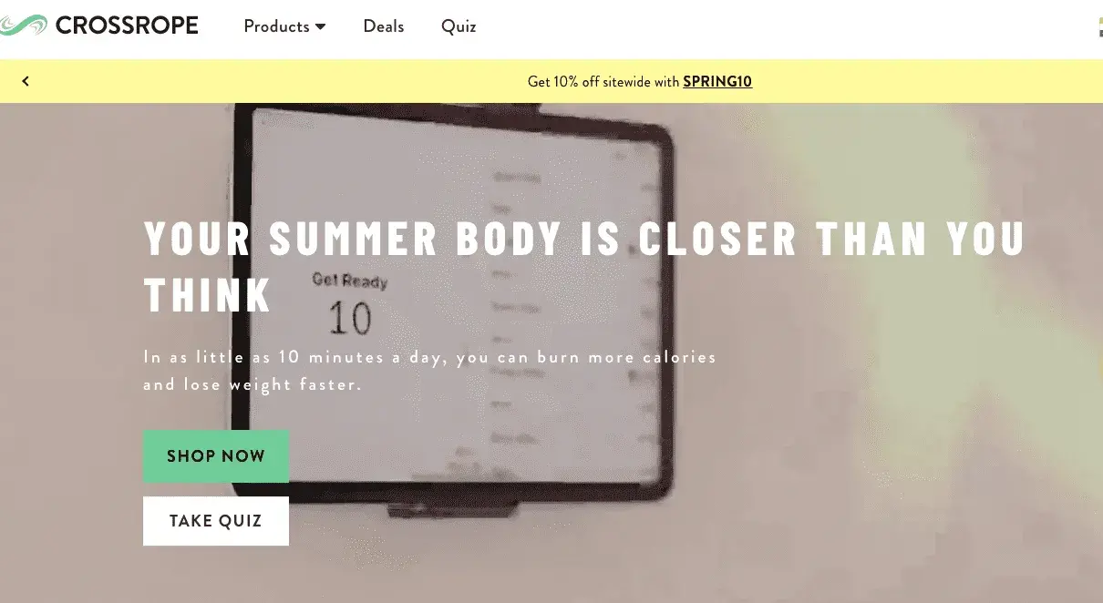
13. (A) Feature single CTA on the hero banner / (B) Feature multiple CTAs
Crossrope, for example, currently features two CTAs on their homepage hero space—this is one of the underrated eCommerce A/B testing ideas that can help you segment your audiences better:
14. (A) All prominent CTAs / (B) Some CTAs more prominent than others
To make certain CTAs less prominent, you might want to skip not color-blocking them—when you’re doing AB split for eCommerce, color-blocking transactional CTAs is usually a good idea.
15. (A) Only button CTAs / (B) Button CTAs + visual cues
Ikea, for example, features a range of CTAs on their homepage (notice how the visual cues are also on point) as an eCommerce testing strategy:
16. (A) Make the header a sign-up prompt / (B) Feature a seasonal sale discount
Which of these eCommerce AB testing ideas you choose will primarily depend on your conversion goals.
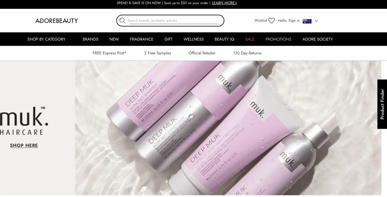
17. (A) Product quiz in the primary navigation / (B) Sticky “product finder” button
Adore Beauty features a sticky product finder button as one of their A/B testing ideas—making it easy for on-the-go folks to explore more quickly.
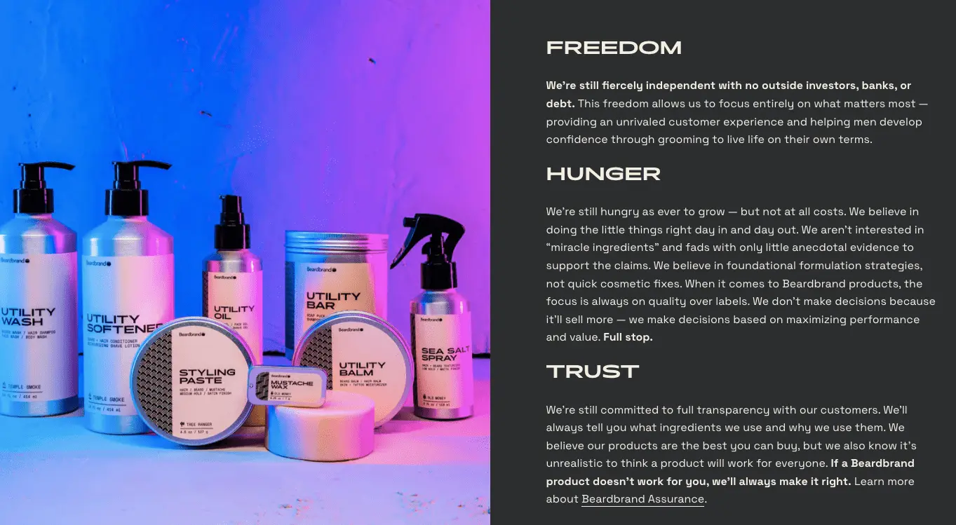
18. (A) Featuring more copy throughout / (B) Featuring more visuals
Beardbrand clearly features more copy in this example of A/B testing for eCommmerce.
Room & Board’s homepage, on the other hand, is clearly more visual-led in this version from their A/B test ideas:
19. (A) Feature more product visuals / (B) Feature more people visuals
Which of these A/B test ideas will work has to do with what kind of business you are—for example, if you sell jewelry, bold “people” photos will work better than if you’re into selling outdoor cooking equipment.
20. (A) Showcase a brand video / (B) Feature a bestseller video
21. (A) Feature hero product images / (B) Feature hero product GIFs
While technically both are image formats, GIFs when used well, convey more information and help set greater context for the shopper—while conducting the AB split for eCommerce consider your site loading speed to choose the right variant.
22. (A) Header with founder’s message / (B) Header with brand values
Try out the latter in the form of graphic icons with text callouts.
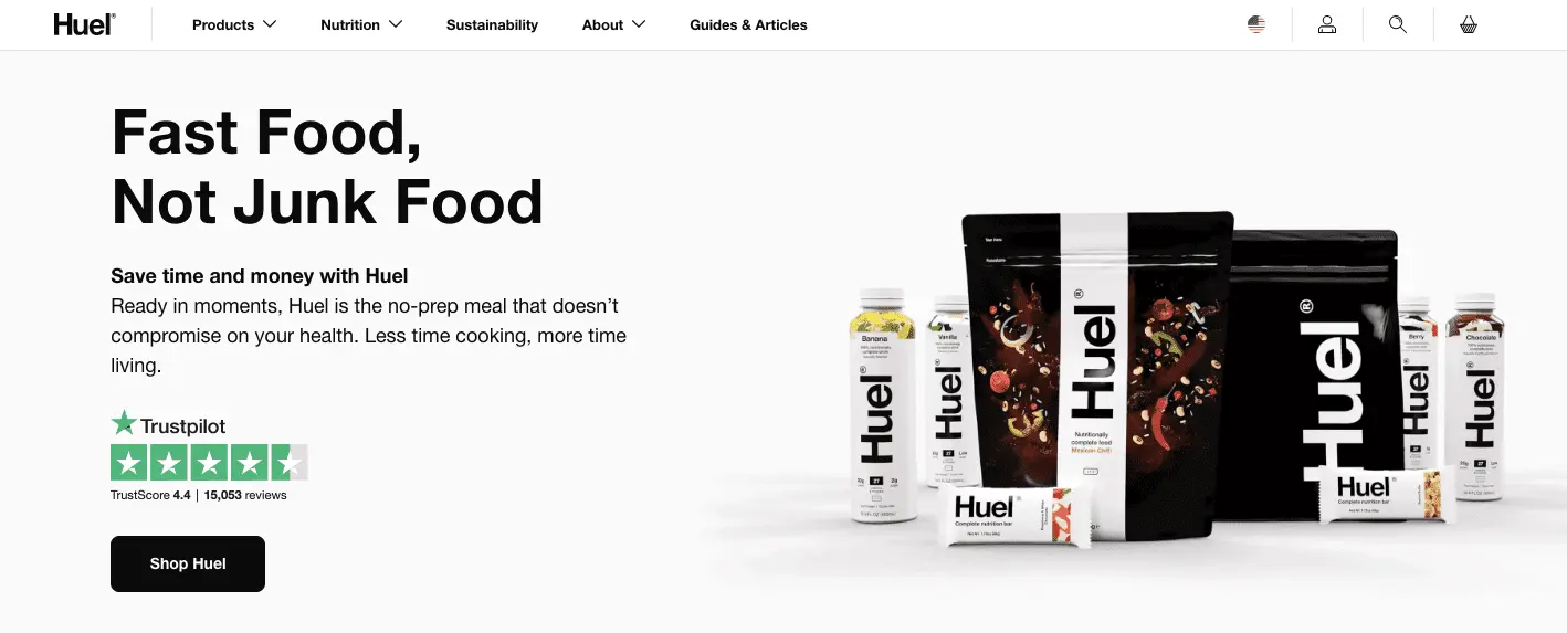
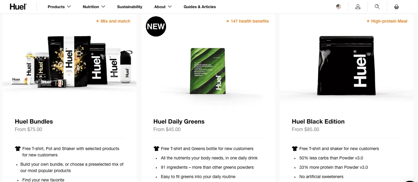
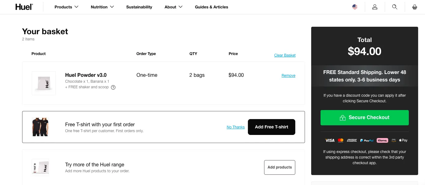
23. (A) Hero image with social proof badge / (B) Hero image with press mentions
Huel, for example, showcases a Trustpilot badge on their hero space as part of their a/b testing for eCommerce ideas:
24. Test between “free shipping” & “free mystery gift” callouts on the notification bar
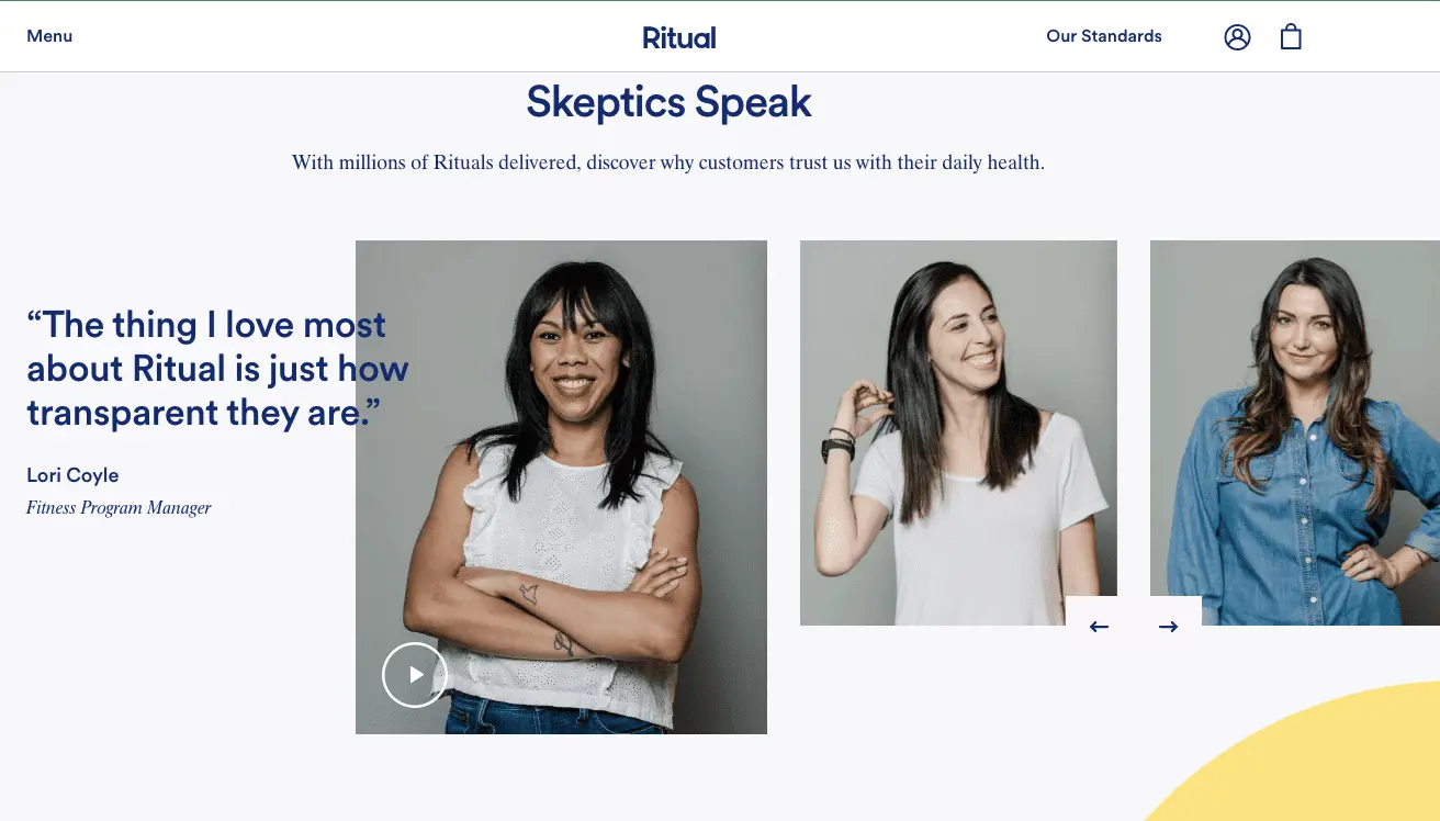
25. (A) Feature a link to customer reviews / (B) Feature customer review snippets
Ritual is an eCommerce brand that seems to have done both in their eCommerce AB testing—reviews highlighted as quotes and video links too!
26. (A) Highlight a customer review snippet / (B) Highlight reviews AND press mentions
27. (A) Create a section with press mentions / (B) Create a section with purchase impact data
Unlike many other brands, Unconditional chooses to throw light on how a purchase creates impact—this is a great TOFu A/B testing eCommerce idea:

28. (A) “About” section with link to about us page / (B) Brand promises called out through icons
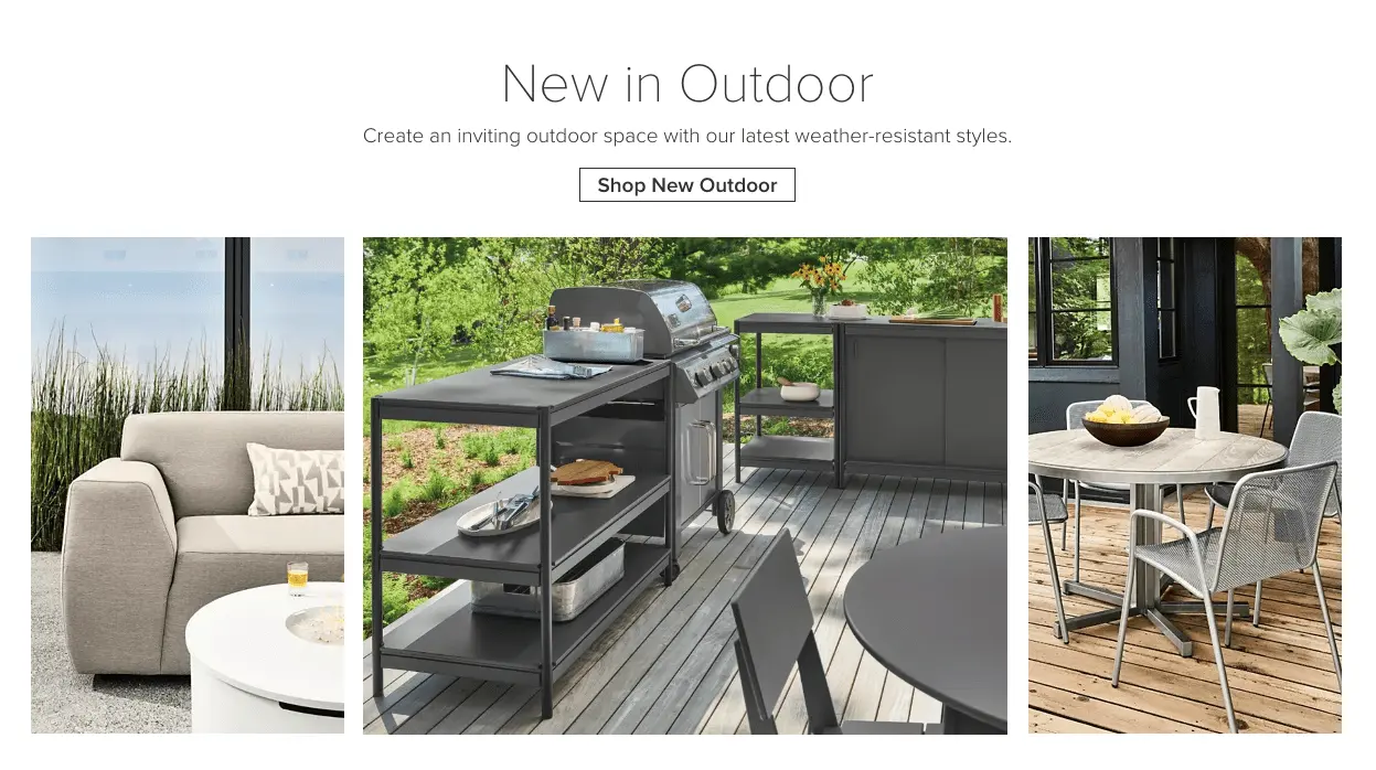
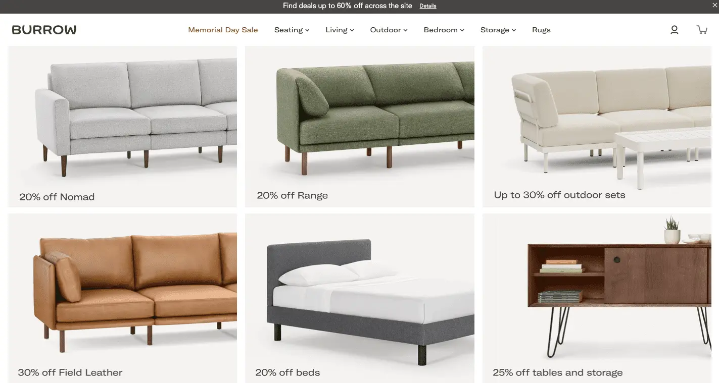
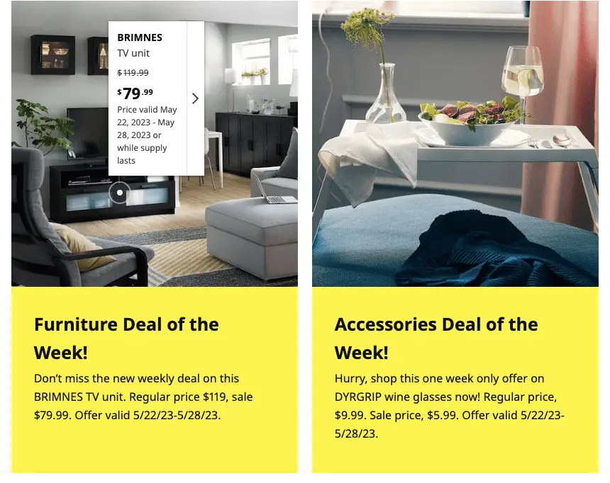
29. (A) Feature a discounted categories section / (B) Feature a “deal of the week” section
Burrow cites categories along with their associated discounts in their eCommerce a/b testing efforts.
On the other hand, Ikea highlights various categories as "deals of the week".
30. (A) Show “shop by categories” / (B) Show “shop by brands” with clickable logos
Larger third party aggregator brands can do a third variant combining both in their eCommerce testing strategy.
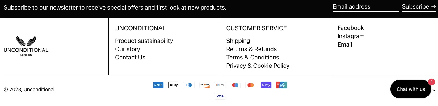
31. (A) Feature BNPL options in the footer / (B) Highlight popular payment methods
eCommerce brand Unconditional does the latter in their A/B testing in eCommerce.
We’ve seen that highlighting BNPL options work really well if your primary target audience is the younger crowd—after all, 56% of millennials claim to use BNPL options widely.
32. (A) Section on loyalty program savings / (B) Section on regular flash sales
33. (A) Social buttons on the footer / (B) Social buttons on the upper navigation panel
Since social handle visits and shares are important micro-conversions, you need to include them in your AB split testing for eCommerce.
34. (A) Social wall featuring influencers / (B) Social wall featuring real customers
35. (A) Randomly picked images for the social wall / (B) Strategic, contextual images
We love how cleverly Crossrope brings their social wall alive on the homepage—they feature customer cases that have a marked visual difference in this eCommerce A/B testing idea.
36. (A) Sections with links to brand/values / (B) Section with links to featured blogs
37. (A) Feature tiles of latest blogs / (B) Feature a “learn” section in the primary navigation
38. (A) Show email signup alert above/below primary navigation / (B) On the footer
39. (A) A short homepage / (B) A longer version
Remember: even if you want a short homepage as part of your A/B testing ideas, you’ll need to balance transactional and non-transactional elements in it.
Do read: 28 Inspiring eCommerce Homepage Examples (not your usual brands)
Key Takeaways for Homepage eCommerce AB Testing
No matter which variants you choose and in what order, for your homepage A/B testing to be successful:
✔ Incorporate a sticky feedback button on the side—this can help you gather more data on CX
✔ Keep a track of average time on page & dwell time—both are crucial because when it comes to organic traffic, the homepage is often the landing page
Ideas for Stage Two: Category Page
40. (A) Position the filter vertically on the left / (B) Horizontally in the center at the top
41. (A) Sub-categories appear as plain text / (B) Sub-categories highlighted through buttons
Nordstrom features links to sub-categories to a/b split for eCommerce:
.webp)
ASOS, on the other hand, features button blocks.
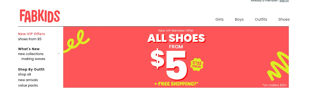
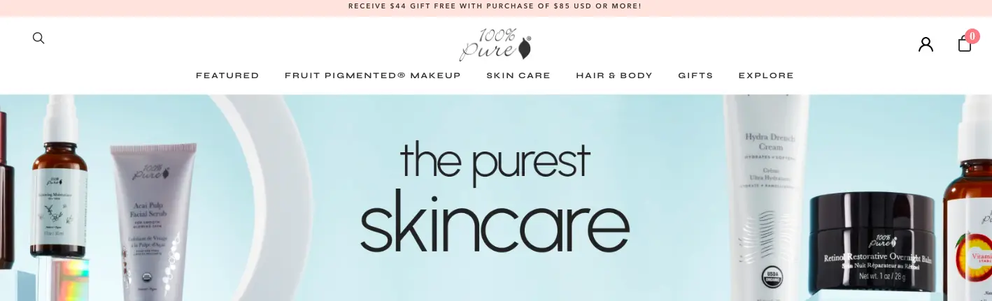
42. (A) An above-the-fold banner shows a sale/discount / (B) Banner talks about the category
Fabkids features the first idea in their AB split testing for eCommerce:
100% Pure calls attention to the category you’re visiting. If you want to announce a special discount on a specific category, the banner space is ideal for drawing attention.
43. (A) Primary CTA featured beneath the product image / (B) Product image with NO CTA
Mejuri does not use add to cart buttons on their category page—this can often compel shoppers to go into individual product pages to know more.
44. (A) Image with wishlisting icon / (B) Image with no wishlisting icon
45. (A) Feature wishlisting icon on the image / (B) Icon next to the product details
eCommerce AB testing on such subtle nuances can be helpful for a brand to get a deeper sense of what’s driving better UX—in this case, whichever variant receives more wishlisting needs to be incorporated to fight cart abandonment.
46. (A) Use only price for sorting / (B) Also use additional features (like recommended, newest/oldest, customer rating etc.)
47. (A) Feature 5-starred suggestions in the top row / (B) Feature 5-starred suggestions with discount
48. (A) Use average star ratings as a number / (B) Mention no. of reviews & make it clickable
In their AB split for eCommerce, Sephora features the average rating through the colored stars, plus the number of reviews made.
49. (A) Make rating & no. of reviews constantly viewable / (B) Viewable only on hover
The latter can potentially pique the shopper’s interest—and hovering to see the review can become one step in the overall category page engagement. (Beardbrand does it as one of their eCommerce AB testing ideas.)
50. (A) Offer a “quick view” option / (B) Use a “quick add” option
51. (A) Sale/Special Price label & reduced price / (B) Sale/Special Price label & price anchoring
52. (A) Use a “Selling Fast” label / (B) Use an “X pieces left only!” label
When you’re AB split testing for eCommerce, pay attention to how options with specified quantities and timeframes perform—typically, stating it creates more urgency!
53. (A) Feature new price marked in bold color / (B) Old price grayed out & struck through
Nordstrom features both new and old prices for shopper satisfaction in their a/b testing eCommerce strategy—the new prices show up in a strong, bold color.

54. (A) Show old price grayed out & new price in different color / (B) Also show discount savings
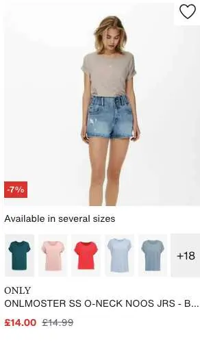
55. (A) Describe size range in the image description / (B) Use “available in various sizes” on hover
Zalando uses the second idea in their category page a/b test ideas—and it’s helpful for shoppers scrolling through by leading them into the respective product pages.
56. (A) Use the “Sold Out” label / (B) Use “Notify Me” as a label
57. (A) ColorS can be viewed with < > buttons / (B) colors displayed with “+X colors available”
58. (A) All color buttons displayed irrespective of availability / (B) Unavailable colors are struck off
59. (A) Sticky email sign-up discount alert on the left panel / (B) “X from so-and-so place bought <name of the product” & image
Built Athletics uses the second idea in their eCommerce AB testing strategy—the social proof features a product shown on the page you’re at, inciting curiosity.
60. (A) Use a descriptive callout for the product on the image / (B) Image with no callout
Huel, for example, makes sure each of their products carries a label that’s unique—this becomes an easy way to absorb information for shoppers who are speeding through.
61. (A) One line descriptor beneath the product image & product name / (B) Only product name
While optimizing conversion rates through a/b testing and user experience, we’ve noticed that the use of descriptors can sometimes appeal to instant purchase decisions, especially that of impulse buyers.
62. (A) Recommendation section of lesser-priced accessories / (B) Section on new releases
63. (A) Show total number of page results at the top / (B) Number of page results split by sub-categories
Women’s Best features the number a shopper can expect in sub-category page results as well—this is one of those A/B test ideas that can ease navigation & reduce scrolling fatigue:
64. (A) Show “load more” at the bottom of the page / (B) Flank “load more” by how many results a shopper is seeing currently
65. (A) Let shoppers choose how many results to see per page / (B) Shoppers don’t have this choice
How much control you give to the shopper at the category page stage, can influence how deeply they explore your product pages—if it’s too many results, the overwhelm can make them easily drop off.
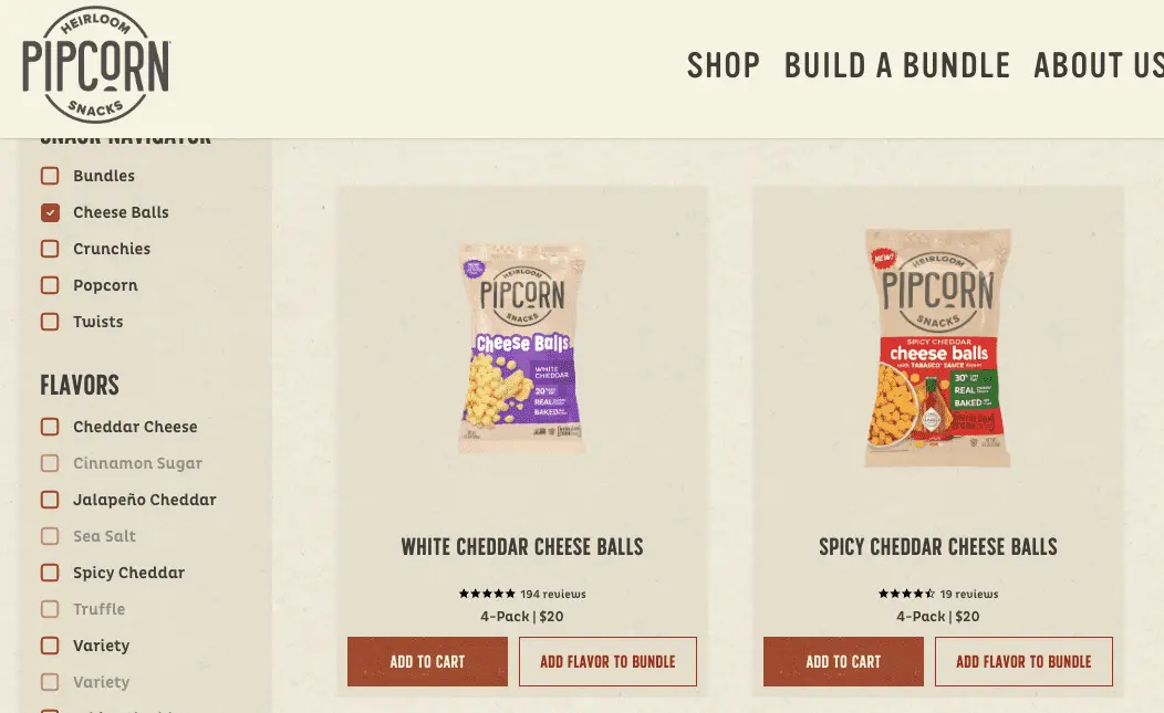
66. (A) “Build Your Bundle” appears in the primary navigation / (B): Every product carries an “Add to Bundle” CTA
Pipcorn ends up using both ideas in combination in their eCommerce testing strategy, which means you could too! (Here's some bundling examples for inspiration.)
67. (A) Use “buy more get $x off” image labels / (B) Use BOGO image labels
Notice how Fashion Nova hypes up BOGO labels in their a/b test for eCommerce personalization:
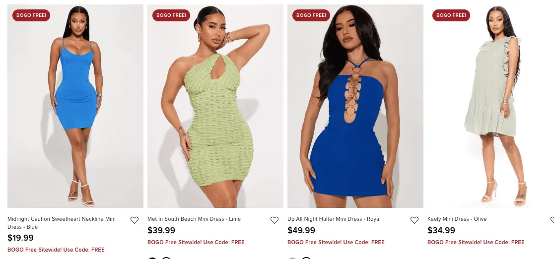
On the other hand, Chubbies urges to buy more for an additional discount in their A/B testing strategy.
68. (A) Use the notification bar to show highlights like free shipping / (B) Feature highlights in the section above the footer
From working with 500+ clients across the world, we’ve noticed that the first idea works better for more immediate offerings such as flash deals, a sitewide discount etc.
The second idea is more suited for values the brand stands by—for example, if the brand is sustainable and 100% natural, this information can come right above the footer in the form of icons.
69. (A) Feature “Bestsellers” in the top row / (B) Feature “Limited Edition” products
Some brands combine the two in their A/B testing solutions for eCommerce to enable greater product discovery.
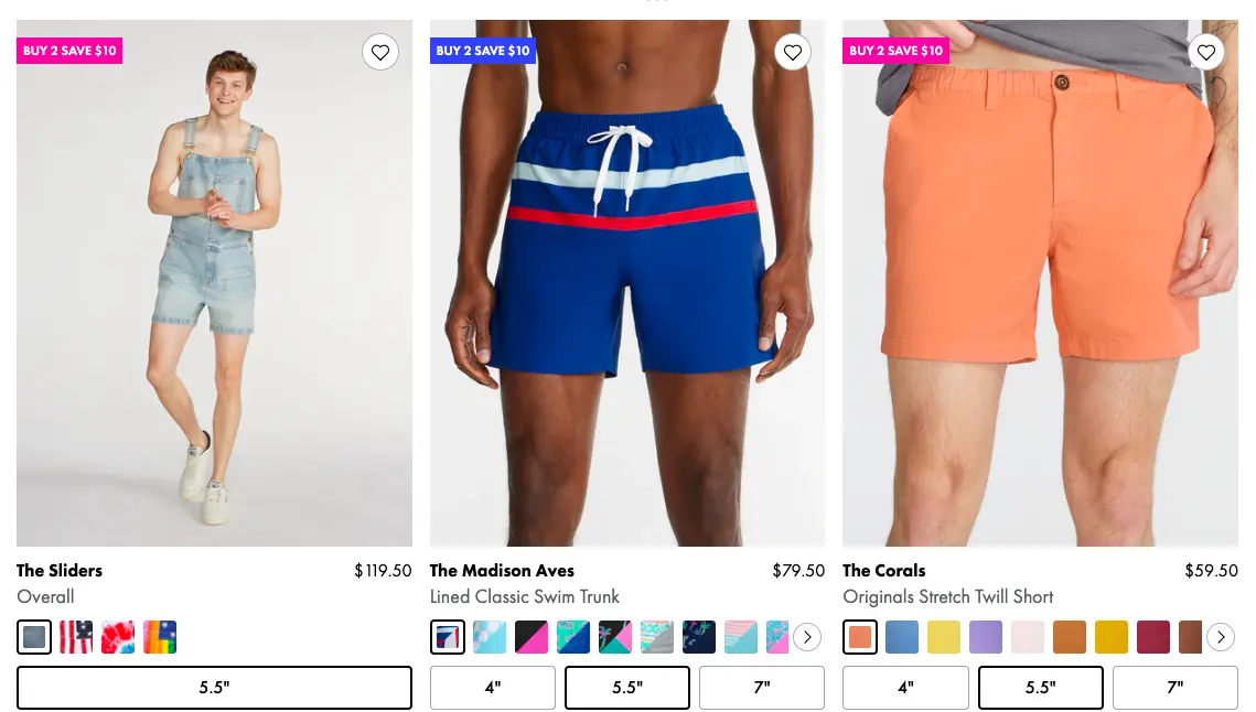
70. (A) Show “Quick Add” prompt before size selection / (B) Show size and “Quick Add” feature prompts together
In the following examples, notice how Fashion Nova features a quick add and when a shopper clicks on it, the size options open up.
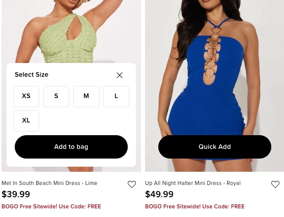
Gymshark, on the other hand, shows both as soon as a shopper hovers over the product image.

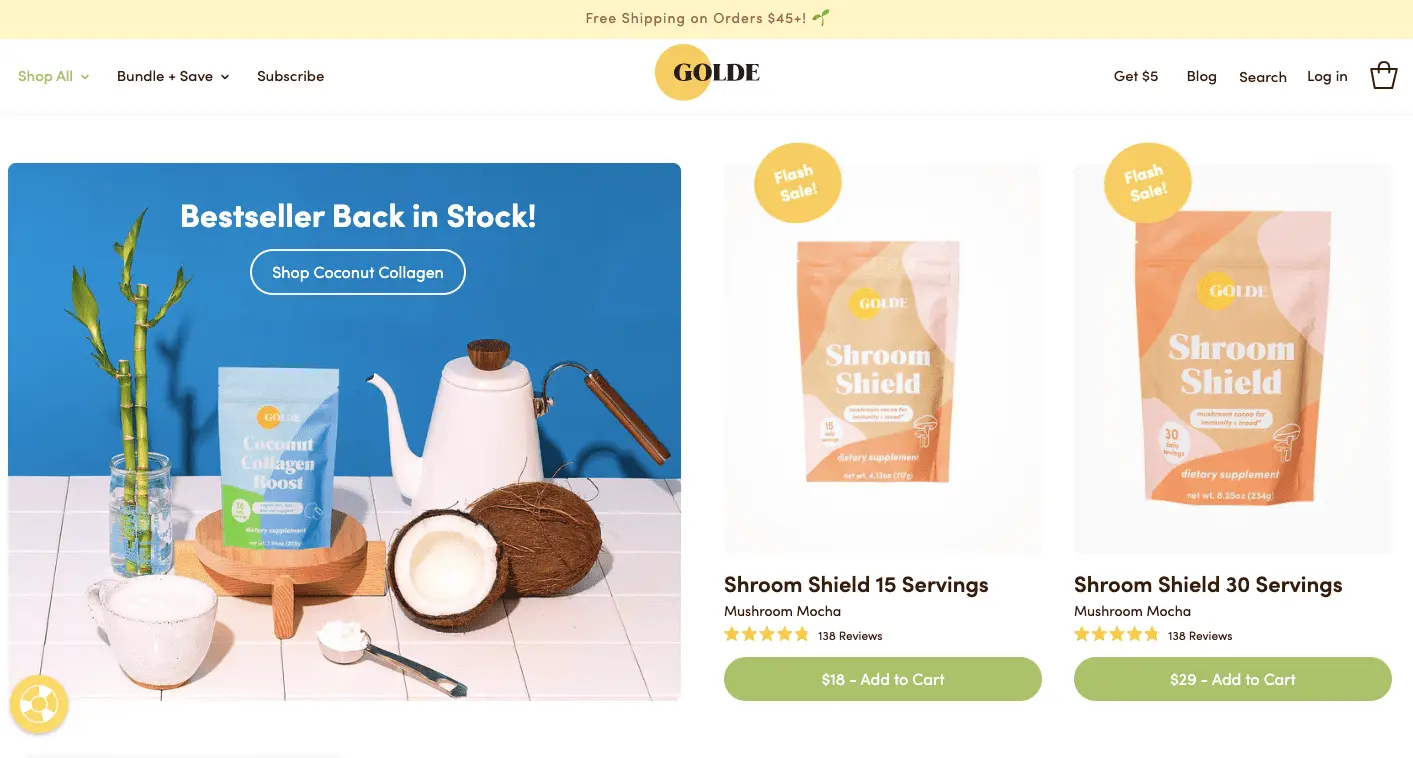
71. (A) “Flash Sale” products featured alongside regular discounts / (B) Only regular discounts are promoted
Golde is one brand that clearly labels some of their products as being under “flash sale”—this induces urgency and can inspire shoppers to explore those products further.
Key Takeaways for Category Page AB Testing eCommerce Ideas
✔ Filtering & sorting experiments will be most necessary for you to improve navigation on these pages
✔ Bestsellers & items on sale need more space in the first few scrolls
✔ Include “quick view” info button to influence shoppers faster
Ideas for Stage Three: Product Page
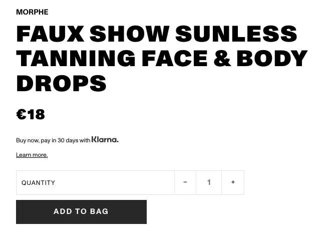
72. (A) Product name gets more attention / (B) Payment methods are more prominent
Here’s how boldly Morphe features its product names as part of their product page test ideas:
In contrast we noticed how Huda Beauty also highlights the payment terms.
73. (A) A short product description above the CTA / Variant B: Display only key features
Here’s how it looks in real time—The Ordinary lays down the key features in their eCommerce testing strategy:
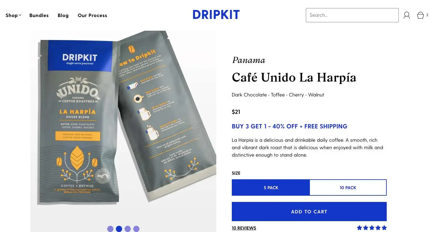
Dripkit describes the product in a short snippet in their product page a/b testing.
Quick tip: Which format you use will depend heavily on the nature of your target audience—if your products help them solve problems (and not just add to life, like say, coffee does), then technical specifications can become crucial.
74. (A) Product description above the CTA / (B) Product description below the CTA
75. (A) ingredients listed in a block of text / (B) A link is provided to a separate page
FAE Beauty is a brand that goes in-depth in explaining its ingredients—hence they do so in a separate page for every product.
This is the best approach if you want to state your AB testing solutions for eCommerce to improve the brand transparency you project.
76. (A) Product description in a horizontal format right above the CTA / (B) Product description in an expandable-collapsible vertical format under the first fold
77. (A) Describe how & where the product is made / (B) Describe the results from a real customer research
The similarity between the two instances is that both create a sense of authority that shoppers derive confidence from—though the second instance works more like social proof, especially when a brand sources the results from real-time research.
Here’s an example from Golde's product page testing ideas:
78. (A) Image gallery in the first fold followed by CTA / (B) Keep the image gallery to the left
79. (A) Before-after buttons around the image gallery / (B) Images are laid out in thumbnail tiles right beneath the gallery
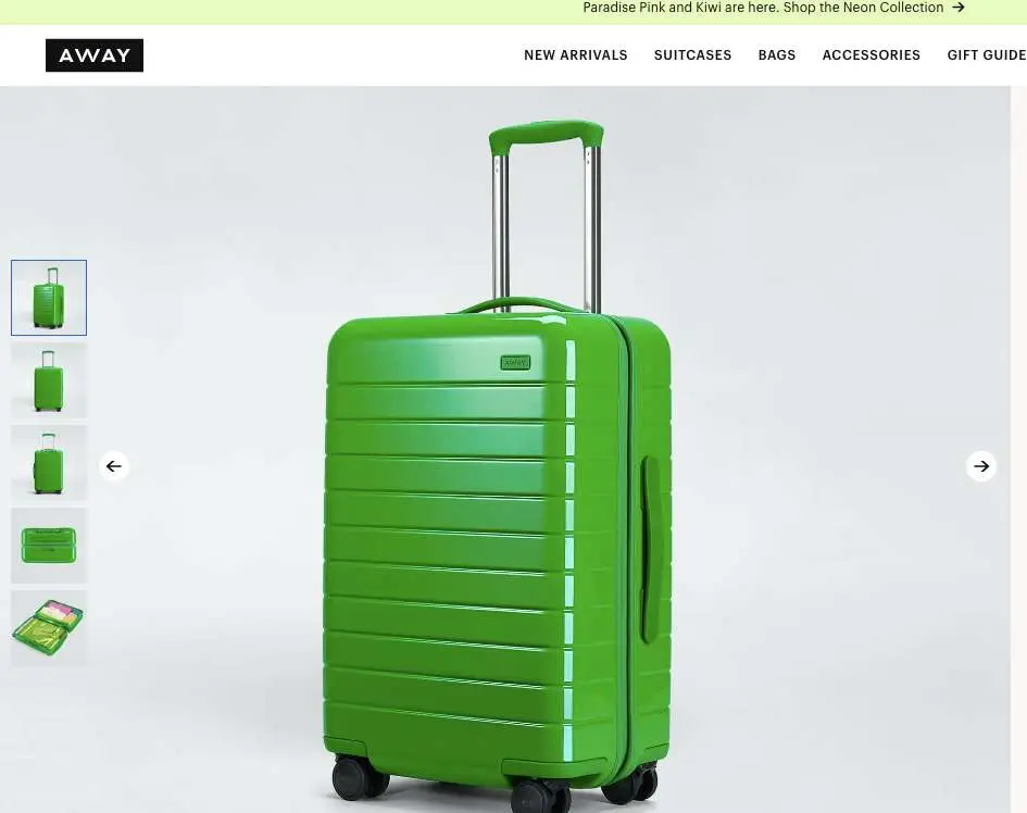
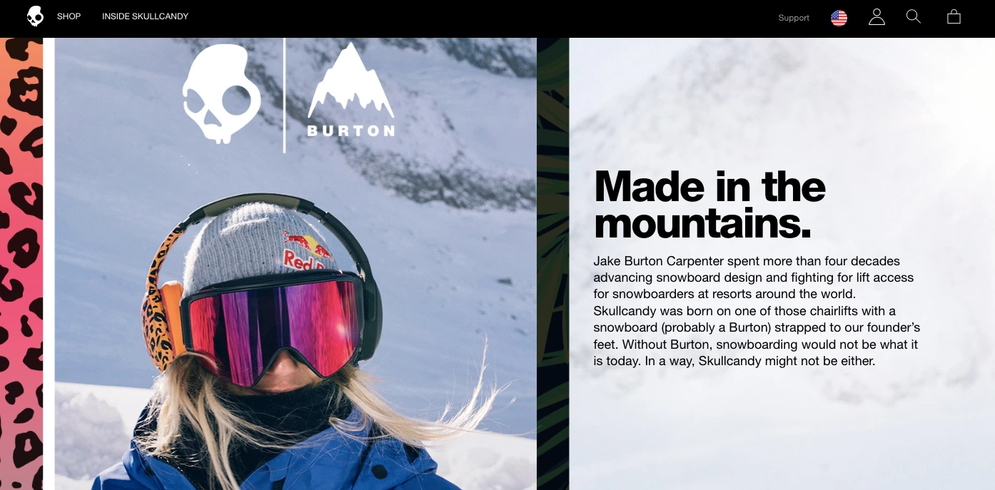
Skullcandy makes their image gallery come alive on the right side of the product page—the “next” button is the main feature in this A/B testing in eCommerce idea.
Away, on the other hand, takes the more usual approach of keeping the image gallery to the left—and maintains thumbnail tiles for a quick overall view of the product.
80. (A) A 360° degree gallery view / (B) One product image carries the most important labels (features, benefits, specifics)
From experience, we know that for products that are fairly simple, you can use the second approach—while for those that feature more parts or technical aspects, a 360° view can generate deeper trust.
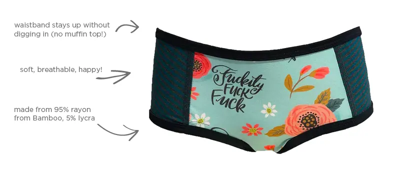
The Candi Factory, which creates breathable underwear, always labels their products in their eCommerce AB testing:
81. (A) The primary visual is a video / (B) The primary visual is an image
Primary visual = the image that’s on display when the shopper first lands up on your product page.
82. (A) Place a GIF in the photo gallery / (B) Place a video right beneath the first fold
83. (A) The image gallery carries a zoom option / (B) The images are distinctly large (compared to the description section)
Luxy Hair, for example, makes use of bold visuals to do away with the need for a zoom option in some of their A/B testing ideas.
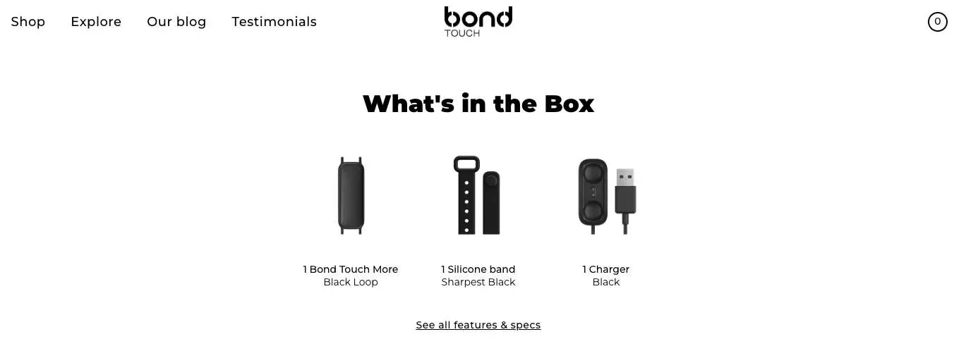
84. (A) Feature an unboxing video / (B) Use a section to show what’s in the package
For several reasons, including needing to reduce page loading speed and marketing spends, businesses look for alternatives to an unboxing video.
The reason we love Bond Touch is because they’ve figured a middle ground—they just use thumbnail images of the different parts within a package.
85. (A) Primary CTA first prompts to “select a size” & then changes to “add to cart” / (B) Primary static “add to cart” CTA
Doing what Crossrope does can mean more intuitive UX—because it might not occur to shoppers that they should select a size first.
So if they add to cart and then are told “please select a size”, it just adds to the overall friction.
86. (A) Features a secondary CTA of a popular payment method / (B) Features a secondary CTA with a wishlisting option
87. (A) Secondary CTA allows shoppers to ask a question / (B) Secondary CTA that enables wishlisting
Hyphen Sleep calls a shopper’s attention to reaching out for support through a secondary CTA in their A/B split testing for eCommerce.
Many shoppers who’ve found their way into the product page are intent on buying, and for a high investment product, it’s likely they would want to ask some questions before they even wishlist it.

88. (A) Secondary CTA features a special VIP price / (B) VIP membership benefits cited above the primary CTA (as a link)
Quick Tip: A secondary CTA featuring a special VIP price makes sense only when you don’t have a ton of other messages or labels vying for the shopper’s attention. For example, if you’re running a special price on the product, avoid using a secondary CTA like this because it can become overwhelming.
In the following example from Fabkids, it’s clear that the brand is promoting a special price for members, and the whole above-the-fold section reflects this.
89. (A) Feature color swatches over the primary CTA / (B) Feature a separate section of available colors below the fold
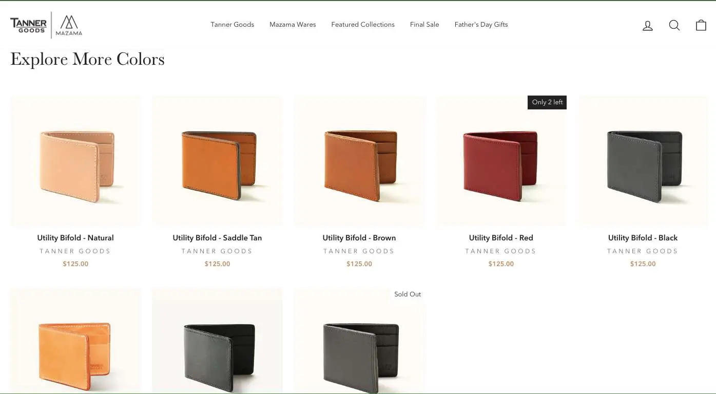
While featuring color swatches is the usual practice, some brands like Tanner Goods choose to highlight a color in the main product section and feature the rest in a section below—if you’re trying to convey quality and differentiation in your products, this could make for a more relevant eCommerce A/B testing idea:
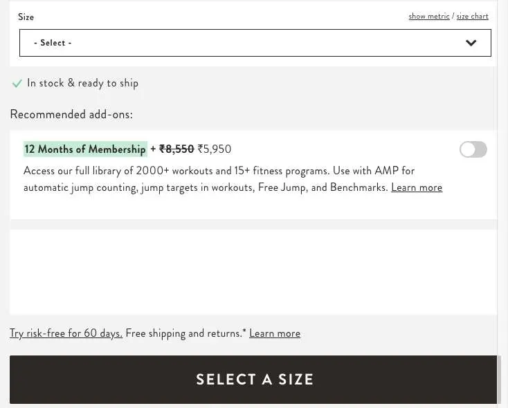
90. (A) Feature a size finder / (B) Feature a size chart
At the “desire” stage of the funnel, relevant engagement can inspire shoppers to actually make a purchase—a size finder or a size quiz can engage and personalize more than just a size chart.
91. (A) The cart icon shows an updated number when a product is added / (B) The CTA click takes shoppers to a separate cart page
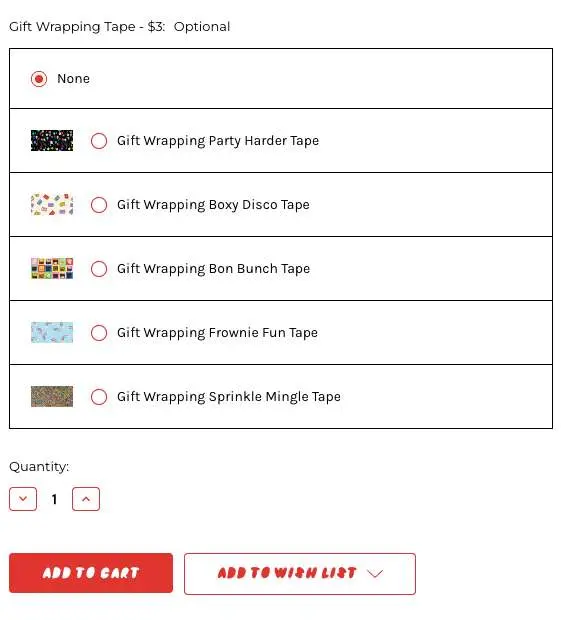
92. (A) Feature the gift wrap option as a checkbox / (B) Feature a list showing the gift wrap options available
Bonbonbon chooses to feature their gift wrap options as check boxes in their product page a/b testing:
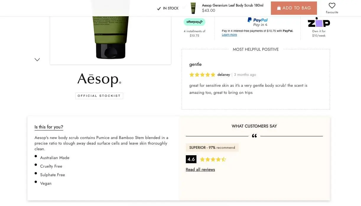
93. (A) Customer review callout section right below the first fold / (B) Feature the usual product description section
Adore Beauty calls out their “most helpful positive” review just below the first fold in their AB split testing for eCommerce—this can be helpful in creating greater confidence in the product.
94. (A) Highlight a customer review above the primary CTA / (B) Highlight a badge of quality above the primary CTA
Here’s how Overstock highlights a badge of quality above the primary CTA in this A/B testing eCommerce experiment:
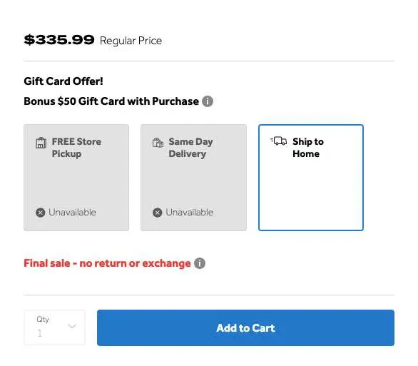
95. (A) Membership savings highlight above the primary CTA / (B) Gift card offer above the primary CTA
Bed Bath & Beyond uses the second idea on its product pages.
96. (A) Social media wall with the descriptor “Follow Us” / (B) Social wall descriptor reads “See It In Real Life”
If you’re a fairly established brand with other sub-brands people follow, then “follow us” may fetch better results in the A/B testing eCommerce results.
However if you’re a brand that’s still small and trying to win confidence, “see it in real life” can make more sense.
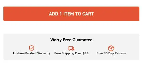
97. (A) Free shipping/X-day returns as link-based line items / (B) A content block that offers a “guarantee”
Solo Stove calls out their free shipping and returns information through a “worry free guarantee” label—this can instantly draw more attention.
FAE Beauty features free shipping & returns as a linked line item:
98. (A) Upsell a related accessory / (B) Offer a similar product recommendation
99. (A) Highlight the background info about the product / (B) Highlight the brand differentiators
Skullcandy creates context on how, where and why a product is made.
Lush, on the other hand, highlights their brand differentiators in their product page a/b testing.

100. (A) Upsell through a CTA button / (B) Make a related product recommendation
Notice how Tanner Goods ups the price through a CTA for those who choose to opt for a monogram—a clever strategy to incorporate in your A/B test ideas:

101. (A) Feature multiple variably priced recommendations / (B) Feature recommendations with the same price as the main product
102. (A) All recommendations being products on sale / (B) Feature just one recommendation on sale
Testing both will help you understand shopper behavior—and in turn inform whether you should test a third alternative with a half-and-half approach where, let's say, you put two recommended products under sale and two others under their original price.
103. (A) Feature “Write a Review” button / (B) Feature a “Review & Earn” button
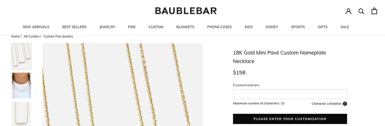
104. (A) Offer a customization field on the product page itself / (B) Feature a secondary customization CTA leading to a sub-page
Baublebar sticks with the first idea in their A/B testing in eCommerce.
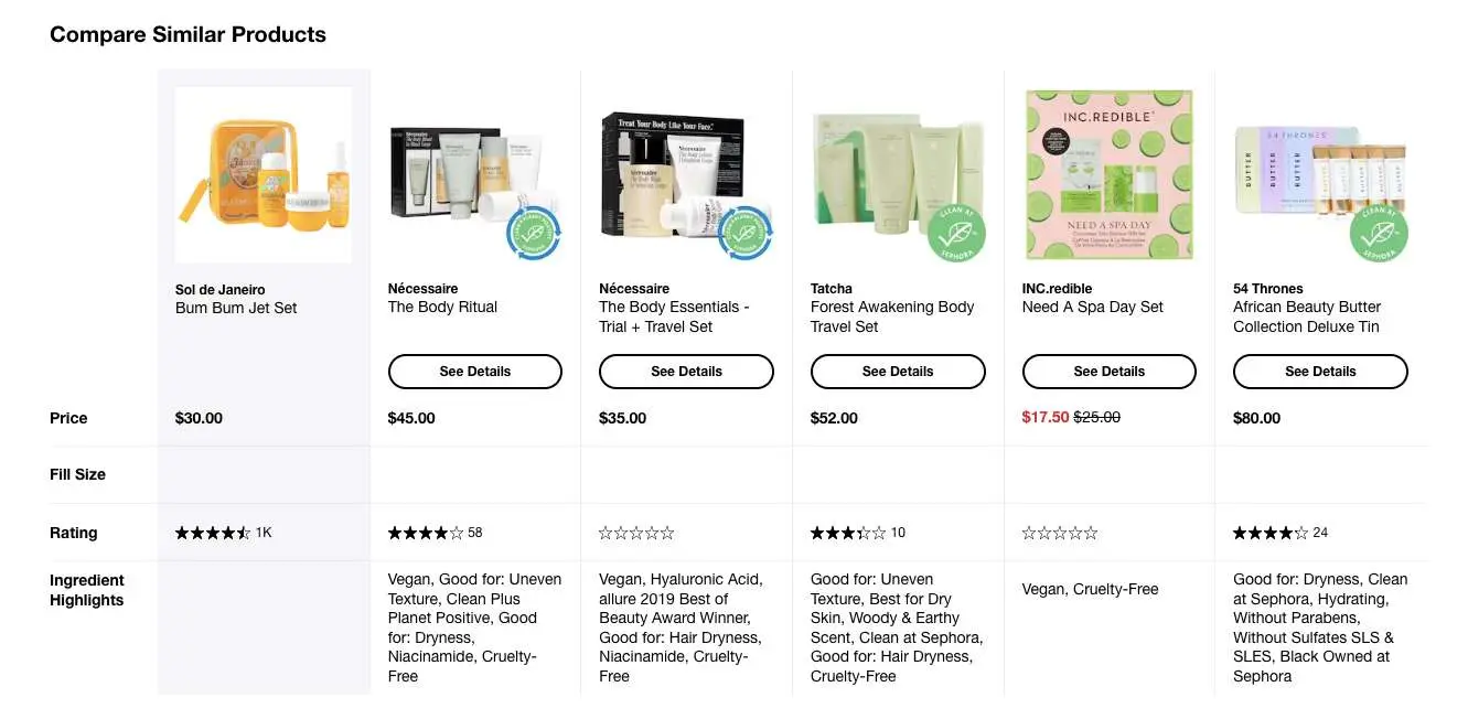
105. (A) Display a product comparison table featuring similar products & prices / (B) Feature a comparison table with a some discounted products
Notice how Sephora features one product in the comparison table with a significantly different price.
106. (A) Features a sticky feedback button / (B) Clickable link is displayed at the end of the page
107. Test between a short product page variant & a longer one
For either, you’ll have to determine which sections to keep and which ones can go.
Here are a few successful ways in which we’ve shortened product pages for customers:
- Offered a link to the product video on Youtube (vs. dedicating a section of the page to the video)
- Created a separate page for product ingredients (so that a “read more” button can take them there after they’ve read the basics on the page)
- Fashioned the product description section like an FAQ
Key Takeaways for Product Page A/B Testing in eCommerce
✔ Carry out most of your A/B testing ideas around the first fold
✔ Experiment with how & where you feature your microcopy
✔ Give a lot of importance on testing product description layouts
Ideas for Stage 4: Cart Page
108. (A) Feature a wishlisting option / (B) Don’t feature a wishlisting option
109. (A) A “free shipping threshold” message / (B) A “free shipping for loyalty members” message
Lush makes use of the first idea in their eCommerce testing strategy—and this is how it looks:
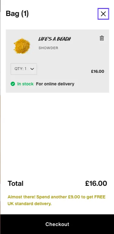
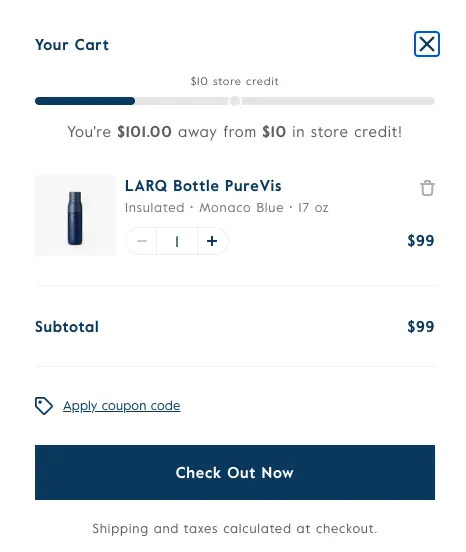
110. (A) Free shipping threshold progress bar / (B) Store credit threshold progress bar
Larq, for example, makes use of a store credit threshold progress bar as part of the eCommerce AB testing ideas:
111. (A) Feature a store credit threshold progress bar / (B) Feature a free gift threshold bar
112. (A) Feature a choice of free samples / (B) Feature an applicable discount code
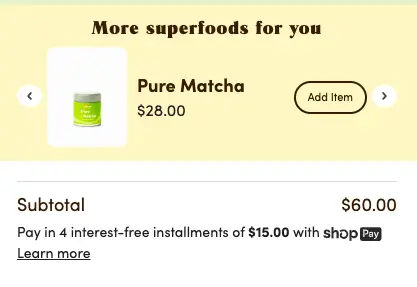
113. (A) Feature “under $x” product recommendations / (B) Feature complementary products
114. (A) Show one product recommendation at a time / (B) List the recommendations in a vertical/horizontal format
Golde ensures a shopper has access to multiple product recommendations—but can focus on each one thanks to previous-next arrow buttons.
115. (A) Call your recommendation section “Recommended For You” / (B) Call it “Things We Know You’ll Love”
While the first puts the brand in a place of authority, the second focuses on shopper preference—and there can be a marked difference of conversions between the two.
116. (A) Promo code is automatically applied / (B) Provide an open field with a list of “featured offers”
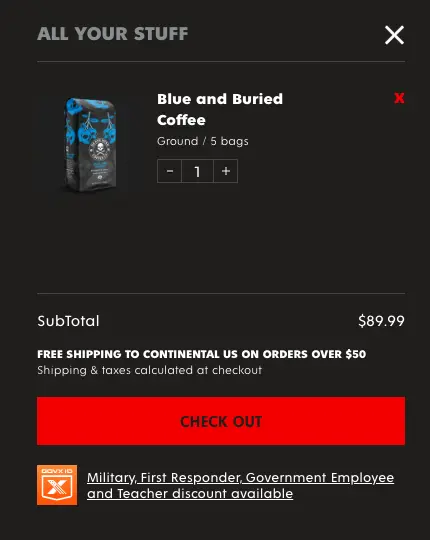
117. (A) Feature standard “apply discount code” field / (B) Feature a special applicable discount
Death Wish Coffee, for example, reserves a special discount for military first responders, government employees and teachers in this eCommerce A/B testing idea.
118. (A) Feature “free shipping & expedited shipping” callouts / (B) Feature “delivery & pickup” callouts
119. (A) Highlight “sale savings” amplifying the new price / (B) Feature the old & new prices w/o a callout
120. (A) Feature a button that says “checkout” / (B) Feature a button that says “secure checkout”
Huel goes with the second variation and this is how it looks—get a picture of how you’d feel if you were going towards checkout from this page?
121. (A) Feature a checkout button as primary CTA / (B) Feature “Continue Shopping” as a secondary button
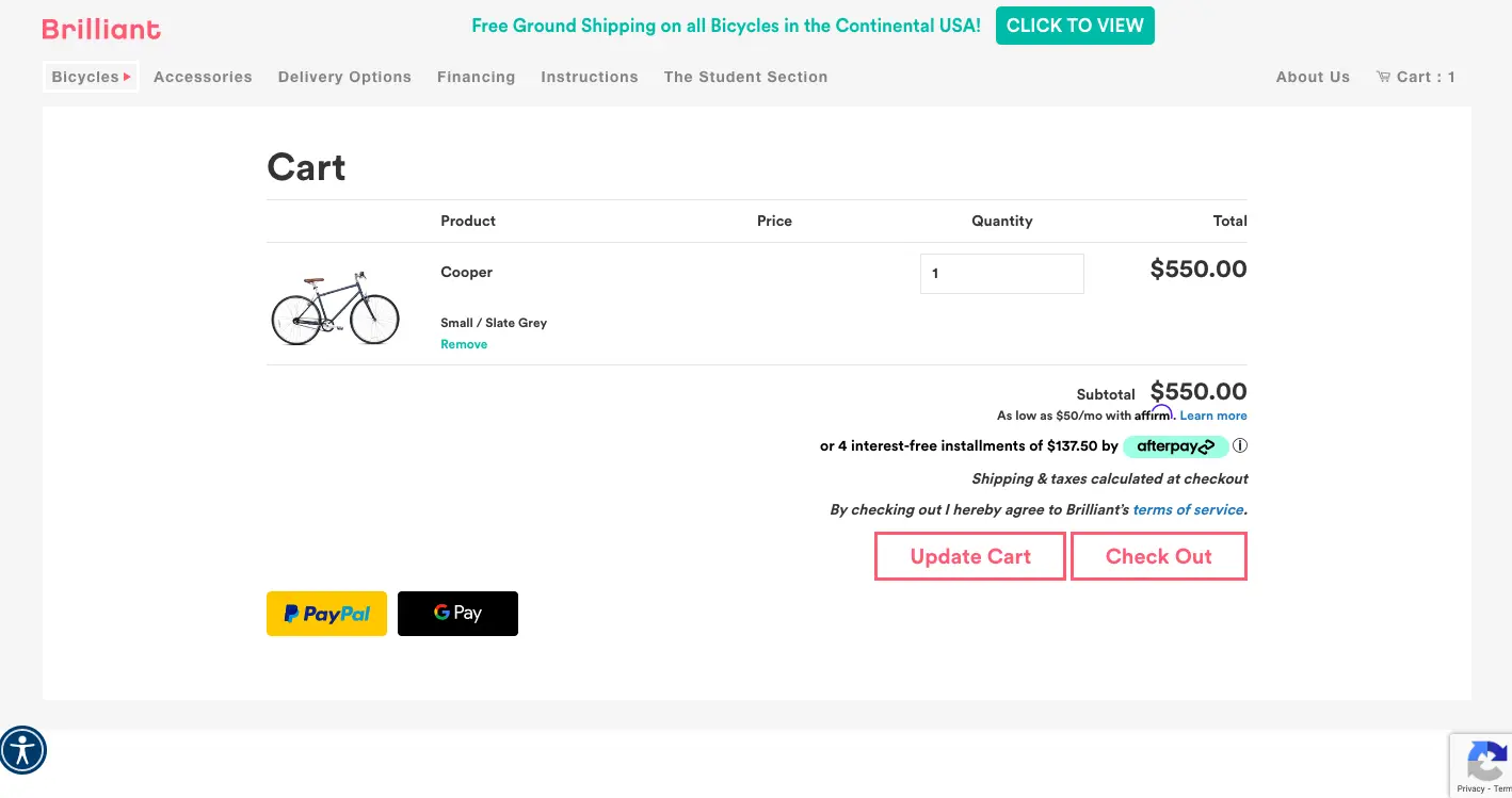
122. (A) Feature a secondary checkout button of a popular payment method / (B) Feature popular payment method logos
Brilliant, an eCommerce bicycle brand, features the regular checkout button but also displays two popular payment methods as express checkout.
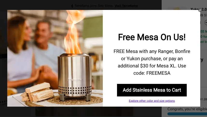
123. (A) Free product callout shows up as pop-up / (B) Free gift is highlighted within the cart page
Solo Stove features a separate pop-up when the shopper becomes eligible for a free gift—this eCommerce A/B testing idea can especially attract first-time visitors.
124. (A) An email signup discount callout / (B) A membership rewards callout
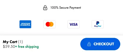
125. (A) Feature trusted payment methods with a “100% secure payment” callout / (B) Feature trusted payment methods w/o the callout
Chubbies sticks with the first variant in their a/b testing for eCommerce:
126. (A) Feature an FAQ link / (B) Feature a shopping assistance highlight (with support number)
127. (A) Allow shoppers to calculate shipping costs / (B) Mention shipping will be calculated during checkout
Spicy Lingerie enables shoppers to calculate shipping costs at the cart page stage as part of their eCommerce AB testing strategy.

Key Takeaways for Cart Page A/B Testing Ideas
✔ Prioritize on the design of threshold bar as this can make all the difference to conversions
✔ Use microcopy and logos to create customer trust w/o waiting till the checkout page
✔ Experiment between recommending products above the main order section and below it
Ideas for Stage 5: Checkout
128. (A) Checkout sections are shown in expandable sections / (B) A progress bar is highlighted at the top of the page
129. (A) Uses a thumbnail product image / (B) Uses only product name & cost
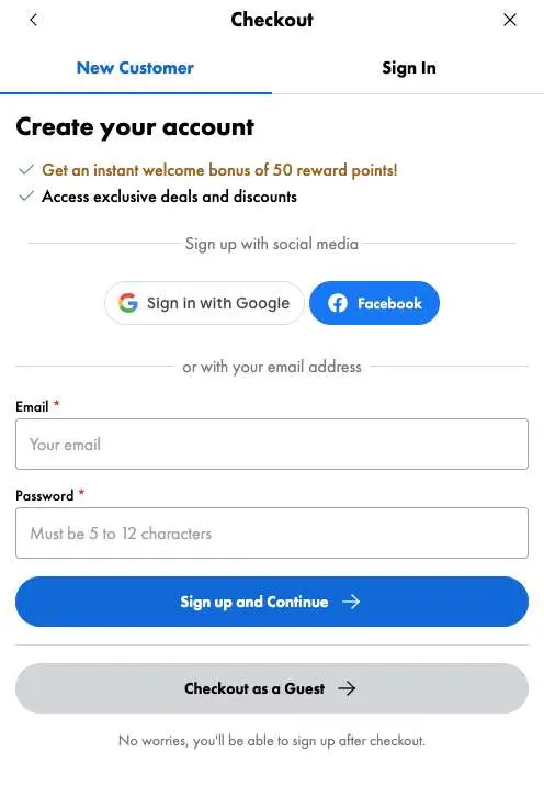
130. (A) Ask shoppers to create an account / (B) Offer X points as reward for creating the account
Chubbies understands account creation is hard work—hence they declare a reward in their eCommerce testing strategy.
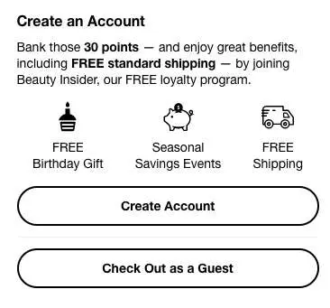
131. (A) Offer account creation points / (B) Additionally feature icons to display other benefits
Sephora chooses to highlight the primary benefits of creating an account—apart from calling out collected points in this AB split for eCommerce:
132. (A) Offer only guest checkout option / (B) Additionally also feature express checkout
133. (A) Feature guest checkout with “create an account” / (B) Feature social sign-in plus “create an account”
After all, 65% of shoppers agree that they will return to a site that automatically lets them in through social login—plus social login allows you to record essential customer information for future use—here’s a piece we wrote to help you understand this phenomenon better.
134. (A) Highlight the membership program / (B) Feature the in-house credit card program & immediate savings
135. (A) Feature multiple known payment methods / (B) Offer points/rewards on a relatively lesser known payment method
Here’s what Chubbies does:
136. (A) Feature payment method logos as trust badges / (B) Feature brand promises as links
Mejuri works with the second idea in their one-page checkout.
137. (A) Feature email alerts / (B) Feature SMS alerts
138. (A) Use a live chat feature / (B) Link to a feedback page
139. (A) Feature only live chat / (B) Mention the link to the customer service page
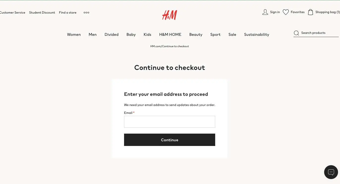
140. (A) Ask for email before you show the checkout page / (B) Show checkout page directly
H&M uses the first method in their eCommerce A/B testing—given that average cart abandonment stands at 69.99%, this can come in handy to not lose out on customers buying without account creation.
Key Takeaways for Checkout Page A/B Testing Ideas
✔ Limit the number of form fields whether you use a single page checkout or not
✔ Experiment with various express checkout options to find out what's converting and in what combination
✔ Focus on making your most important policies accessible at this stage (linked microcopy often helps)
Bonus: Ideas to test over Email
141. (A) Use the receiver’s name in the email subject line / (B) Use a warm phrase like “hello there” but no name
142. (A) Use just your business name / (B) Mention “<insert name> from <business name>”
143. (A) Declare the discount as the first word in the subject line / (B) Feature the discount in the second half of the subject line
144. (A) Use the power word “guarantee” in the subject line / (B) Use the power word “promise”
145. (A) Make the subject line about a freebie / (B) Make the subject line about a discount
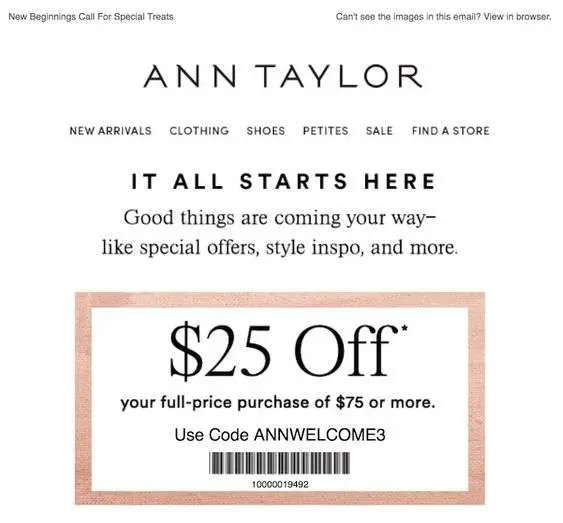
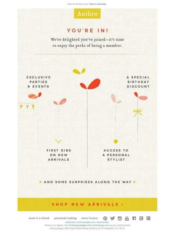
146. (A) Offer a discount as a welcome gift / (B) Feature multiple advantages of signing up
Ann Taylor clearly works with the first idea in their AB split testing for eCommerce.
Anthro, on the other hand, leverages the second one.
147. (A) Keep the focus of the shopper on immediate gains / (B) Draw the shopper’s attention to long-term benefits
For example, for A, you could talk about an immediate discount, BOGO offer or even an exclusive price.
For B: you could take the shopper’s attention to loyalty program discounts, what kind of gated content they’ll have access to etc.
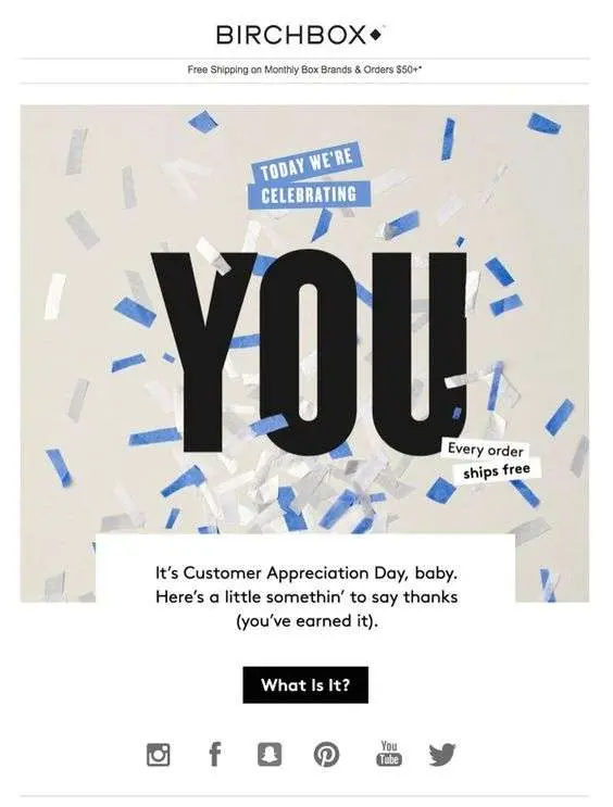
148. (A) Keep the shopper at the center of the communication / (B) Keep the offer at the center of the communication
In the following example, Birchbox makes the shopper the focus—this is the kind of email personalization every shopper secretly looks forward to (while all of us also know how the “50% off” discount mails look like.)
149. (A) Feature a blown up image of a product range/ (B) Feature thumbnail images of the products and product names
150. (A) Use a single CTA in the email body / (B) Use multiple CTAs in the email body
Quick Tip: Ideally, a single CTA boldly draws a shopper’s attention, however there are times multiple CTAs might work better:
- if you have multiple categories of products (even then mention no more than two)
- if you’re trying to draw the shopper’s attention to multiple resources on your site (like blogs, tools or videos—in this case, mention no more than three)
151. (A) Feature “shop now” as the primary email CTA / (B) Feature a CTA that says“get $x off today”
152. (A) Bring in urgency in the headline / (B) Feature urgency in the CTA
153. (A) Feature just a headline in the email body along with a relevant CTA / (B) Feature microcopy along with the headline
Check this out: Email A/B Testing: Elements to Test + Mistakes to Avoid
What are the most important elements to A/B test in eCommerce?
Across your storefront, here are the most crucial aspects to cover under your A/B testing ideas:
✔ Category hieracrchy in primary navigation
✔ Call-to-action buttons
✔ The hero header section
✔ Product description content & layout
✔ Trust symbols
How to analyze your A/B tests
1. Track the right metrics
When you're trying to make sense of your A/B tests, it's important that you track the right metrics—here are a few we've found to be super relevant:
- Bounce Rate (the % of visitors who hop off your storefront after viewing just one page)
- Scroll Depth (how far your shoppers scroll once they land on your site)
- Abandonment Rate (the % of tasks shoppers open but don't conclude—for example, adding to cart but not finishing the purchase)
- Conversion Rate (the % of shoppers who complete a desired action—it can further be divided into micro-conversions and macro conversions)
2. Divide your audience into segments
You can factor in various critical elements to do the segmentation—these factors include demographic, motivational, behavioral, attitudinal and preferential amongst others. Factoring in segments can help you test more deeply and analyze in a more granular way.
3. Monitor behavior analysis tools closely
There's a reason why behavior analysis tools such as heatmaps and visitor recordings help in breaking down results from A/B tests—for one, they can help you notice which pages on your site are getting more traction. They're also instrumental in indicating what's happening to visitor behavior across the conversion funnel.
What are the most important metrics for eCommerce A/B testing?
✔ Conversion Rate: This metric calculates the percentage of shoppers who complete a desired action (for example, adding to cart)
✔ Bounce Rate: This metric calculates the percentage of shoppers who land on a page but do not proceed to look at other pages.
✔ Clickthrough Rate: This calculates the percentage of shoppers who clicked on a said link versus the percentage that saw the link but didn't click it (in eCommerce, this metric helps businesses gauge the effectiveness of both transactional and non-transactional links.)
Before you go
A/B testing or not, 98% of visitors who visit an eCommerce site still drop off without buying anything.
Why: user experience issues that cause friction for visitors.
And this is the problem Convertcart solves.
We've helped 500+ eCommerce stores (in the US) improve user experience—and 2X their conversions.
How we can help you:
Our conversion experts can audit your site—identify UX issues, and suggest changes to improve conversions.
Subscribe for more articles like this!
500+ brands across 35 countries, including Everlast, USA Hockey, American Heart Association use ConvertCart to boost traffic-to-sales conversion rate—without having to break the bank.
.webp)
.png)


.svg)

.svg)

.svg)
.svg)
