Conversion Optimization
15 Product Page Designs That Blew Our Minds
March 3, 2026


Sadly, most product pages behave like a bored shop assistant, technically present, not especially helpful. And yet, the difference between a page that converts at 2% and one that converts at 6% often comes down to a handful of deliberate decisions: where the CTA sits, how uncertainty is resolved, and whether the copy speaks to someone or just at them.
We've spent time in 2026 studying the brands that are getting this right, and a few patterns keep emerging.
Here's what they're doing, and more importantly, what you can steal from them.
This post covers:
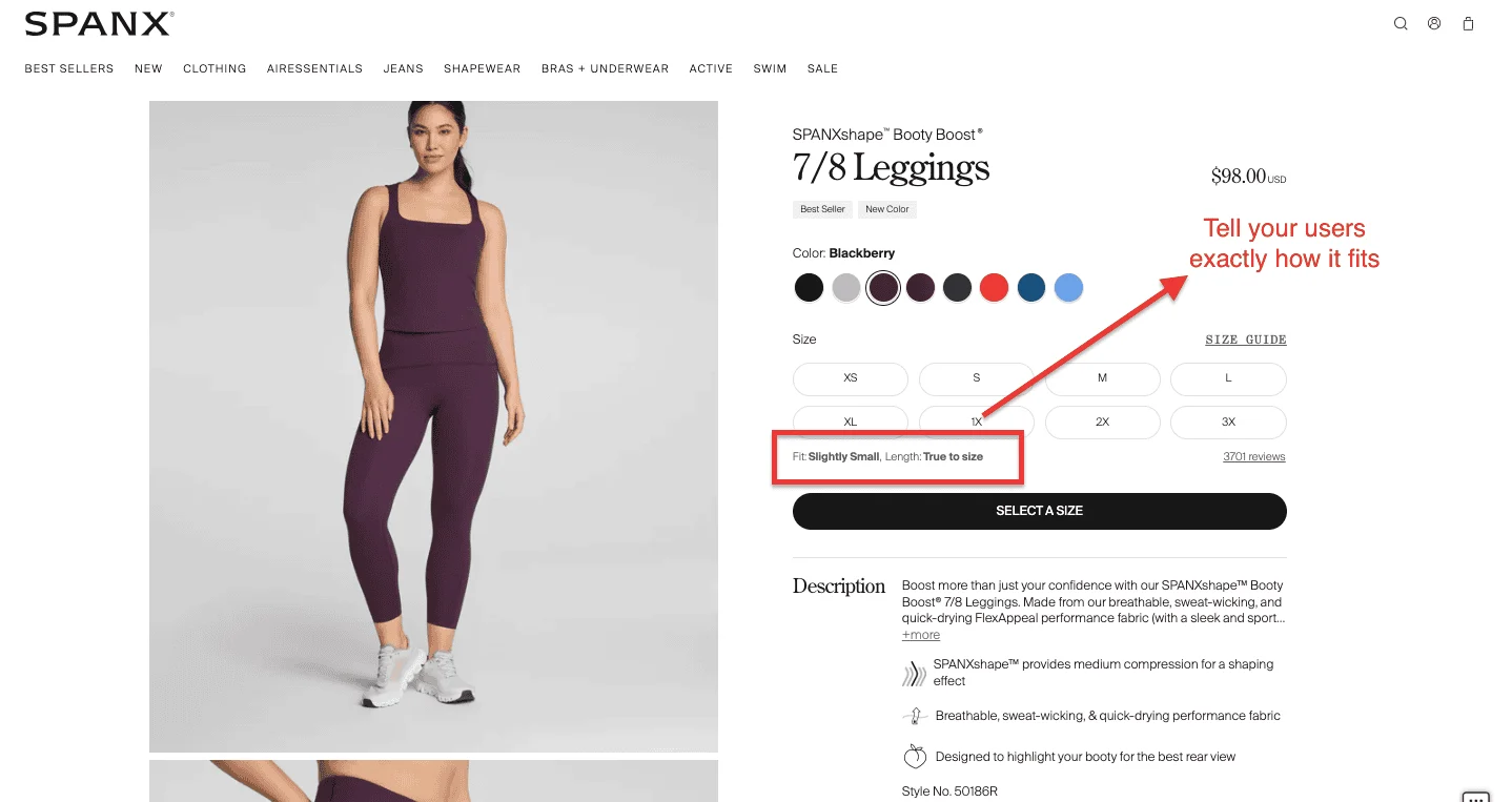
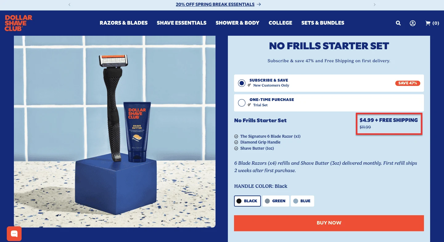
1. Spanx: How Answering "What Size Am I?" Before the Shopper Asks - Lifts AOV by 20%
2. BlendJet: The Three-Feature Rule That Converts Browsers Into Buyers in Under 15 Seconds
3. Lululemon: A Page Built for the 62% of US Shoppers Who Won't Buy Without Free Shipping
5. Away: The Personalization Play That Delivers 400% ROI, for 70% of US Retailers Who Commit to It
6. Manitobah: The High-Ticket Social Proof Strategy That Makes Shoppers 102% More Likely to Convert
9. Brooklinen: The One Line of Copy That Does More Conversion Work Than Any Image on the Page
10. Chubbies: Why Offering More Choice Converts 3x Better Than Offering Less
According to research, stores using product recommendation and guided selling tools on their product pages report an average AOV increase of 20%.
Buying shapewear online is, by any objective measure, a leap of faith. You can't try it on. You're not entirely sure of your size in this particular product category. And the stakes of getting it wrong feel oddly high.
Spanx's product page understands this better than most brands do.
The standout feature is context-sensitive sizing. A shopper looking at leggings sees a different size guide than a shopper looking at shorts, a small thing that eliminates a major source of anxiety.
What Spanx has built is essentially a digital fitting room, not flashy, but deeply reassuring.
That reassurance is what converts.
Key Takeaway: If your product has a fit or sizing dimension, your product page should answer that question before the shopper asks it.
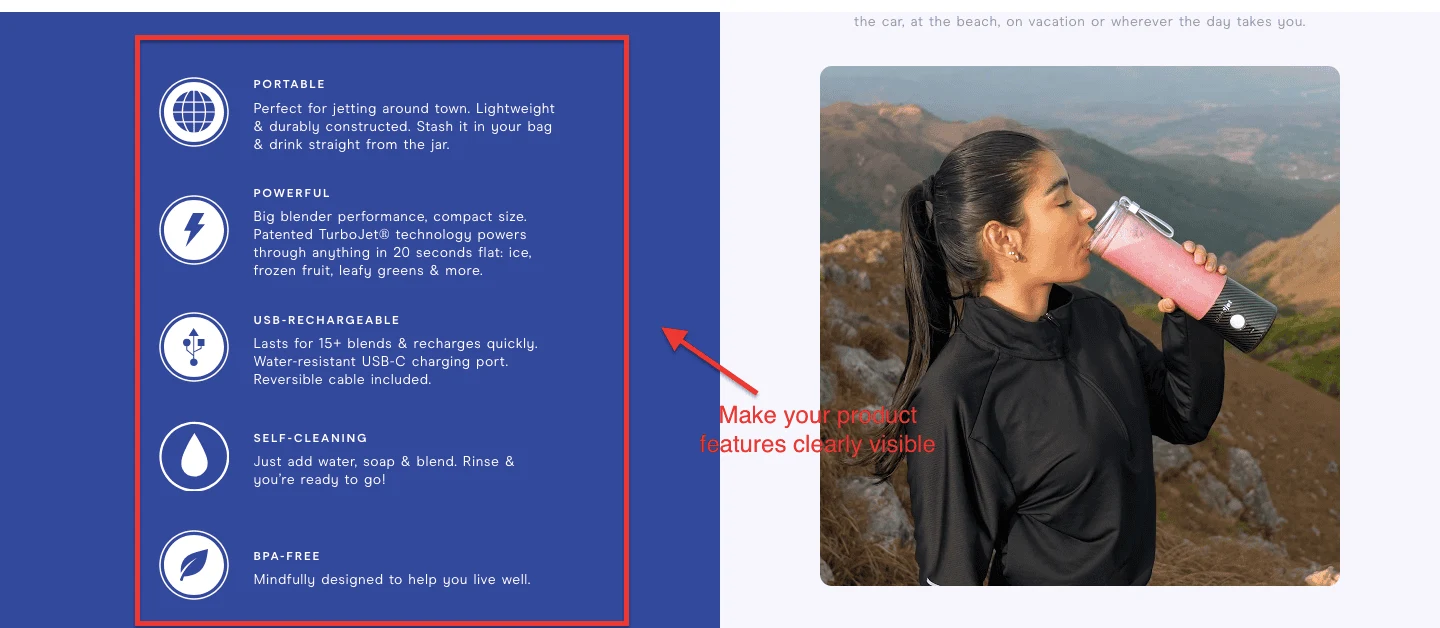
Baymard Institute's large-scale product page usability study found that feature highlights with icons vastly outperform text-only bullet descriptions because shoppers feel they’re casually scanning while actually absorbing information more deeply, leaving them more impressed with the product than those who read conventional text blocks.
BlendJet sells a portable blender to busy, health-conscious people who've probably seen 40 portable blenders on Instagram and aren't entirely sure which one won't break after three weeks.
BlendJet has put the product's five most important features front and center, in a format that's impossible to skim past.
The feature block is hard to miss with a bold blue background, an icon for each feature, and two lines of plain-English copy under every header. No spec sheets. No technical jargon. Just five things the buyer actually wants to know.
That's not a coincidence; that's deliberate copywriting.
Key Takeaway: Your feature block isn't just a description; it's a pre-emptive objection handler. Write each feature as the answer to a question your buyer is already worried about.
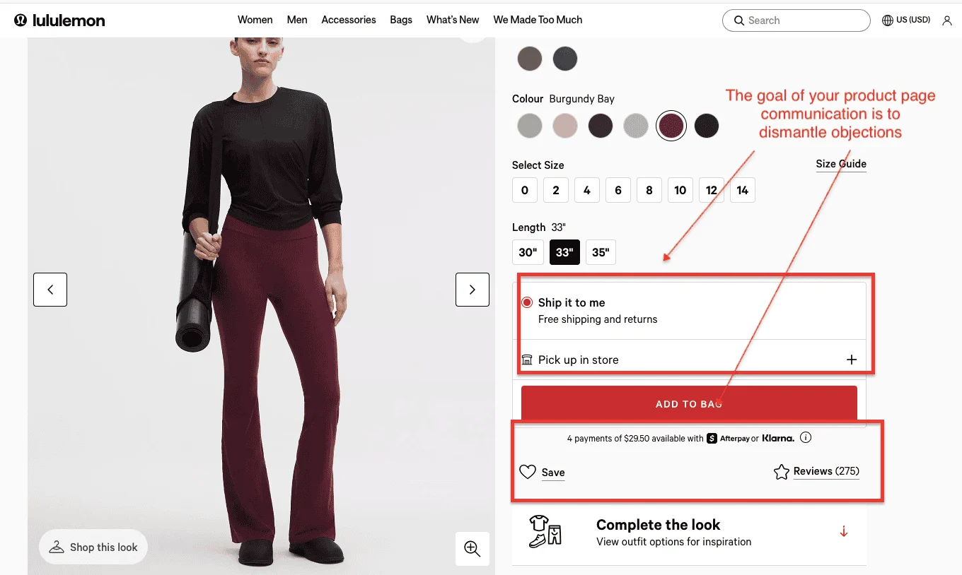
According to research, 62% of online shoppers won't make a purchase without free shipping, and 48% will abandon their cart specifically because of unexpected shipping costs at checkout.
Lululemon sells premium athletic gear at prices that require justification. Their product page's primary job isn't to excite; it's to dismantle objections one by one until nothing stands between the shopper and the Add to Bag button.
They lead with "Free Shipping + Free Returns"; not at checkout, not in small print, but prominently on the product page itself.
The fulfillment options are clearly spelled out: ship to your door or pick up in-store. Afterpay and Klarna are there for buyers who flinch at a $128 pair of leggings. Over 300 reviews provide social proof at scale. Each of these elements is doing the same job: reducing the perceived risk of a purchase.
What’s more? The page is clean, functional, and sharply focused on removing friction rather than adding noise.
Key Takeaway: Every element of a high-converting product page should answer one question: "What's stopping this person from buying right now?"
Looking to learn more about how to offer free shipping? Read more here: How To Offer Free Shipping — And Recover Costs Too
Baymard Institute's research confirms that eCommerce sites can achieve a 35.26% increase in conversion rate through better trust elements alone with the compound effect of reviews, transparency, guarantees and third-party validation creating exponential rather than linear improvements.
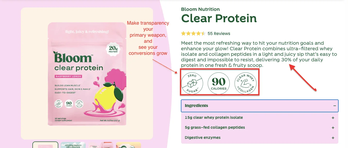
The supplement space has a trust problem. Every brand has before-and-after photos. Everyone has five-star reviews. Bloom Nutrition takes a different approach: they lead with data, and they make it readable.
Their product pages feature nutrition facts front and center, not hidden in a tab or buried in small print, but front and center for the shopper who cares about what they're actually consuming.
The design makes a health-conscious buyer feel they've done their due diligence — even if they've spent only 90 seconds on the page. That's the whole trick.
Key Takeaway: In health and wellness eCommerce, transparency isn't just ethical, it's a conversion lever. Hence, you must always show your work.
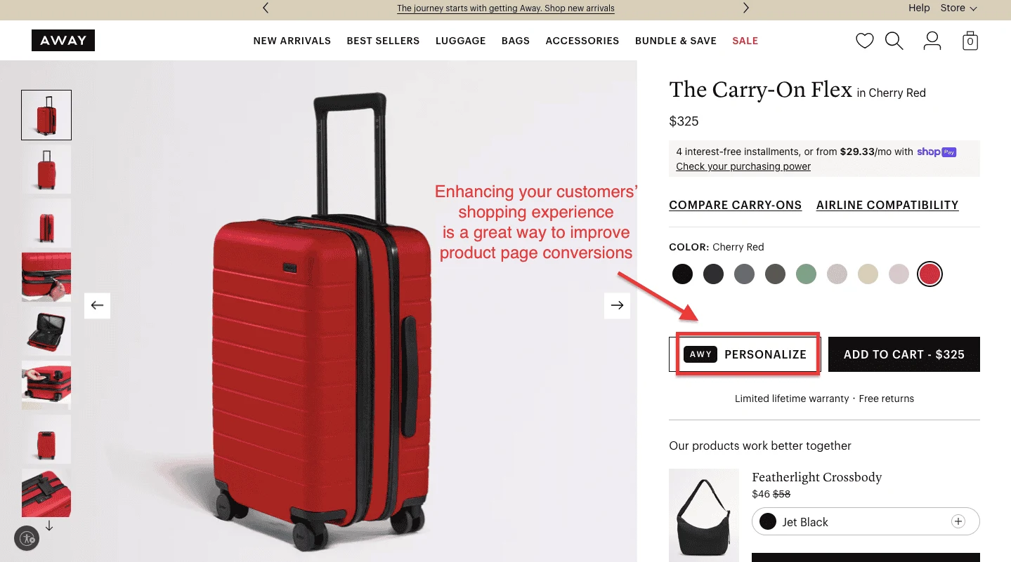
70% of retailers who invested in personalizing their customer experience saw an ROI of at least 400%.
Away sells luggage, but that undersells what their product pages are doing. They've built a browsing experience that makes personalization feel central to the purchase, because for a $275 suitcase, it should.
On the product page, shoppers can monogram their bag, choose from city-inspired colorways, and configure a set. Every one of these interactions deepens engagement and increases the likelihood of conversion.
Also, the photography is clean, aspirational, and minimal does the quiet work of making the product feel like it belongs in a better version of your life.
Key Takeaway: Personalization tools on the product page aren't just nice-to-haves; they're an engagement mechanism that keeps shoppers from bouncing.
According to research, visitors who interact with user-generated content convert at a 102.4% higher rate than those who don't.
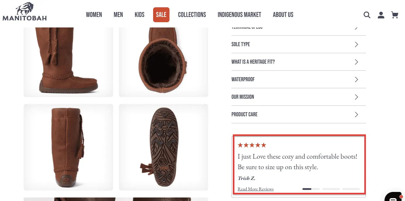
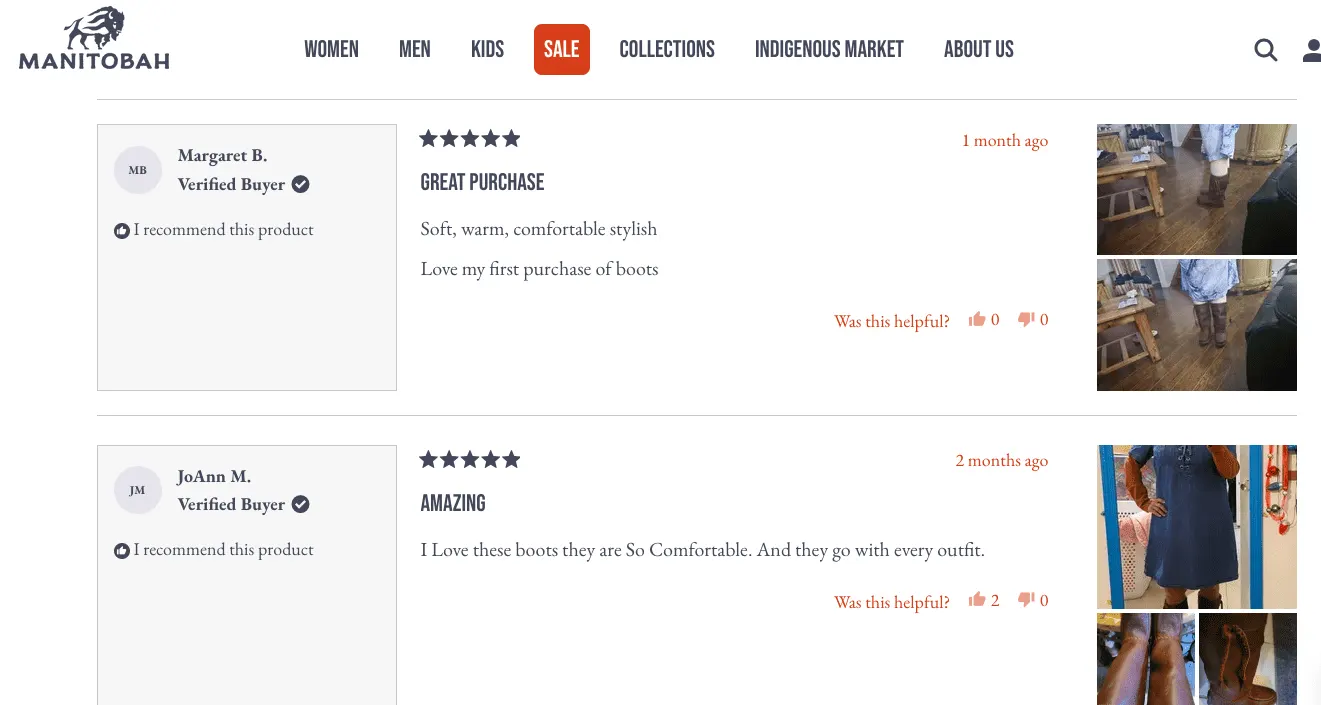
When a pair of boots costs $400, the buying decision doesn't happen in 30 seconds. Manitobah, an Indigenous-owned Canadian footwear brand, seems to understand this, and its product page is structured accordingly.
Below that, the real work happens: customer-submitted photos show the shoes in context (on snowy streets, at outdoor markets, in everyday winter life), making it easy for a prospective buyer to place themselves in the product.
The photography isn't slick. It's real. And for a product at this price point, real is more persuasive than polished.
Key Takeaway: For products above $150, your product page needs to reduce perceived risk, not just increase perceived desire.
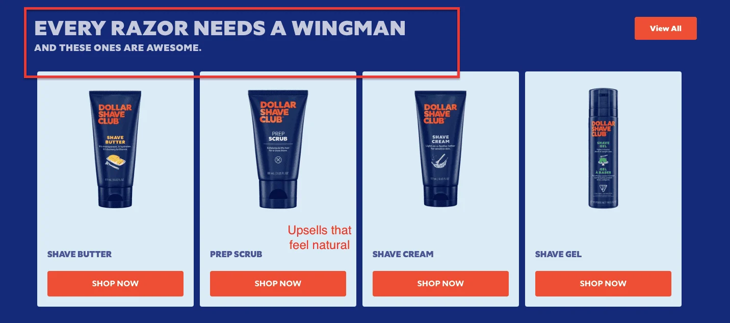
According to Accenture research, upselling increases revenue by 10-30% on average, and critically, it does so without requiring a single additional visitor, making it one of the few growth levers a US eCommerce founder can pull without increasing ad spend.
Dollar Shave Club has always understood that the razor is just the beginning.
Their product pages reflect this: complementary products, such as shave butter, post-shave cream, and moisturizer, are presented as logical next steps rather than pushy sales tactics. The cross-sell is built into the page structure itself, not bolted on as an afterthought.
What Dollar Shave Club does well is make AOV-boosting feel natural. The shopper doesn't feel upsold; they feel equipped.
Key Takeaway: The best cross-selling doesn't feel like selling. It feels like the page is helping you not forget something important.
Wish to get more upselling ideas for your eCommerce business? Read more here: How to Increase AOV on Shopify: 27 Upselling Ideas
Shopify's own data reveals that products featuring 3D and AR content see an average of 94% higher conversion rates than those without with one report noting a 90% lift in conversion rates among AR users compared to non-AR users.
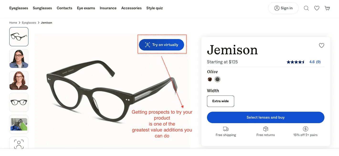
Buying glasses online has one enormous problem: you can't try them on. For a product worn on your face, visible in every photo and video call you'll ever appear in, that's not a small objection. It's the objection.
Warby Parker has built their entire product page strategy around dismantling it. They offer two distinct try-before-you-buy mechanisms, both prominently featured on every product page.
Warby Parker’s AR Virtual Try-On uses your iPhone's TrueDepth camera to place frames on your face with lifelike accuracy, accounting for your unique facial geometry and even showing how light filters through acetate.
Key Takeaway: The highest-converting product pages don't just describe the product; they also make you try it!
Peer-reviewed research published in Corporate Reputation Review confirms that sensory cues particularly tactile and visual language are among the most powerful drivers of brand attachment and purchase decisions available to marketers.
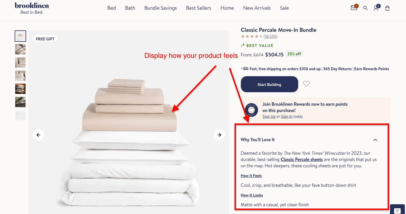
Bedding has a fundamental eCommerce problem: you can't touch it. A shopper staring at a product page for sheets has no way of knowing whether they're about to spend $500 on something that feels like a cloud or a hotel ironing board cover.
Brooklinen's product page solves this problem with a deceptively simple piece of copy that most brands never think to write.
Under the "Why You'll Love It" section, they don't just list specs or thread counts.
They answer two questions in plain English: How It Feels: "Cool, crisp, and breathable, like your fave button-down shirt", and How It Looks: "Matte with a casual, yet clean finish." That's it.
Two sentences that do more conversion work than a paragraph of material specifications ever could, because they translate a physical experience into something a shopper can actually imagine.
The New York Times Wirecutter endorsement sits directly above it, lending credibility before the sensory description lands.
Key Takeaway: For any product a shopper can't touch before buying, your product page copy needs to do the sensory work for it. Tell them exactly how it feels in plain, specific language, not marketing speak.
Conventional CRO wisdom says fewer choices mean higher conversions but research shows the real enemy isn't too many options, it's poorly presented options: when choices are clearly labeled and easy to navigate, the sweet spot of two to four well-organized variants consistently outperforms a single-option product page by a factor of three.
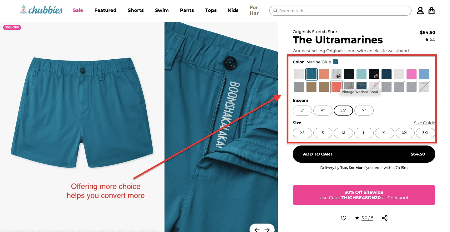
There's a conventional wisdom in eCommerce that too many choices kill conversions. Chubbies have apparently decided to ignore it entirely, and their product pages are better for it.
Take "The Ultramarines." On a single product page, a shopper can choose from over 20 colorways (each with its own name — not just "blue" but "Marine Blue," "Vintage Washed Coral"), four inseam lengths (2", 4", 5.5", 7"), and seven sizes from XS to 3XL.
That's a significant number of decisions. And yet the page doesn't feel overwhelming, because the variant selection is built for browsing.
Color swatches are large enough to actually distinguish, inseam options are displayed as clear pill selectors, and the currently selected combination is labeled in plain text above the swatches. The shopper always knows exactly where they are.
Key Takeaway: More variants don't hurt conversions if the selector UX is clean. Give shoppers real choice, label everything clearly, and let them find the version that feels made for them.
Emplifi's Q3 2025 Social Media Benchmarks report, based on tens of thousands of global brands, found that social posts featuring UGC drove 10.38x higher conversion rates compared to non-UGC posts, nearly double the 5.29x lift recorded just one quarter earlier.
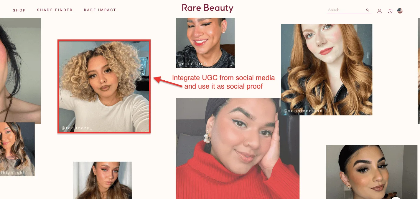
Most beauty brands treat UGC as a nice-to-have, a reviews block at the bottom of the page that shoppers scroll past on the way to checkout.
Rare Beauty treats it as the main event.
Scroll down any Rare Beauty product page, and you hit a full-width mosaic of real customer photos, pulled straight from social media and credited by Instagram handles: @raqueezy_, @mua.ftrob, @sophieemand, @fhighlight, and dozens more.
These aren't carefully selected brand ambassadors shot in a studio. They're real people, in their bedrooms and bathrooms, wearing the product in their actual lives. Different skin tones, hair textures, face shapes, and lighting conditions.
The cumulative effect is that virtually every shopper who lands on this page can find someone who looks like them and see exactly how the product performs on that person's skin.
Key Takeaway: Your existing customers are already posting about your product. Put that content on your product page, credit them by name, and let real people sell to real people.
US online returns hit $890 billion in 2024, and 71% of consumers say they returned a product specifically because the actual item didn't match what the images showed.
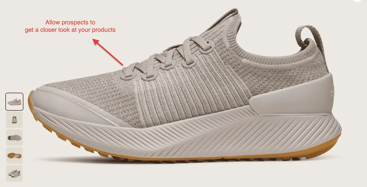
There's a moment in every online shoe purchase where the shopper squints at a product image and thinks: But what does it actually look like up close?
Allbirds answers this by making the product image so large, sharp, and zoomable that a shopper can practically count the individual knit loops on the upper.
The hero image on an Allbirds product page is doing serious work. At full size, you can see the texture of the merino wool knit in granular detail, the way the fibers run vertically across the upper, and how the lace eyelets are integrated cleanly into the knit without reinforcement panels.
This isn't accidental. For a brand selling shoes at $130+ on the strength of their materials and craftsmanship, the product image is the proof. It has to hold up to scrutiny, and it does.
The thumbnail strip does the rest. Five angles cover every dimension a shopper might want to inspect before buying: side profile, outsole, three-quarter front, insole, and rear. Each angle answers a specific question.
Key Takeaway: If your product's quality is part of what you're charging for, your images need to back it up. A shopper who can see the craftsmanship up close has one less reason not to buy.
87% of customers say that product content is the single most important factor when deciding to purchase online, and 87% of consumers are unlikely to make a repeat purchase if that content turns out to be inaccurate.
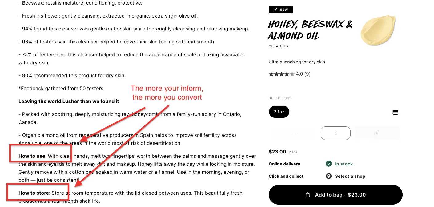
There's a temptation in beauty eCommerce to keep product pages short and frictionless, get the shopper to the Add to Bag button as fast as possible. Lush bets on the opposite approach, and it works because its customers actually want to know what they're putting on their faces.
Take the Honey, Beeswax & Almond Oil cleanser page. By the time a shopper has scrolled through it, they know quite a bit about the origins of the product’s ingredients.
That's not an incidental detail. For a Lush customer who chose this brand specifically because they care about what goes on their skin and where it comes from, that level of specificity is exactly what closes the sale.
And the "How to Use" and "How to Store" sections at the bottom remove the last remaining sources of post-purchase anxiety: you know exactly what to do with it and how long it will last.
Key Takeaway: Information-dense product pages don't slow conversions; they accelerate them for customers who've already decided they care about what they buy. Write for that person.
Luxury and high-ticket items like mattresses convert at just 1.41% on average, with nearly 79% of carts abandoned mostly because shoppers want to think twice before committing to a bulky or expensive item.
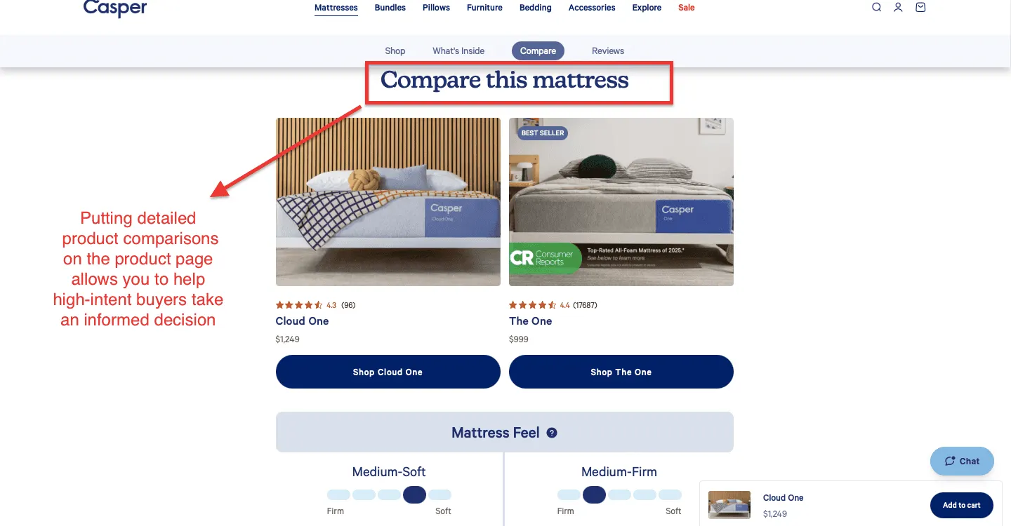
Buying a mattress online is, rationally speaking, a slightly insane thing to do. You're spending four figures on something you'll spend a third of your life on, based entirely on what a product page tells you.
Casper's response to this isn't to hide the complexity, it's to address it head-on, right there on the product page, with a "Compare this mattress" section that does something most brands are too nervous to do: it shows you the competition within the brand's own lineup and lets you decide.
The comparison is disarmingly honest. That’s why this product page works as a trusted advisor rather than a salesperson. And that’s exactly why it’s likely to convert more prospects into customers.
Key Takeaway: High-ticket shoppers will compare before they buy. Build that comparison into your product page, and they'll do it on your turf, not your competitor's.
Studies show that product pages that read like they were written by a human, not a spreadsheet, consistently outperform generic copy across every eCommerce category.
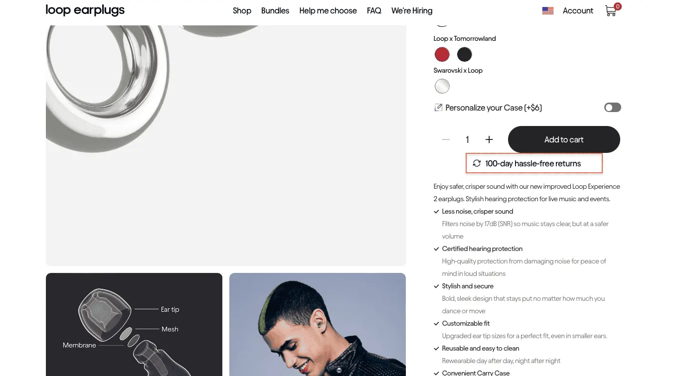
There's a version of the Loop Experience 2 product page that could have been a disaster. Earplugs are a small, commoditized product that most Americans associate with a foam cylinder from a drugstore checkout.
The first thing you notice is what isn't there. The page is clean to the point of being almost severe, and generous white space surrounds the product imagery, the color selector, and the copy. Nothing fights for attention.
The lifestyle imagery earns its place, too. Rather than studio shots of earplugs on a white surface, Loop shows real people wearing the Experience 2 at festivals, concerts, and events dancing, laughing, fully present in loud environments. The product is almost incidental in these images. Here’s what we loved about Loop’s product page:
Fifteen product pages. Fifteen different categories, price points, and customer types.
And yet the same truth keeps surfacing: the stores converting at 3, 4, 5% aren't doing something fundamentally different from you, they're just making fewer assumptions about what their shoppers already know and trust.
A well-placed returns policy, an honest ingredient list, and a lifestyle photo that shows the right person in the right moment do not require a six-figure redesign. Most of it requires clarity about your customer and the willingness to act on it.
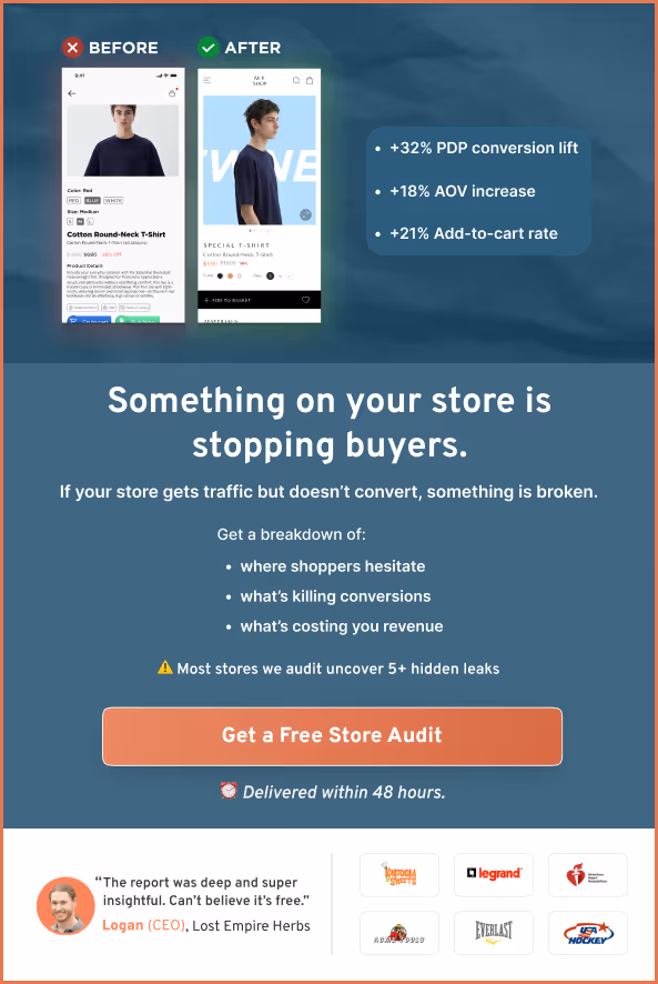
Not sure where your product pages are losing people? Get a free site audit from ConvertCart, and we'll show you exactly where the drop-offs are happening and what to do about them.
Getting Traffic But No Sales? 24 Reasons Why (+ How To Solve)
What’s Working in Online Promotion for US eCommerce Brands
20 Scientific Strategies to Increase Your eCommerce Conversion Rate
Subscribe for more articles like this!


Read by 5000+ ecommerce store owners
.svg)

.svg)

.svg)
.svg)
2026 Convertcart, All Rights Reserved
33/1, Castle Street, Ashok Nagar, Bengaluru, India