At ConvertCart, we've audited hundreds of luxury eCommerce stores. And we wanted to start this article with the most common problems that we come across:
The Most Common Problems We Came Across - While Auditing Luxury Product Pages
1. The Page Creates No Desire
A fine jewelry brand we audited had stunning photography, but the product description read like a spec sheet. There was no story, no provenance, no sense of why this piece existed.
Shoppers were landing with intent and leaving unconvinced. 48% of the luxury stores we audited lacked enough lifestyle imagery to attract prospective customers to buy.
2. The Craft Story is Missing
A luxury outerwear brand we worked with made their coats entirely by hand, using ethically sourced wool from a single farm in New Zealand. None of that was on the product page. What was there? "Premium wool blend. Dry clean only."
A shopper spending $900 needs to understand why it costs $900. Unfortunately, this page gave them nothing.
In fact, 54% of the luxury stores we’ve audited did not have a visible craft story. And that’s why some of these stores have a very low conversion rate.
3. Confidence Signals are Buried
A luxury accessories brand had a comprehensive size guide, transparent shipping costs, and a generous returns policy. All of it was in the footer. Shoppers spending $600 on a bag were hitting the Add to Cart button without ever finding the reassurance that would have helped them commit.
Checkout initiation was low, and nobody could explain why.
In our audits of luxury stores, we’ve found that 61% of the stores have missing fit guidance, and it becomes a reason for a low confidence level among buyers. Another 43% of the stores we audited did not have transparent shipping.
4. There's no Sense of Ownership
A luxury homeware brand we audited showed every product on a white background, isolated, context-free. No lifestyle imagery. No UGC. No sense of where this piece would live or who it was for. Shoppers couldn't picture owning it, so they didn't.
5. The Experience Isn't Effortless
A high-end fashion brand had a desktop product page that felt genuinely luxurious. On mobile, the primary CTA was obscured by a cookie banner, product images didn't zoom, and the size selector required three taps to open.
Over 65% of their traffic was on mobile. The experience was losing them all.
After seeing these patterns repeat across hundreds of audits, we started asking a different question. Not "what's broken?" but "what are the pages that do convert getting right, consistently?"
The Five Signals Your Product Page Needs - To Justify Premium Pricing
So we went back through five years of audit data, conversion tests, and client results.
We looked at the luxury brands that were outperforming their category benchmarks and mapped every element that separated their product pages from the ones that weren't converting.
Five signals kept coming up. Every high-converting luxury product page was nailing all five. Every underperforming one was dropping at least one, usually the same ones.
That's how this framework was born.
In this post, we walk you through all five signals, with real brand examples of each one, and a scorecard at the end so you can audit your own pages right now.
Each signal directly addresses one of the five problems above, works through them in order, and you'll see exactly where your conversions are leaking and why.
Every luxury product page needs to answer five questions simultaneously, whether it knows it or not.
Signal
The Question Being Answered
Desire
Why do I want this?
Craft
Why does it cost this much?
Confidence
Will I regret buying it?
Status
What does owning this say about me?
Convenience
How easy is it to buy?
A page that nails all five converts. A page that botches even one of them, particularly Confidence or Craft, loses the sale quietly, with no abandoned cart notification and no obvious explanation in your analytics.
Let's go through each one.
Signal 1: Desire: Create Aspiration Before Information
Luxury shoppers buy desire first and specifications second. Always. This seems obvious, but the number of luxury product pages that lead with a bullet list of features, hand-stitched Italian leather, available in four colors, is startling.
The first fold of a luxury product page isn't a product listing. It's a feeling.
What the best brands do:
Gucci Builds Desire With Big, Bold, Immersive Imagery
Gucci lets the product occupy almost the entire first fold. The price is there, but it's secondary. Navigation is minimal. Nothing competes with the image for attention. The shopper's brain processes want before it processes anything else, and that sequencing matters enormously.
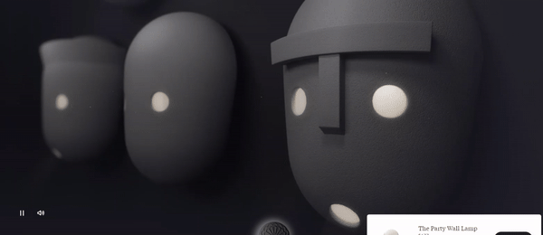
Moooi Turns Product Pages Into a Gallery-Like Experience
Moooi, the Dutch furniture brand, goes further. Their product pages feel less like shopping and more like walking into a beautifully lit gallery. They use immersive visual storytelling, layered imagery, atmospheric context shots, and video before a single specification appears.
By the time you reach the price, you've already imagined the chair in your living room.
Golden Goose Balances Minimalism With Craftsmanship Storytelling
Golden Goose threads a harder needle: functional and minimal at the same time, keeping attention on the product while communicating craftsmanship and personalization options before anything transactional enters the picture.
Industry experts also feel that showcasing too many products makes the shopping experience unwholesome.
“The biggest conversion killer on luxury e-commerce sites is too many options but not enough guidance. Shoppers who are already sold on buying your category go through hesitation when they can't effortlessly figure out which product is right for them. They don't quit because they lost interest. They leave because the site made them unconfident about their decision,” says John Beaver, Founder at a high-end furniture store.
Here are some ways to make your luxury product pages more desirable:
Step 1: Give the product image 90% of the first viewport. Price and navigation should be present but visually secondary; they're not what earns the desire.
Step 2: Use context shots alongside white-background product images. A watch on a wrist, a coat on a cobblestone street, a chair in an actual room, these images do conversion work that isolated product shots cannot.
Step 3: Hold back the specification table. Keep it accessible, but below the fold. The shopper who needs specs will find them. The shopper who needs to feel something will leave if specs are the first thing they see.
What’s the revenue impact: Getting “desire” right reduces bounce rate and increases time-on-page, the two metrics that most reliably predict whether a shopper will add to cart.
Signal 2: Craft: Justify the Price Without Defending It
This is where most luxury brands leave serious money on the table. Craft is not the same as features. Features are what a product does. Craft is why it costs what it costs and, more importantly, why that cost is right.
A $1,400 sneaker needs a different kind of explanation than a $140 one. It has to be an explanation that makes the price feel inevitable, even modest, once you understand what went into it.
Here’s what the best brands do:
Golden Goose Tells the Story Behind Every Material
Golden Goose doesn't list materials it tells the story of the materials. Where they're sourced, how the shoe is made, and what the co-creation process involves. By the time a shopper reads through the page, the price isn't a barrier. It's a signal of everything they just learned.
Aquazzura Frames Its Products as Long-Term Investments
Aquazzura treats its products explicitly as investments. Care instructions appear not as an afterthought but as a trust signal: this product will last long enough to need caring for. The framing is subtle and devastatingly effective.
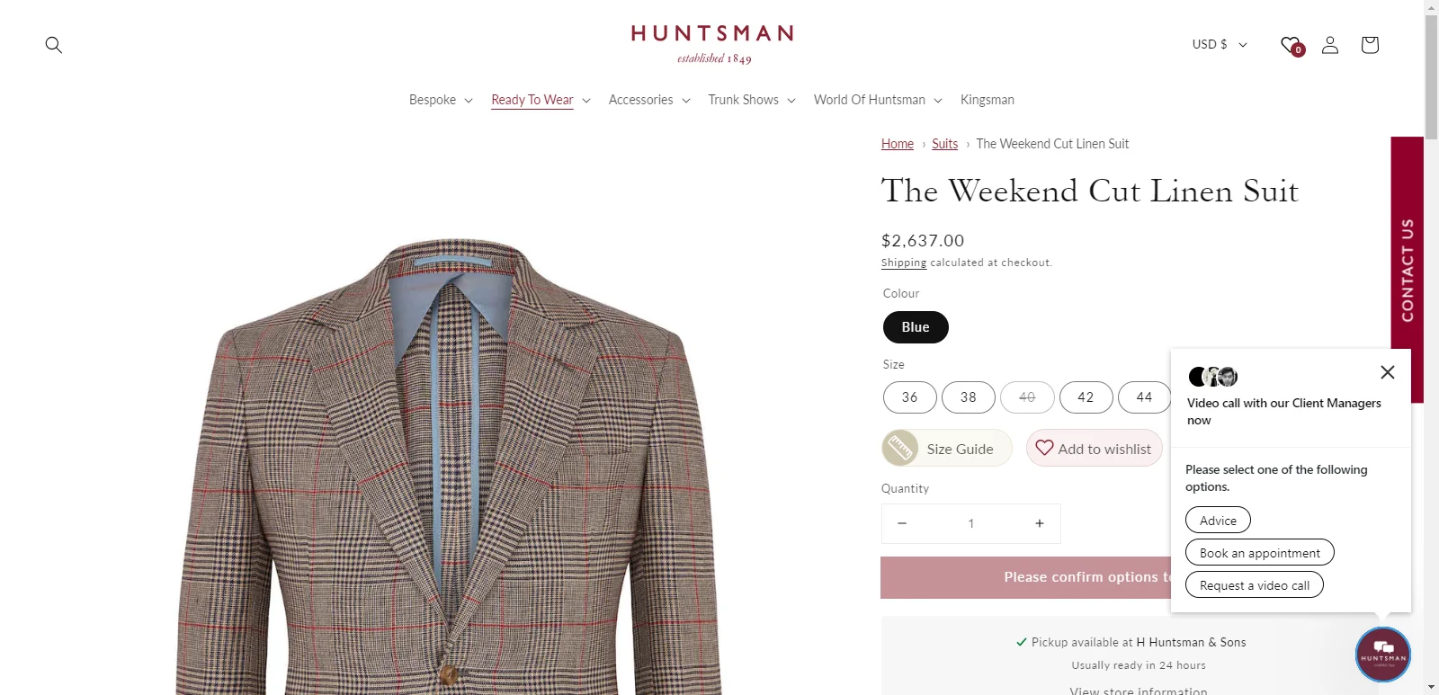
Huntsman Lets Its Tailoring Expertise Speak for Itself
Huntsman, the Savile Row tailor, uses visual references for sizing and tailoring expertise in a way that communicates decades of craft without a single boastful adjective. The expertise is demonstrated, not claimed.
The Luxury Value Ladder
Understanding where your product sits on this ladder and writing to it is the difference between a page that justifies its price and one that apologizes for it.
Commodity
Premium
Luxury
Features
Benefits
Craftsmanship
Materials
Quality
Provenance
Product
Experience
Heritage
Your goal is to move your shoppers up this ladder. From thinking about what the product does, to understanding what it represents.
Here are some actionable steps to craft the right message on your luxury eCommerce product pages:
Step 1: Rewrite product descriptions around provenance, materials, and process, not a feature list. Answer: where did this come from, who made it, and how? Our guide on writing highly persuasive product descriptions covers exactly how to do this.
Step 2: Add investment framing. Care instructions, longevity cues, and material sourcing aren't just practical information; they're proof that this product earns its price over time.
Step 3: Use a scrolling sticky image panel so visuals stay present while the copy does its work. The product should never leave the screen while the shopper is reading about it.
Step 4: Don't confuse brevity with elegance. The best luxury product pages provide more context than standard pages; they simply deliver it with better design and tighter writing.
What’s the revenue impact? Strong Craft signals directly improve add-to-cart rate, particularly on high-ticket items where purchase hesitation is driven by price anxiety rather than low intent.
Signal 3: Confidence: Eliminate Premium Purchase Anxiety
The higher the price, the higher the stakes and the more reassurance the shopper needs before they commit.
A $50 impulse purchase that turns out to be the wrong size is annoying. A $900 coat that doesn't fit is a problem. Luxury shoppers know this, and they'll circle a product page multiple times looking for the answer to one question: Am I going to regret this?
Most luxury brands answer this question too late, too quietly, or not at all.
Here’s what the best brands do:
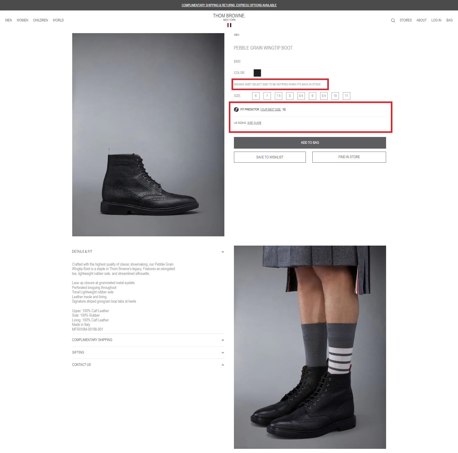
Thom Browne Turns Sizing Anxiety Into a Service
Thom Browne's Fit Predictor is one of the cleanest examples in luxury eCommerce. It's a sizing quiz built directly into the product page that removes the single biggest anxiety for international shoppers: will this fit me? Critically, it doesn't feel like a gimmick. It feels like a service.
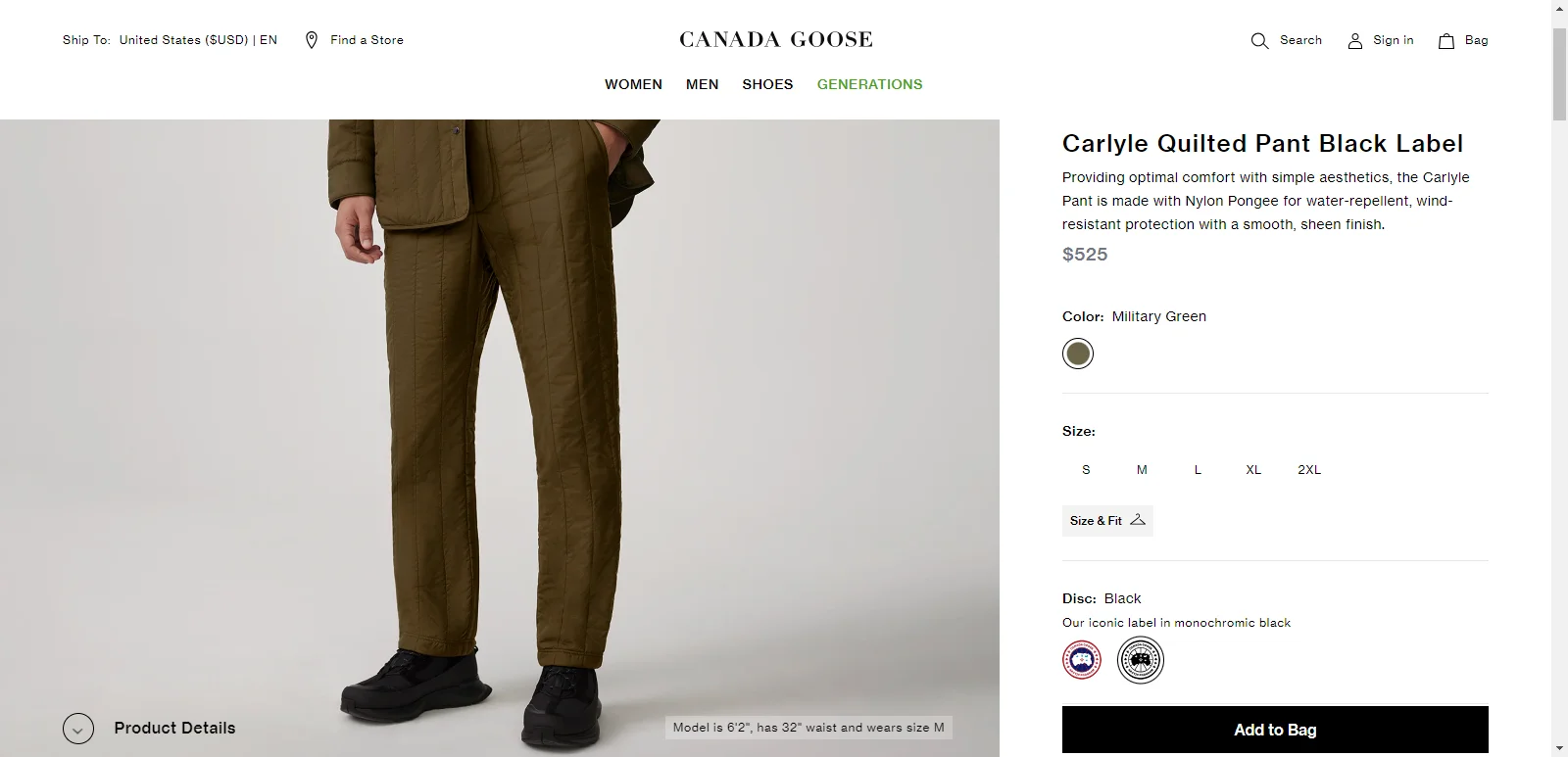
Canada Goose Shows Fit Information Where Shoppers Are Already Looking
Canada Goose shows the model's height and the size they're wearing directly in the product image, not buried in a size guide.
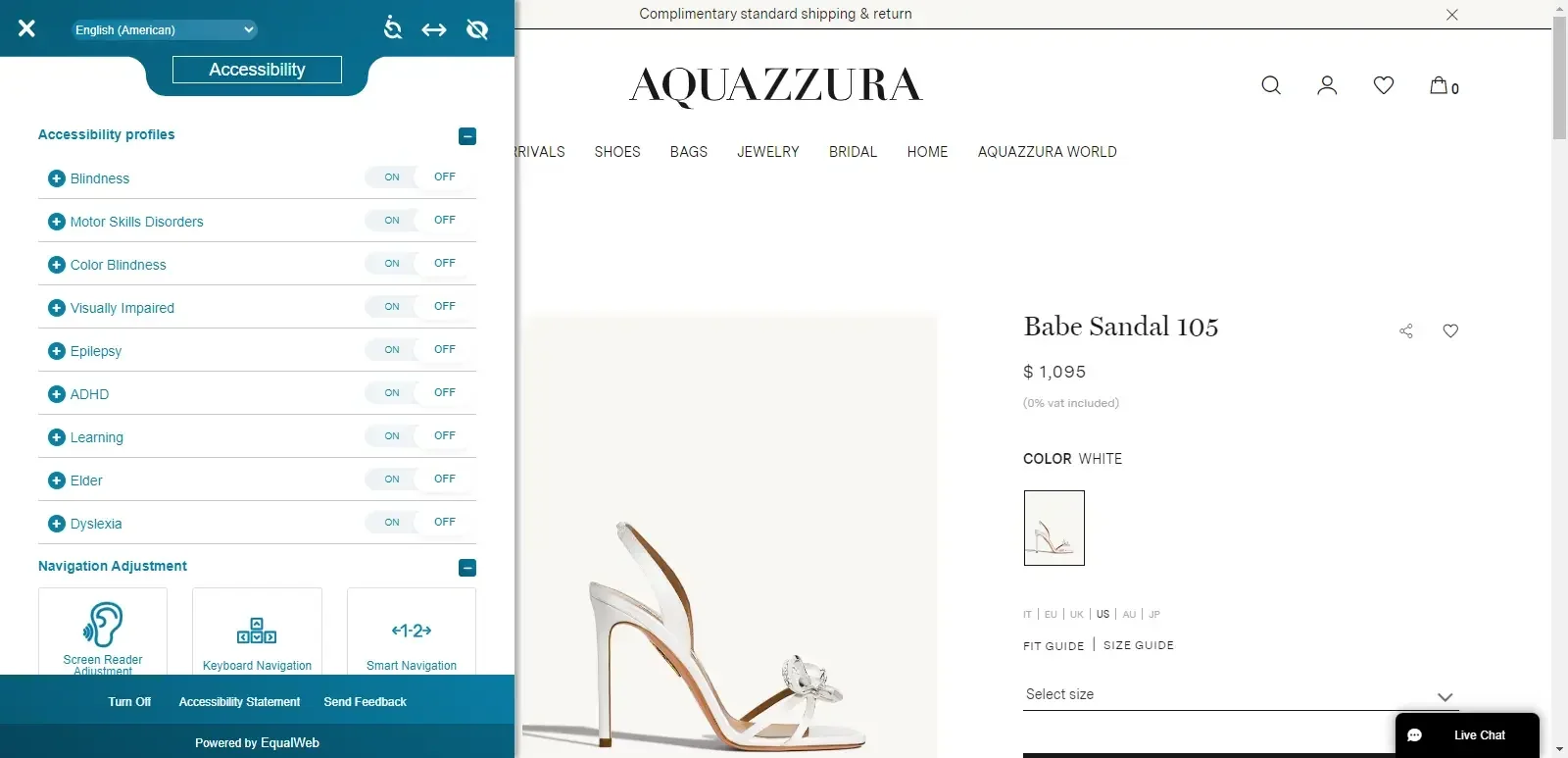
Aquazzura Answers Three Confidence Questions at Once
Aquazzura handles three confidence signals simultaneously: transparent pricing (VAT stated upfront), clear shipping timelines, and an accessibility control panel. None of it feels defensive; all of it removes friction.
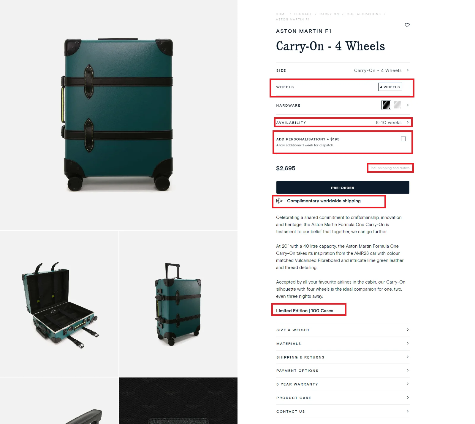
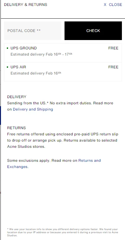
Globetrotter Removes Checkout Surprises Before They Happen
Globetrotter builds confidence through duty-inclusive pricing. No checkout surprises. What you see is what you pay. For international shoppers, this alone is a significant conversion driver.
A well-crafted eCommerce return policy works hand in hand with this — shoppers who trust the purchase process also trust the returns process.
Here’s a quick confidence layer checklist:
Every luxury product page above $300 should have all of the following:
Zoom functionality
360° view or multi-angle images
Model dimensions and size worn
Size guide surfaced within the variant selector (not buried in a modal)
Confirmed delivery date (not just an estimate range)
Duties and VAT stated upfront
Returns policy clear, prominent, human
Care instructions
Here are some actionable steps to build confidence among luxury eCommerce shoppers:
Step 1: Audit every point of purchase anxiety on your product pages. What questions does a $500+ shopper have that a $50 shopper doesn't? Answer all of them on the page before checkout.
Step 2: Surface your size guide inside the variant selector. The shopper who opens size options is the shopper who's deciding. That's the moment to give them the guide not three scrolls away.
Step 3: State duties, VAT, and shipping costs on the product page. Check out is too late. Shoppers who hit an unexpected cost at the final step don't come back. If your cart abandonment rate is high, unexpected costs at checkout are often a primary cause.
Step 4: Add a fit finder or quiz only if it answers a genuine purchase anxiety. If it's just a feature, it's friction. If it removes doubt, it converts.
What’s the revenue impact: Confidence signals directly improve checkout initiation rate, the step where most luxury stores lose their highest-intent shoppers.
Signal 4: Status: Show Ownership Without Looking Promotional
This is the signal most brands ignore entirely, and one of the most powerful tools in luxury eCommerce. Luxury isn't just about product ownership. It's about identity. The shopper buying a Stella McCartney jacket isn't just buying a jacket; they're buying membership in a community of people who care about sustainable fashion. The shopper buying a Golden Goose sneaker isn't just buying footwear; they're buying into a particular aesthetic and the story it tells about them.
A luxury product page that ignores this leaves its most emotionally compelling argument off the table.
The Luxury Ownership Test
Before publishing any luxury product page, ask four questions:
Can a shopper visualize where they'll use this product?
Can they picture who they'll be with?
Can they feel how they'll feel?
Can they imagine how others will perceive them as an owner?
If the answer to any of these is no, the status signal is weak, and the page is working harder than it needs to.
Here’s what the best brands do:
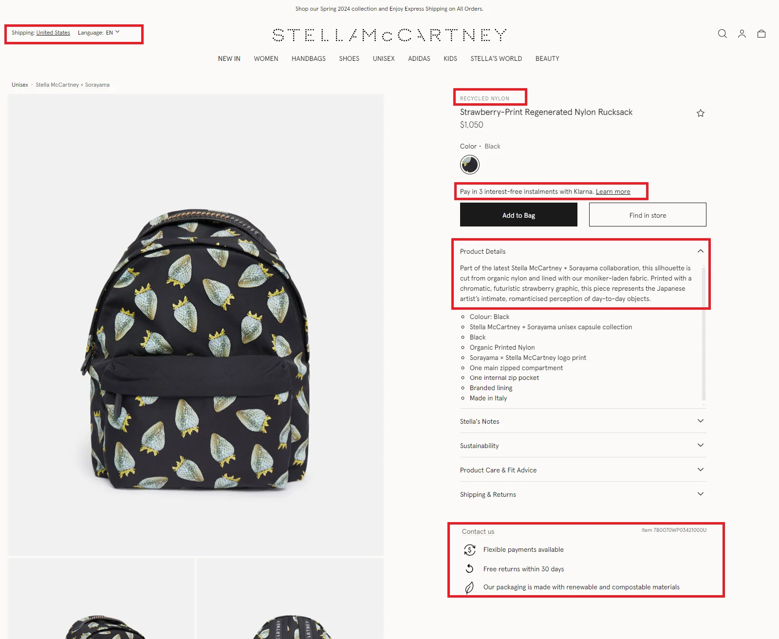
Stella McCartney Makes Sustainability Part of the Product Identity
Stella McCartney makes sustainability integral to every product page in the description, in the iconography, in the imagery. Buying from Stella McCartney signals something about the buyer's values, and the product page reinforces that signal at every touchpoint.
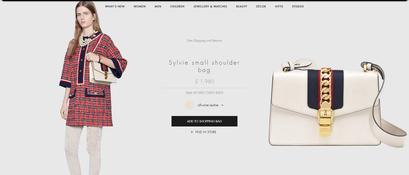
Gucci Shows the Ownership Experience Before the Purchase Happens
Gucci showcases its packaging on the product page, not just at delivery. The box, the ribbon, and the tissue paper are part of the product and part of the identity signal. Owning a Gucci product means receiving a Gucci experience, and the product page makes that visible before purchase.
Moooi Lets Shoppers Picture the Product in Their Own Lives
Mooi's "Seen in the Wild" section uses interactive imagery showing their products in real homes, real spaces, real lives. It's aspirational without being prescriptive. The shopper sees the product in context and does the status projection themselves
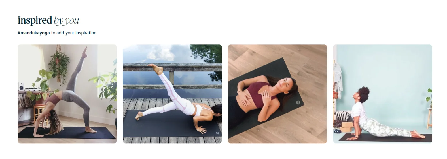
Manduka Helps Shoppers See Themselves in the Community
Manduka shows product-specific UGC on every product page, not a generic review wall, but actual images of that product in use, curated by product, so shoppers can see their future selves in the community already using it.
Here are some actionable steps to create a sense of status among luxury eCommerce shoppers:
Step 1: Add "in context" imagery alongside white-background shots. Show the product where it will actually be used, by people who represent your buyer's aspirational identity.
Step 2: Make your brand values visible on the product page, not just the about page. Sustainability, craftsmanship, heritage, and exclusivity, whichever values define your brand, belong near the product, not in a footer. eCommerce psychological triggers like identity alignment and social proof are especially powerful here.
Step 3: Use curated, product-specific UGC. Filter and display reviews and images by product. A shopper looking at a specific yoga mat wants to see that yoga mat in use, not a wall of general brand reviews.
Step 4: Showcase packaging, unboxing, and post-purchase experience where relevant. What happens after the buy button is part of the product and part of the identity signal.
What’s the Revenue impact? Strong status signals increase conversion rate among high-intent browsers and significantly improve repeat purchase behavior. Buyers who feel good about their identity signal come back.
Signal 5: Convenience: Make Luxury Effortless
Here's something luxury brands get wrong more often than any other: they confuse minimalism with effortlessness. A product page with fewer elements is not automatically more convenient. A product page where the shopper can find everything they need, make their decision confidently, and complete the purchase without friction:
That's convenient. And luxury shoppers, despite their willingness to spend, are just as impatient with friction as anyone else.
In fact, they're more impatient. When you're spending $800 on a coat, a clunky checkout doesn't feel like a minor inconvenience. It feels like a brand that isn't ready for your business.
Here’s what the best brands do:
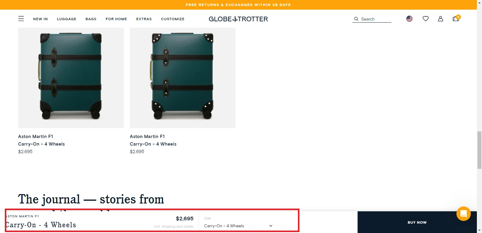
Globetrotter Keeps Every Purchase Detail Visible Without Scrolling
Globetrotter executes the sticky add-to-cart button as well as anyone in luxury eCommerce. The button carries the product title, the variant selected, the price, and the shipping estimate, all visible without scrolling back up. The shopper never loses their place.
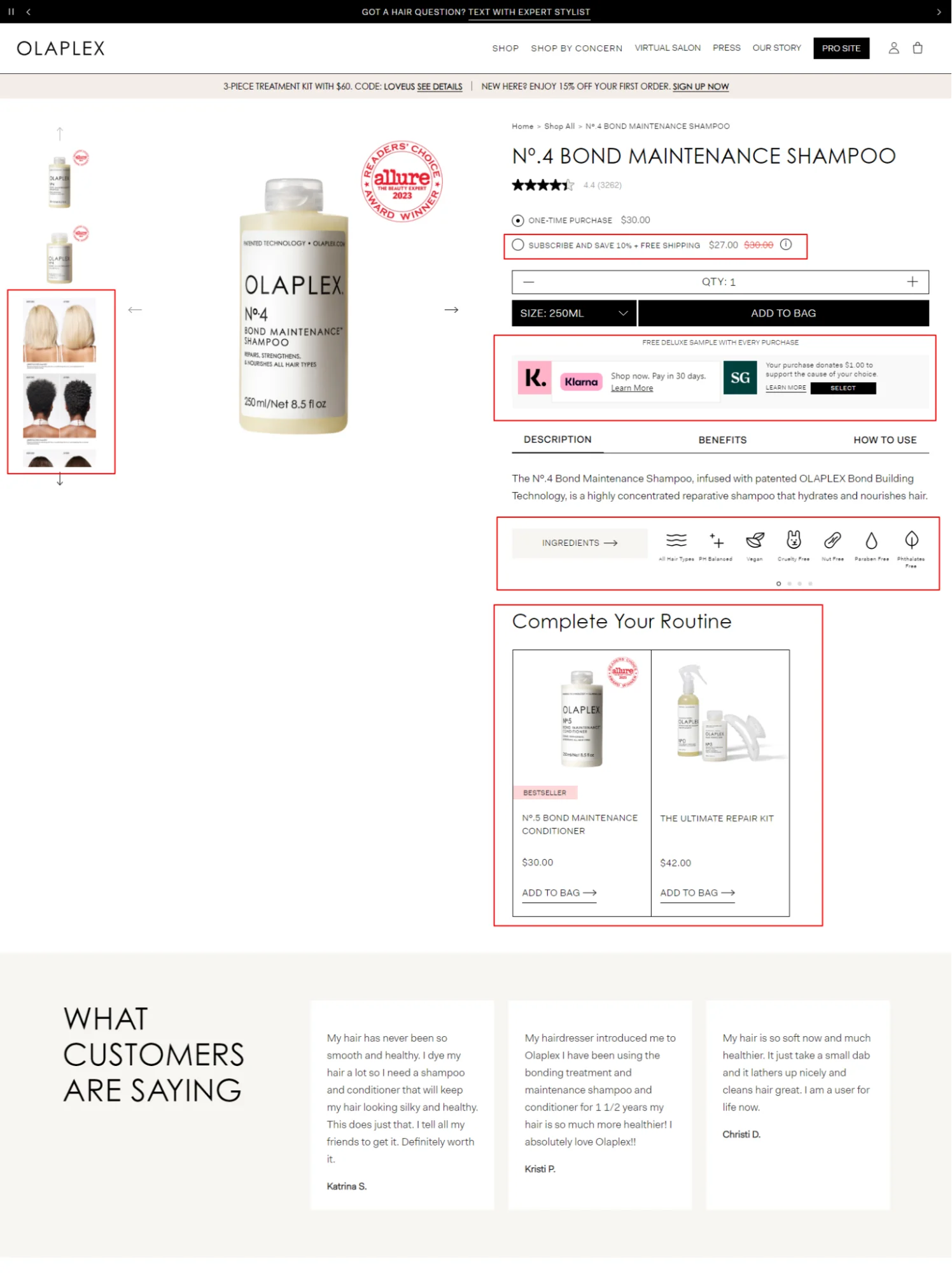
Olaplex Frames Flexible Payments as a Convenience, Not a Concession
Olaplex frames BNPL as a convenience signal, not an affordability one. The copy doesn't say "can't afford it all at once?" It says "flexible payment options." The placement is near the product, not near the price. That framing matters enormously in luxury.
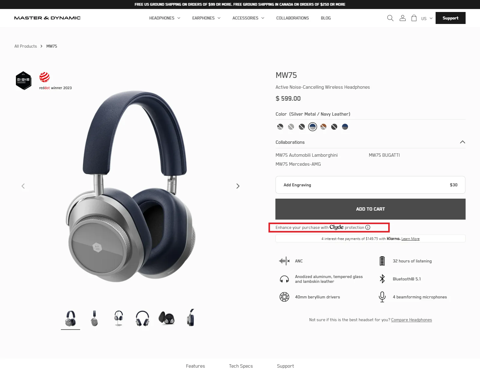
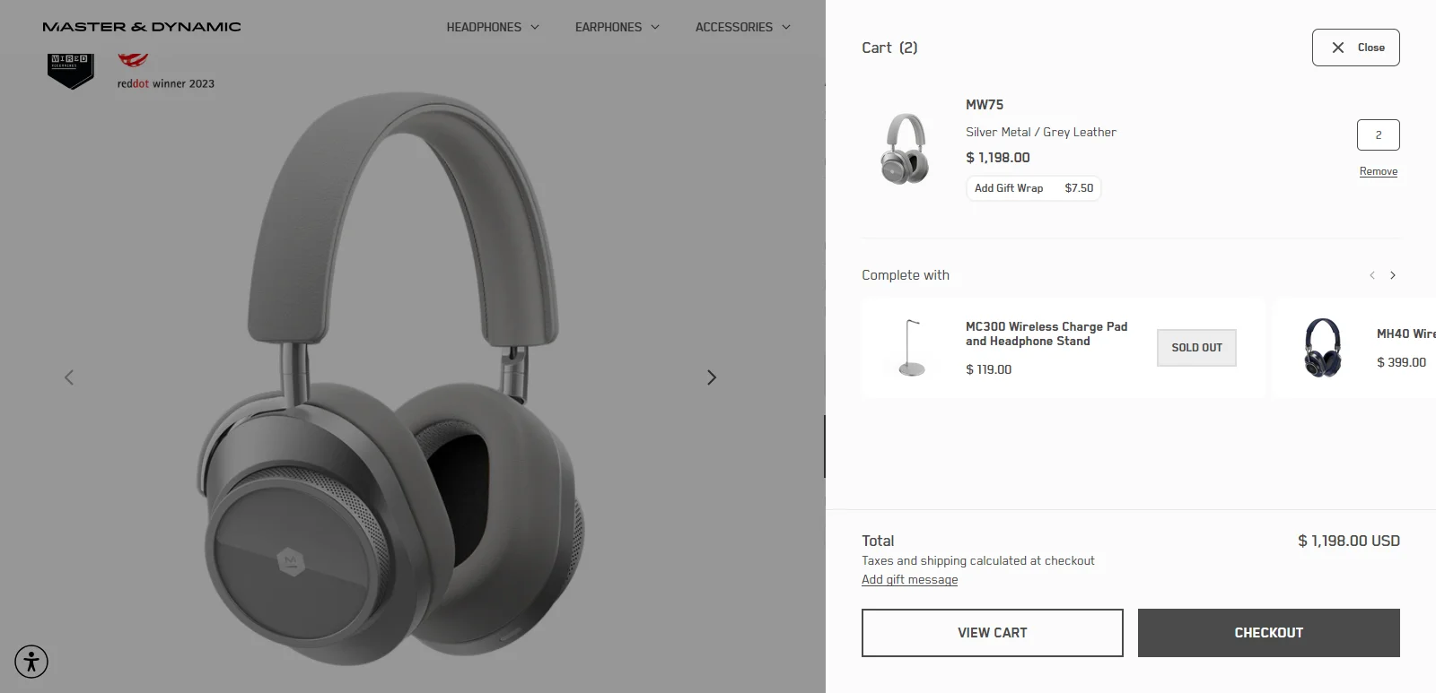
Master Dynamic Builds a Single, Distraction-Free Path to Purchase
Master Dynamic keeps a single, clear conversion path one CTA, one direction, minimal distraction. Their mini-cart includes a cross-sell, but it's clean and purposeful, not a desperate upsell dump. See how the best cart page designs handle this balance.
Acne Studios Treats Mobile Navigation as a Discipline
Acne Studios handles mobile navigation with discipline: their menu occupies minimal screen space, disappears when scrolling, and never competes with the product for attention.
Let’s look at some actionable steps to make shopping a convenient experience for luxury eCommerce buyers:
Step 1: Frame BNPL and flexible payment options as convenience, not financial assistance. Position them near the product description, not near the price, and write copy that speaks to flexibility, not affordability.
Step 2: Build a sticky ATC button that carries variant and price information. It should disappear only when the native ATC button is in the viewport. The shopper should never have to scroll back up to remember what they've chosen.
Step 3: Offer guest checkout without exception. Mandatory account creation is the single most unnecessary piece of friction in luxury eCommerce. It costs conversions every day.
Step 4: Redesign your mobile product page from scratch, don't resize the desktop version. Give images full viewport width, collapse navigation aggressively, and use a full-width sticky footer CTA instead of a floating button.
What’s the revenue impact: Convenience improvements have the highest direct impact on checkout conversion rate, where the revenue either closes or permanently disappears.
The Scorecard We Use At Convertcart To Gauge Product Pages
Use this scorecard to assess any luxury product page. Score each signal from 1 to 5.
Signal
What to Assess
Score (1–5)
Desire
Does the first fold create want before it delivers information?
___
Craft
Does the page explain — not just state — why this product costs what it costs?
___
Confidence
Does the page answer every question a high-intent shopper would have before committing?
___
Status
Can a shopper visualize themselves as an owner and feel good about it?
___
Convenience
Can the shopper complete the purchase without a single moment of friction or confusion?
___
Score Interpretation:
Here’s what your score tells you about how your product pages are doing:
0–10 → Commodity Experience: The page doesn't match the product. Shoppers who arrive with intent are leaving without buying.
11–15 → Premium Experience: The fundamentals are there, but the page is leaving conversion on the table.
16–20 → Luxury Experience: The page earns its price point. Marginal improvements will drive meaningful gains.
21–25 → Category-Leading Experience: The page is a competitive advantage. Protect and iterate it
Luxury Doesn't Mean Minimal: It Means Elegant
There's a persistent myth in luxury eCommerce that less is more. Less copy. Less information. Less explanation. The data says otherwise.
The highest-converting luxury product pages, like Gucci, Golden Goose, Aquazzura, and Thom Browne, provide more information than their mid-market equivalents.
More imagery. More context. More proof. More reassurance. They simply deliver all of it with better design, tighter writing, and a cleaner hierarchy.
Luxury means elegant, every element earns its place so that nothing is wasted, and the shopper arrives at the buy button feeling informed, reassured, and genuinely excited to own what they're buying.
Convertcart has helped 500+ eCommerce brands improve their product page UX and double their conversion rates. If you want to know which of the five signals your pages are getting wrong and what it's costing you, get a free audit here.
Subscribe for more articles like this!
Thank you - we'll see you in your inbox soon!
Oops! Something went wrong while submitting the form.
Read by 5000+ ecommerce store owners
Subscribe for more articles like this!
Thank you - we'll see you in your inbox soon!
Oops! Something went wrong while submitting the form.


.svg)

.svg)

.svg)
.svg)
